- Item Name : DreamGigs - Buy / Sell Marketplace
- Item Version : v1.0
- Author : Dreams Technologies
- Support via email: support@dreamstechnologies.com
- Support via codecanyon: Take me there
 DreamGigs
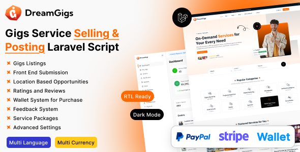
DreamGigs is a fully-featured “buy/sell” services marketplace built on Laravel, designed for those who want to launch their own Fiverr / Upwork style platform — fast, clean, and secure. Whether you want a white-label solution for your region, niche, or industry, or to build from the ground up using tried and tested features, DreamGigs gives you the tools to do just that.
Admin Login
URL: https://dreamsgigs.dreamstechnologies.com/admin/login
Email: demoadmin@example.com
Password: 12345678
User Login
URL: https://dreamsgigs.dreamstechnologies.com/login
Email: demouser@example.com
Password: 12345678
A turnkey Fiverr/Upwork-style marketplace built on Laravel
Core Platform Features
Multi-Language Support: Unlimited languages for both frontend and backend.
RTL Support: Full right-to-left language compatibility for global markets.
Modular Content Management: Built-in modules for pages, blogs, menus, contact forms, newsletters, FAQs, testimonials, and more.
Advanced Media System: Secure media management with Amazon S3 integration and organized file handling.
SEO & Sitemap: SEO-optimized with automatic sitemap.xml generation for better search rankings.
Easy Language Translation: Translate both frontend themes and the admin panel with a few clicks.
Advanced Permission System: Role-based access control for admins, staff, buyers, and sellers.
Fully Responsive Design: Smooth, optimized experience across mobile, tablet, and desktop.
Gigs Marketplace Features
Gig Creation & Management: Sellers can create and edit detailed service listings with pricing, delivery times, images, and descriptions.
Order Workflow: Buyers place orders, sellers fulfill them with built-in statuses (pending, in progress, delivered, completed, cancelled).
Ratings & Reviews: Buyers leave feedback after order completion, building trust and improving seller visibility.
Favorites / Wishlists: Buyers can save gigs or sellers for future purchases.
Secure Messaging: Direct buyer-seller messaging for project discussions and file sharing.
Categories & Tags: Gigs organized by category, sub-category, and tags to improve discovery.
Powerful Search & Filters: Filter by price, delivery time, rating, or category to quickly find the right service.
Gig Extras / Add-Ons: Sellers can offer premium extras such as faster delivery or additional revisions.
Delivery & Revisions: Sellers upload deliverables and buyers can request revisions within set limits.
Escrow & Secure Payments: Funds are released to sellers only after buyer approval.
Seller Portfolio: Showcase past projects, images, or sample work to attract more buyers.
Trending & Featured Gigs: Admins can highlight featured gigs or promote trending services to boost visibility.
PSR-12 and Laravel 12 Structure: Clean, modular, and maintainable code following modern industry standards.
Service/Repository Pattern: Separates business logic and data access layers, improving scalability and testability.
Security Best Practices: Covers Command Injection prevention, Path Traversal safeguards, SSRF mitigation, XSS protection, secure file uploads, and input validation.
Install SSL certificate on your hosting/VPS: You need to install an SSL certificate on your hosting/VPS first. You can purchase an SSL certificate or use free SSL, for example Let's Encrypt.
Redirect http to https: Change the
following
code in
.env file from APP_URL=http://domain.com to
APP_URL=https://domain.com.
Option 1: Add
ENABLE_HTTPS_SUPPORT=true to
.env file
Option 2: Add to .env
file
following code:
FORCE_SCHEMA=https
FORCE_ROOT_URL=https://domain.com
ENABLE_HTTPS_SUPPORT=false
Server Requirements
-
PHP 8.4x
-
Operating System : Linux or Windows
-
Shared, VPS or Dedicated Server
-
MySql: 5.7+
Required Upgrades
Those settings to upload 1GB file, you need to change them besides on your needs and your server specifications.
-
allow_url_fopen = on
-
max_execution_time = 300
-
max_input_time = 300
-
post_max_size = 100M
-
memory_limit = 100M
-
upload_max_filesize = 100M
PHP Extensions
-
BCMath
-
bz2
-
curl
-
fileinfo
-
gd
-
intl
-
mbstring
-
mysqli
-
openssl
-
pdo_mysql
-
sodium
-
zip
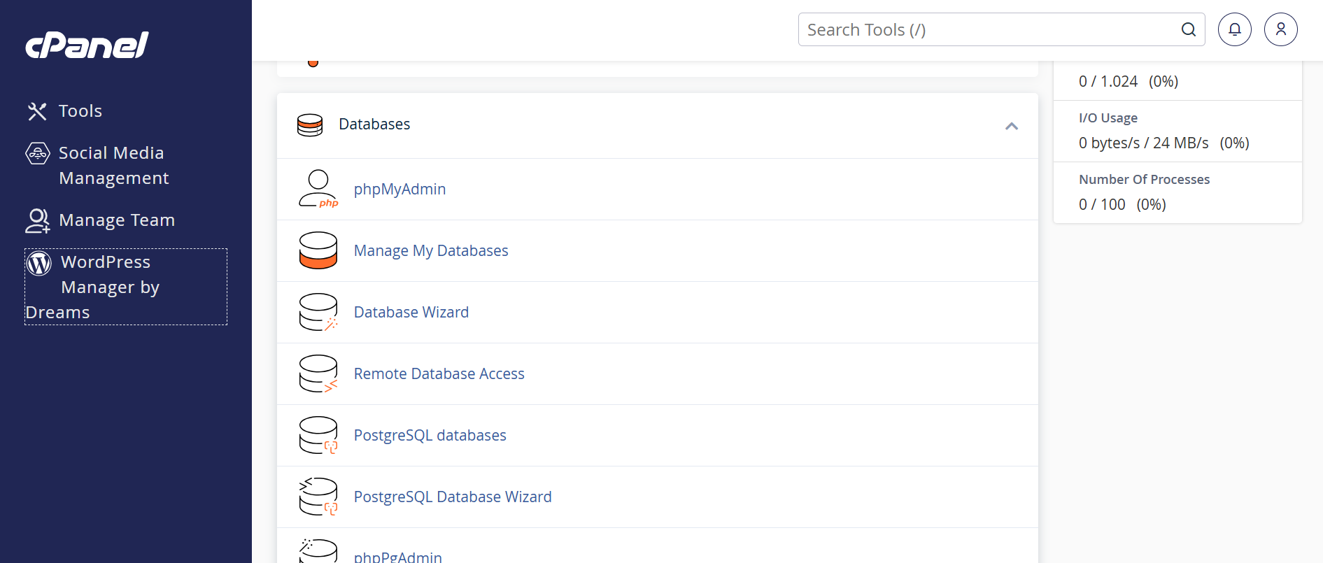
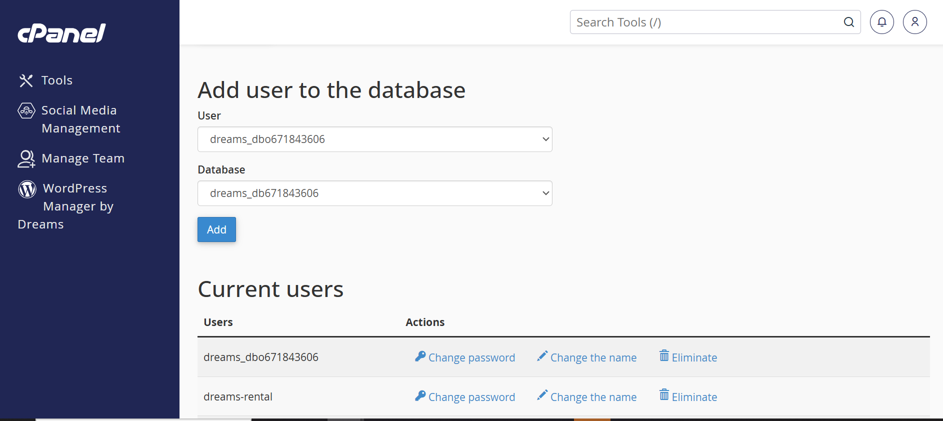
1. Login to your hosting server. 2. Go to cPanel Dashboard. 3. Click on MySQL®
Databases under the
Databases section.
Accessing cPanel:
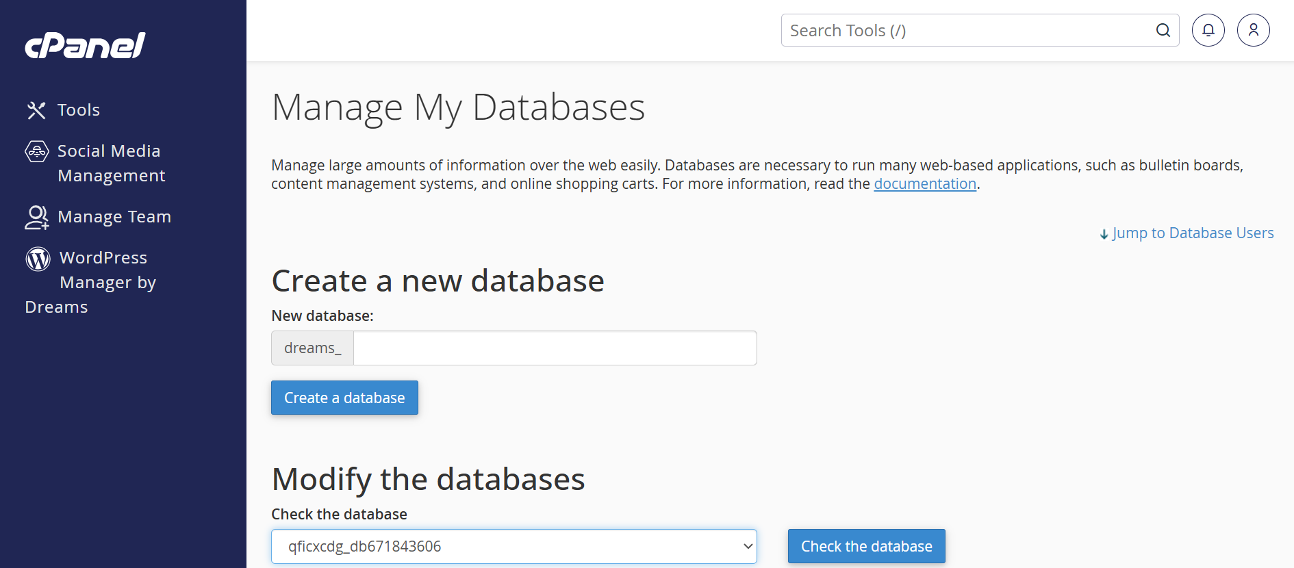
1. Find the "Create New
Database" section. 2. Enter a database name (e.g.,
3. Click "Create
Database" to finalize.
Creating a New MySQL
Database:
Dreams Gigs_db).
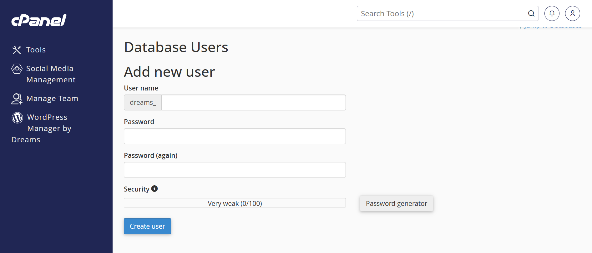
1. Scroll to the MySQL
Users section. 2. Enter a username (e.g.,
3. Enter a strong password (twice). 4. Use the Password
Generator for added security. 5. Click "Create
User".
Creating a MySQL User:
dreams_user).
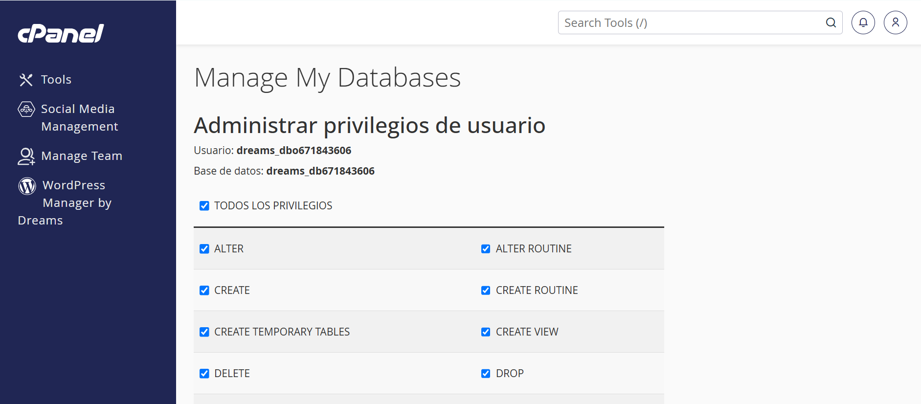
1. Under "Add User to
Database", select the user and the database you created.
2. Click "Add".
3. On the next screen, select "All Privileges". 4. Click "Make
Changes" to apply the permissions.
Assigning User to
Database:
1. In cPanel, open File Manager. 2. Navigate to the desired directory (usually
3. Click "Upload"
in the top menu. 4. Select your application's ZIP file and wait for
the upload to finish.
Uploading Files:
public_html).
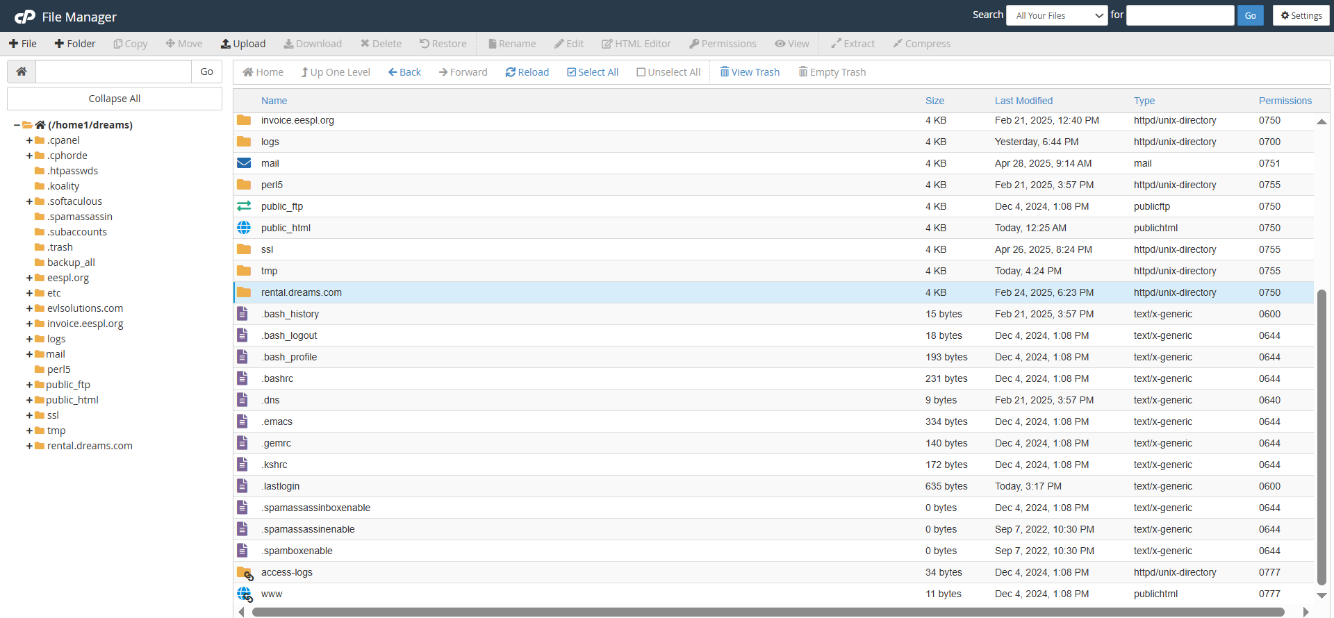
1. Once uploaded, select the ZIP file. 2. Click "Extract"
to unpack the files. 3. Ensure all files are in the correct public
directory (typically
Extracting Files:
public_html).
Setup Laravel Environment File
1. Copy the example environment
file
Run this command in your project folder:
cp .env.example .env2. Generate the application key
Run:
php artisan key:generateCheck Composer Installation
1. Ensure Composer is installed
Download Composer: https://getcomposer.org/download/
To verify installation, run:
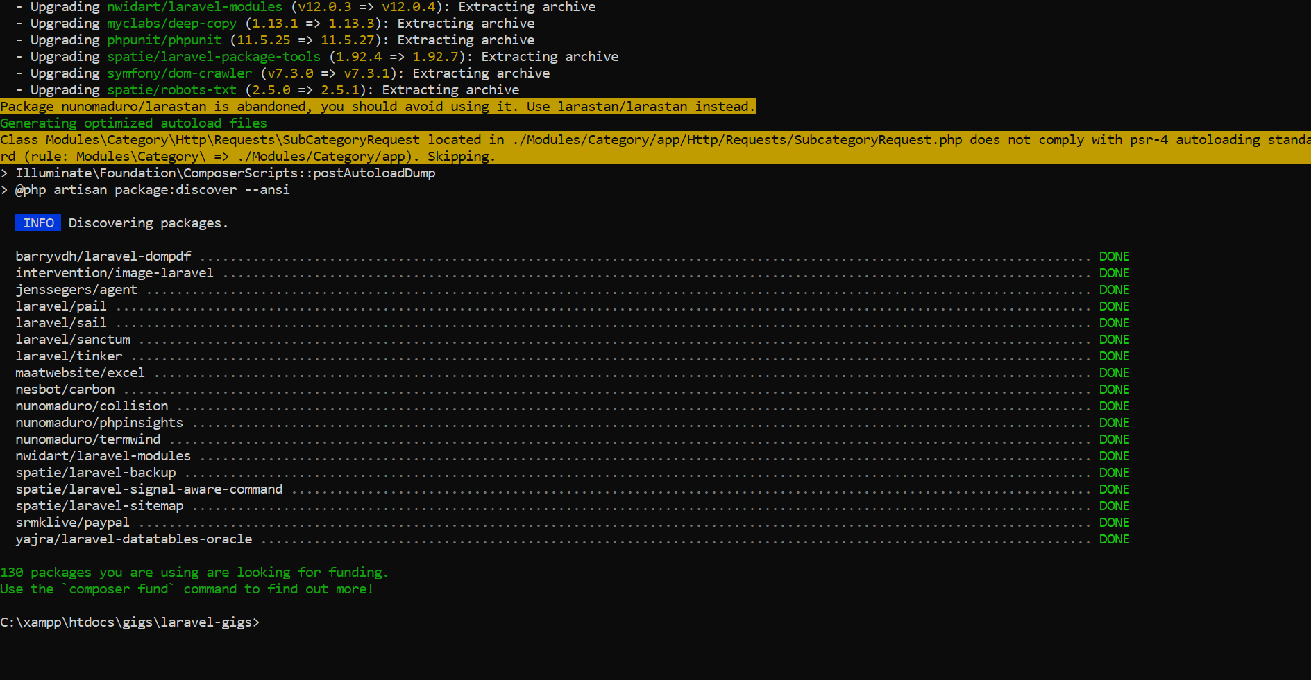
composer -VInstall Laravel Dependencies
1. Navigate to your Laravel project folder
cd your-project-folder2. Install required packages
composer installOptional (Production): Use optimized install
composer install --no-dev --optimize-autoloadercomposer install
Installs all the dependencies listed in the
Description:
composer.json file. This command is used when
setting up a project for the first time or when a team member
clones the repository.
Ensures all necessary PHP packages required for the Laravel
application are downloaded and installed in the vendor
directory.
Purpose:
Composer update (If you already have a vendor file. You can use this command.)
Updates all installed dependencies to the latest versions
allowed by the constraints defined in the
Description:
composer.json file. Use this when you want to bring
packages up to date while staying within specified version
ranges.
Keeps the project dependencies updated and ensures compatibility
with the latest versions.
Purpose:
php artisan storage:link
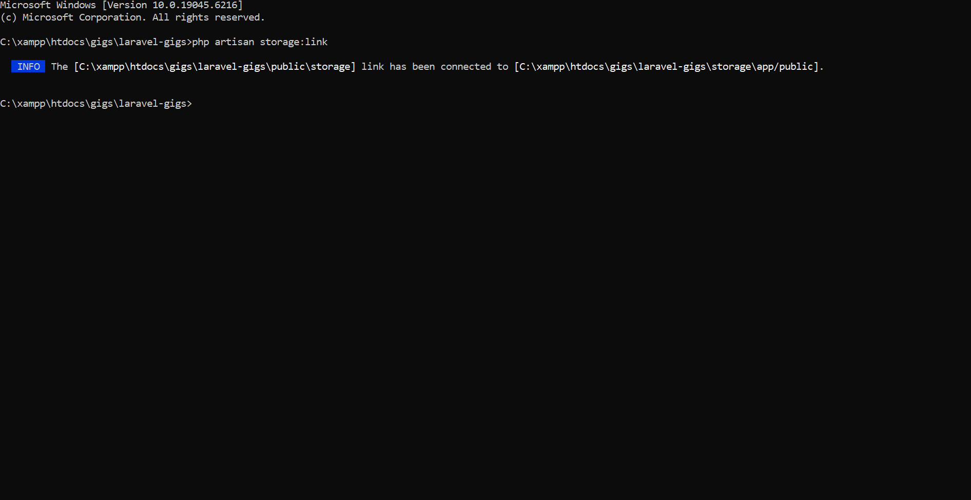
The
Description:
php artisan storage:link command creates a
symbolic link from public/storage to
storage/app/public, making files in the storage
folder accessible via a public URL.
php artisan serve
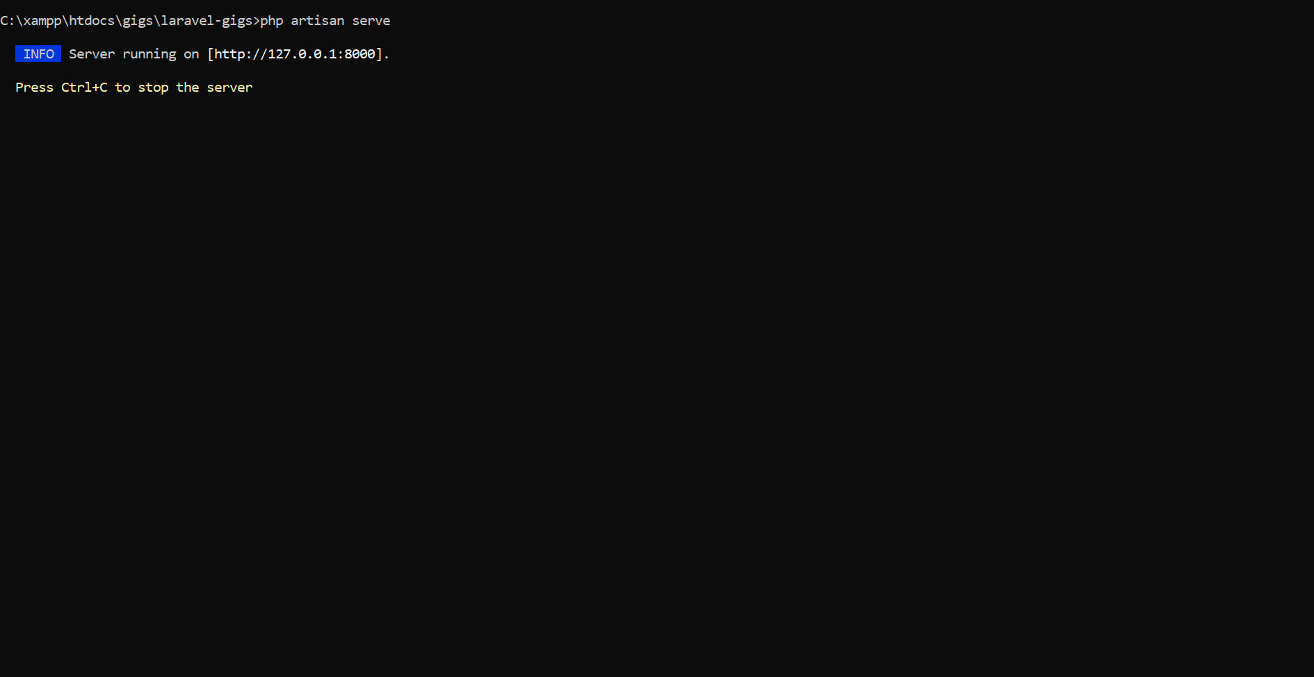
Starts a built-in development server for running the application
locally.
Description:
No need for an external web server like Apache or Nginx during
development.
Purpose:
php artisan cache:clear
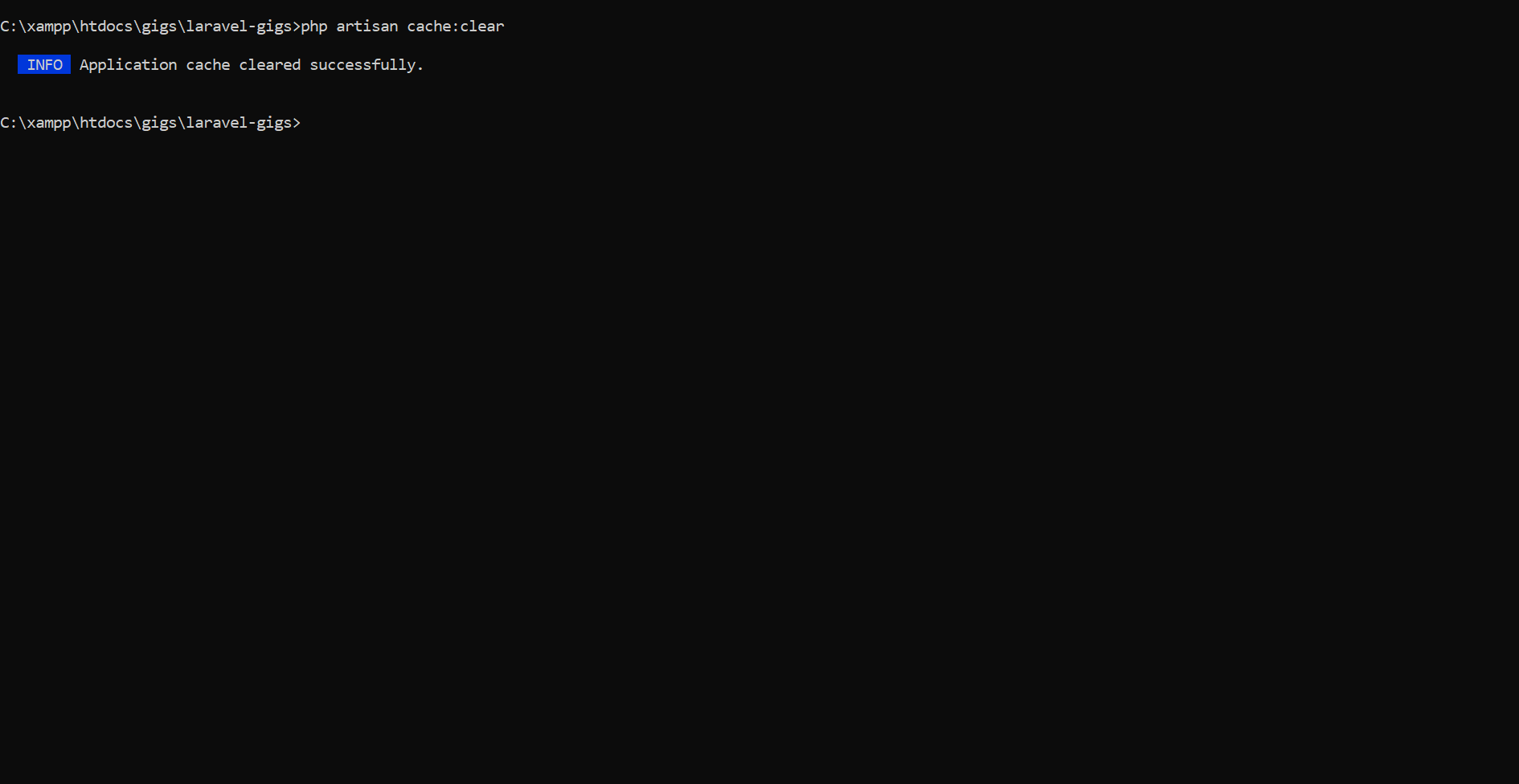
Clears all application caches, including data cached via the
cache()
Description:
helper or Cache facade.
php artisan config:clear
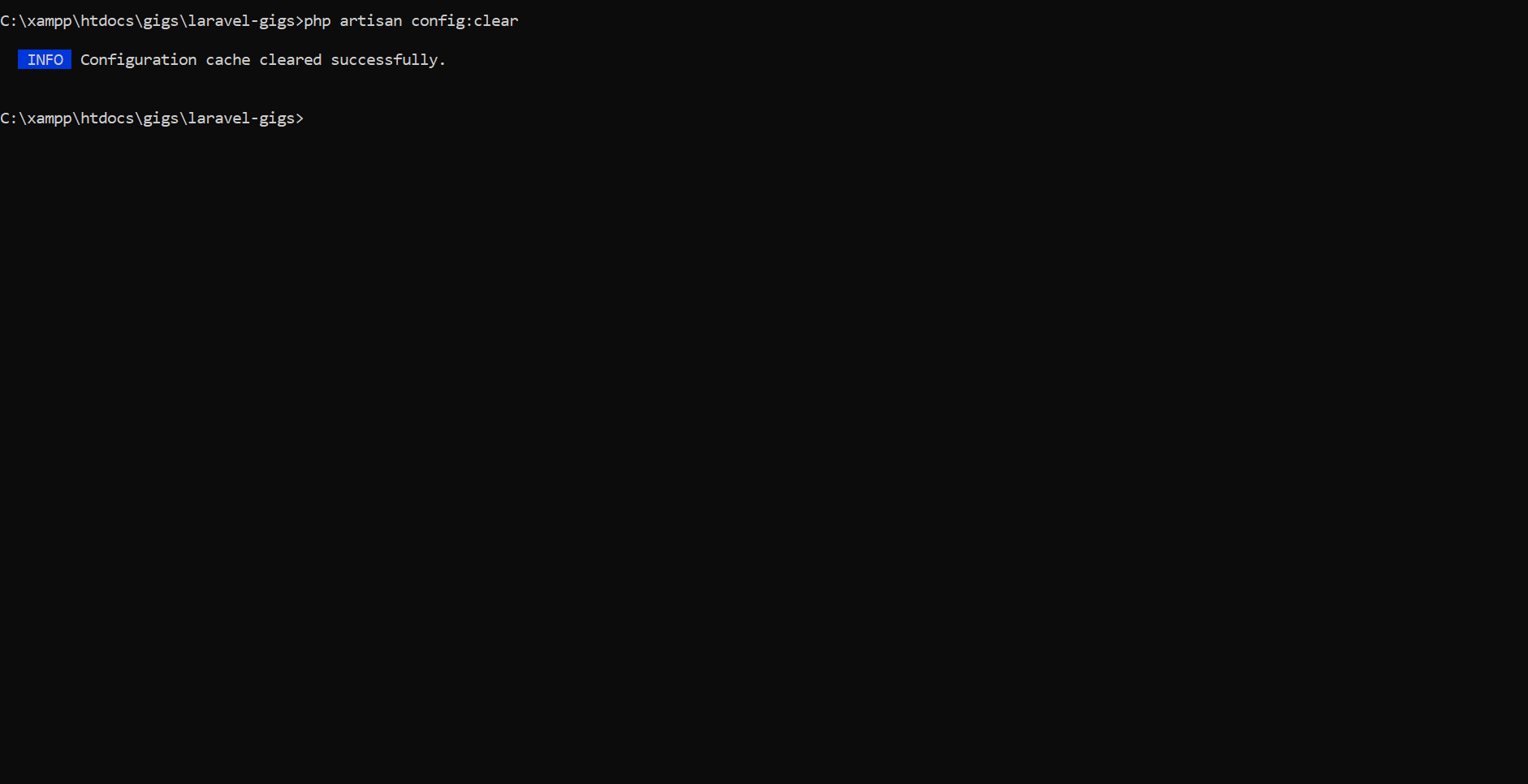
Clears the configuration cache, ensuring that updates to
Description:
.env or config
files take effect.
php artisan route:clear
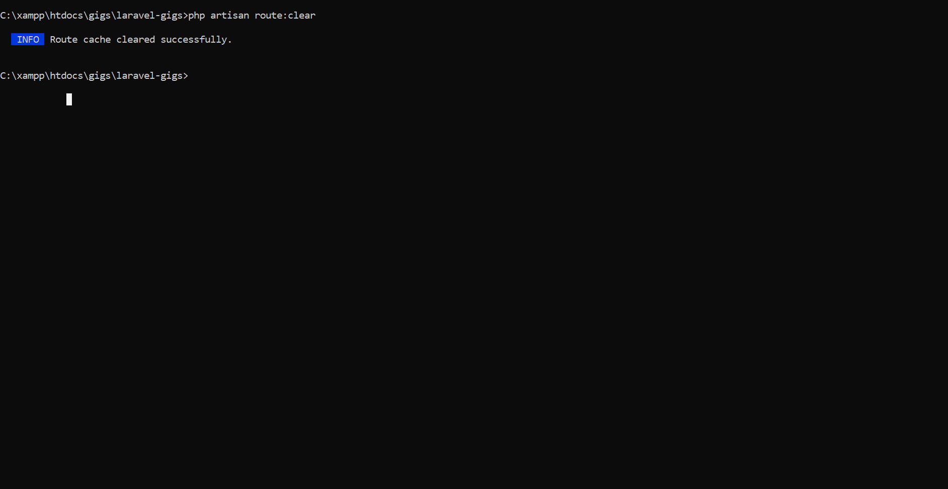
Removes the cached routes to reflect new or updated routes in
the
Description:
application.
php artisan view:clear
Clears compiled Blade templates, forcing the framework to
regenerate them.
Description:
Requirements
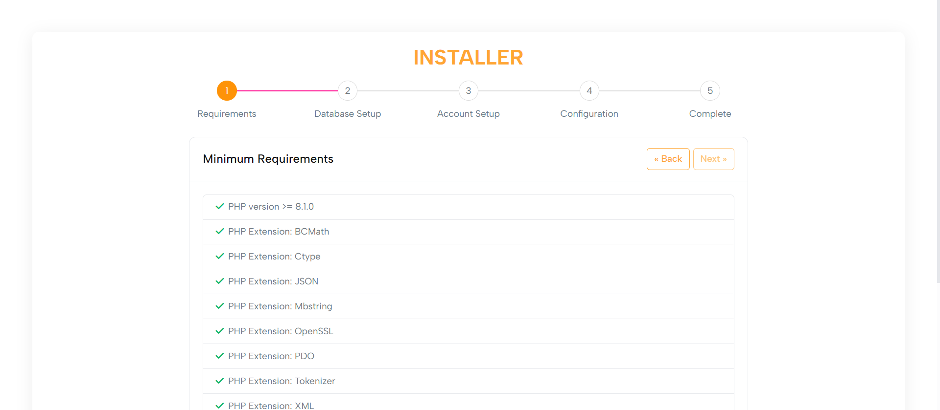
The Minimum Requirements step checks system compatibility,
including:
Purpose:
1. PHP version
2. Required extensions
3. File permissions
1. A user-friendly list of checks with indicators:
Layout:
- Green checkmarks for passed items
- Red icons with informative messages for failed
items
2. Failed checks include links for guidance.
3. Navigation buttons to Go Back or Proceed once all checks are
successful.
Built with Bootstrap classes, ensuring optimal usability on
desktops, tablets, and mobile screens.
Responsive Design:
Database Setup
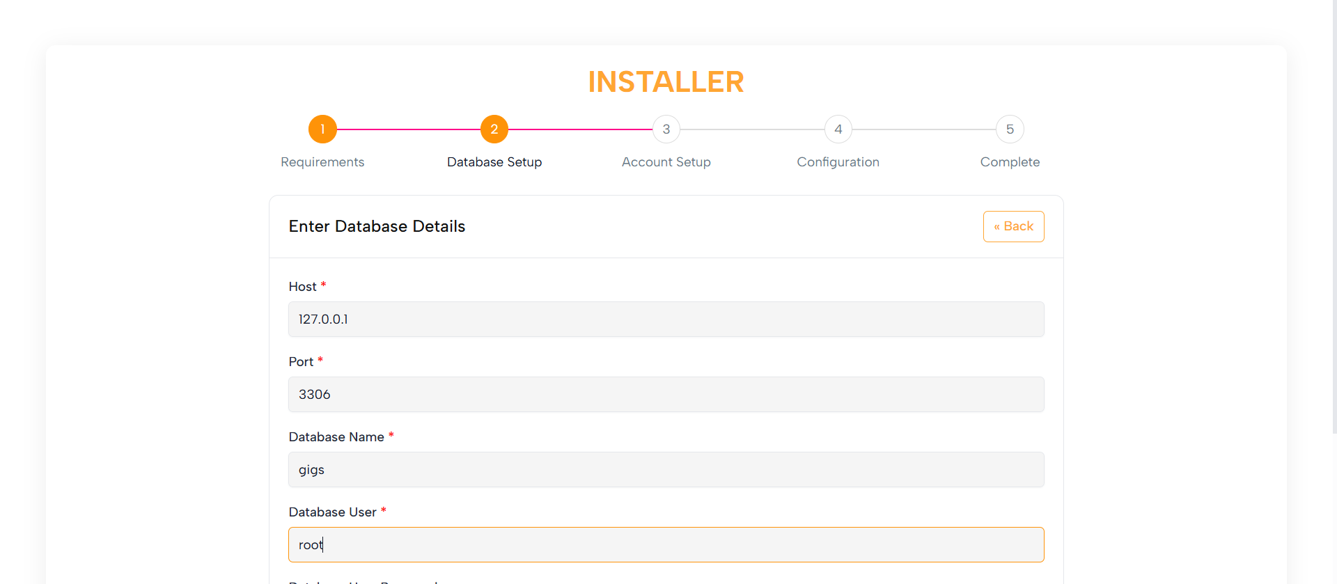
Allows users to configure the database by entering:
Purpose:
1. Hostname
2. Database name
3. Username
4. Password
This step ensures database connectivity and smooth operation.
1. Clean form fields with helpful placeholders and tooltips
Layout:
2. Clear error messaging for invalid or missing details
Optimized with Bootstrap for use on desktops, tablets, and mobile
devices.
Responsive Design:
Account Setup
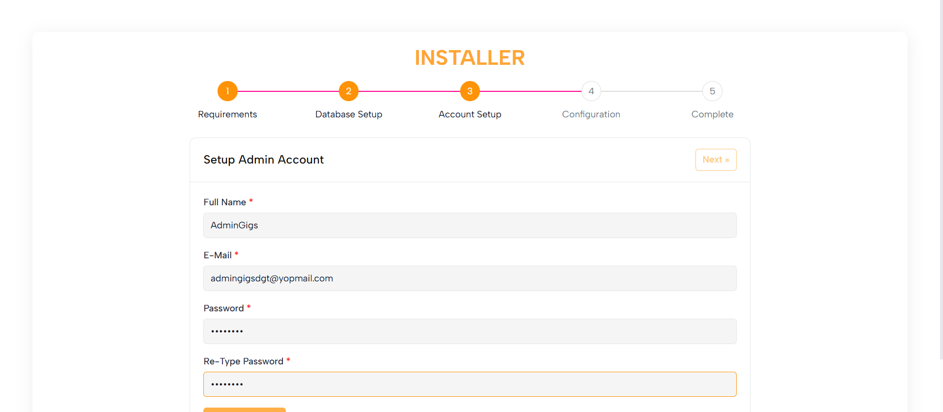
Enables users to create an Admin Account with:
Purpose:
1. Username
2. Email
3. Password
1. Straightforward form fields with labels and placeholders
Layout:
2. Password strength indicator (optional)
3. Clear instructions and validation messages
Built with Bootstrap to work seamlessly on all screen sizes.
Responsive Design:
Configuration

Allows users to configure additional system settings, such as:
Purpose:
1. App URL
2. Mail settings
3. Other essential configurations
1. Organized sections with labels, fields, and tooltips
Layout:
2. Clear instructions for each field
Bootstrap ensures the layout adapts for all devices.
Responsive Design:
Completed
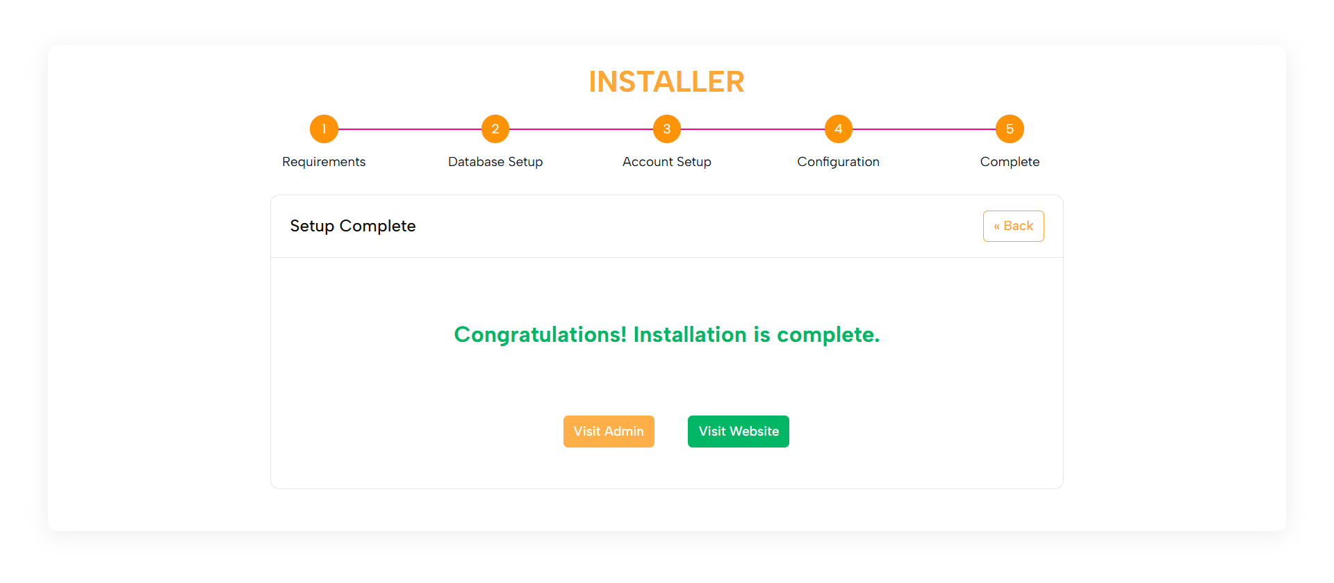
Confirms that the installation is complete and the application is
ready to use.
Purpose:
1. A friendly success message
Layout:
2. Direct links to the Admin Panel and Front-end
3. Optionally, a link to the documentation
Optimized with Bootstrap for consistency across all devices.
Responsive Design:
Purpose:
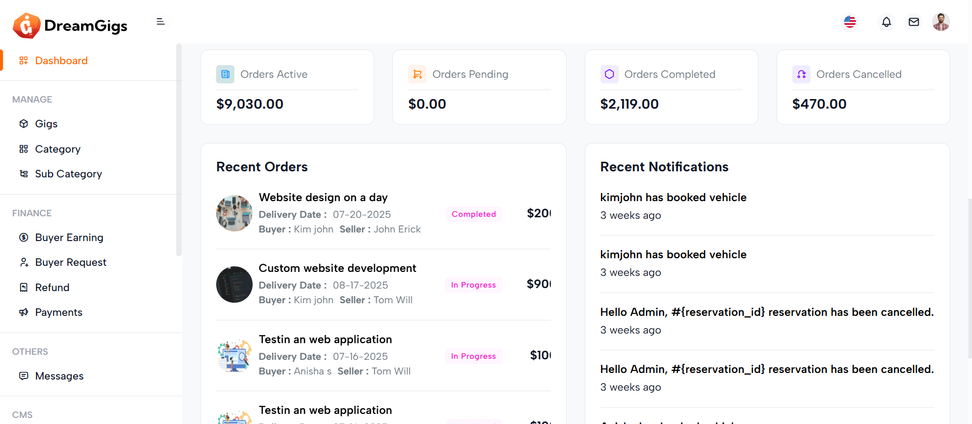
The admin dashboard provides a high-level summary of the platform’s performance, allowing administrators to monitor key business metrics at a glance. It displays real-time data such as order statuses, income trends, top buyers, recent orders, and notifications. This page serves as a centralized hub for tracking activities and making informed decisions quickly.
Layout:
The dashboard is structured using a multi-row, card-based layout. Key sections include summary cards for order statuses, income statistics with an interactive year picker, a top buyers table, and recent orders and notifications. Each data block is encapsulated in a Bootstrap card for clarity and separation. Dynamic data such as charts and tables are populated using Blade directives and Laravel relationships, and interactive elements like the income chart use ApexCharts for data visualization. Conditional checks ensure graceful fallbacks for empty datasets.
Responsive Design:
Designed using Bootstrap’s grid system (row, col-md-*, col-xl-*), the dashboard layout adjusts seamlessly across screen sizes. Cards stack vertically on smaller devices and align horizontally on wider screens to maximize space efficiency. Tables are wrapped in table-responsive containers for horizontal scrolling on mobile devices. Interactive charts and images scale fluidly within their containers, ensuring a consistent and user-friendly experience across desktops, tablets, and mobile devices.
Purpose:
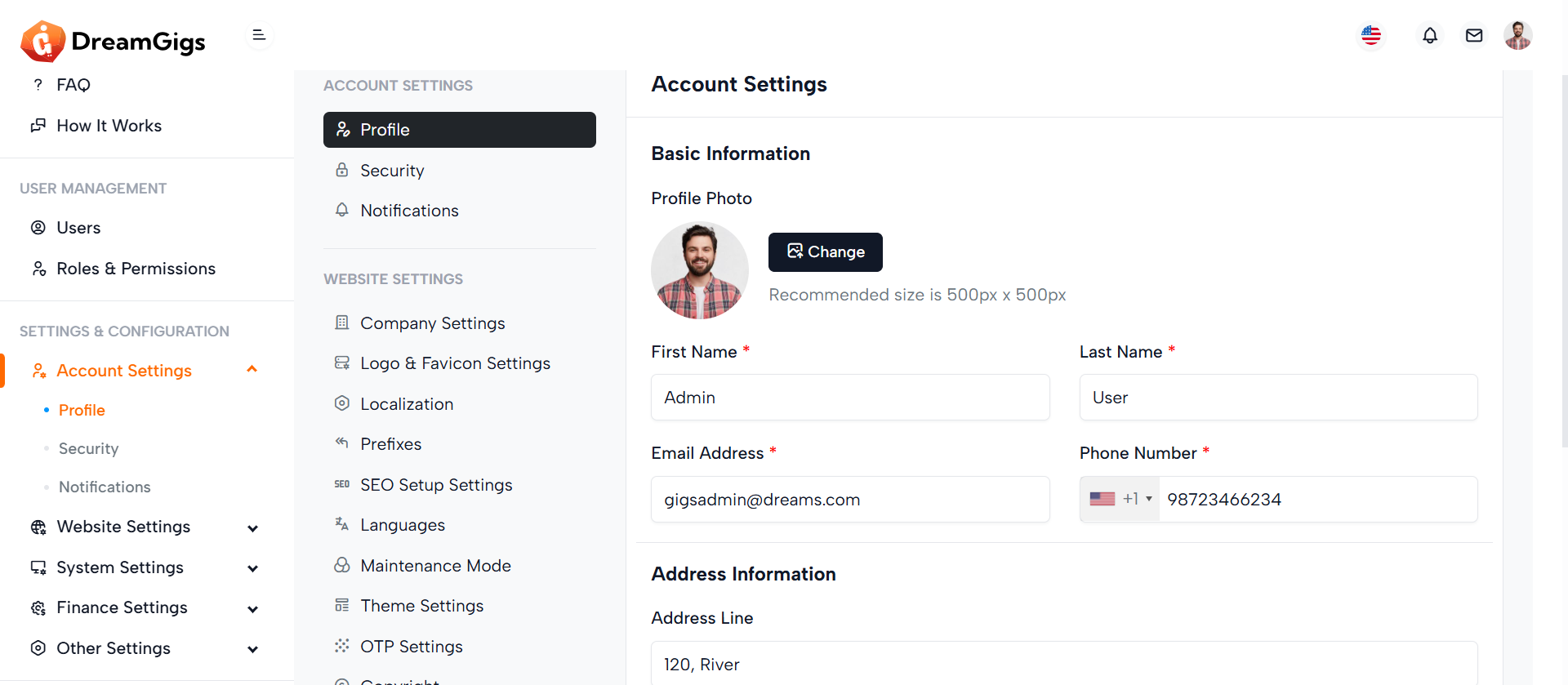
The admin profile form enables administrators to manage their personal and account details, including profile photo, name, contact information, and address. It ensures that the admin can update their profile conveniently within the admin dashboard.
Layout:
The form is structured into two primary sections—Basic Information and Address Information—with clearly labeled fields and grouped layouts for usability. Skeleton loaders enhance the user experience during data fetch, while the form uses Bootstrap classes for consistent styling. The form fields are dynamically revealed after data loading using d-none real-label toggling for a smooth transition from loading state to the actual form.
Responsive Design:
Built with a responsive grid system using row and col-md-* classes, the layout adapts seamlessly across various screen sizes. Profile photo upload and form inputs stack gracefully on smaller devices. The drag-and-drop image uploader and select inputs are optimized for both desktop and mobile interfaces, ensuring accessibility and usability across all devices.
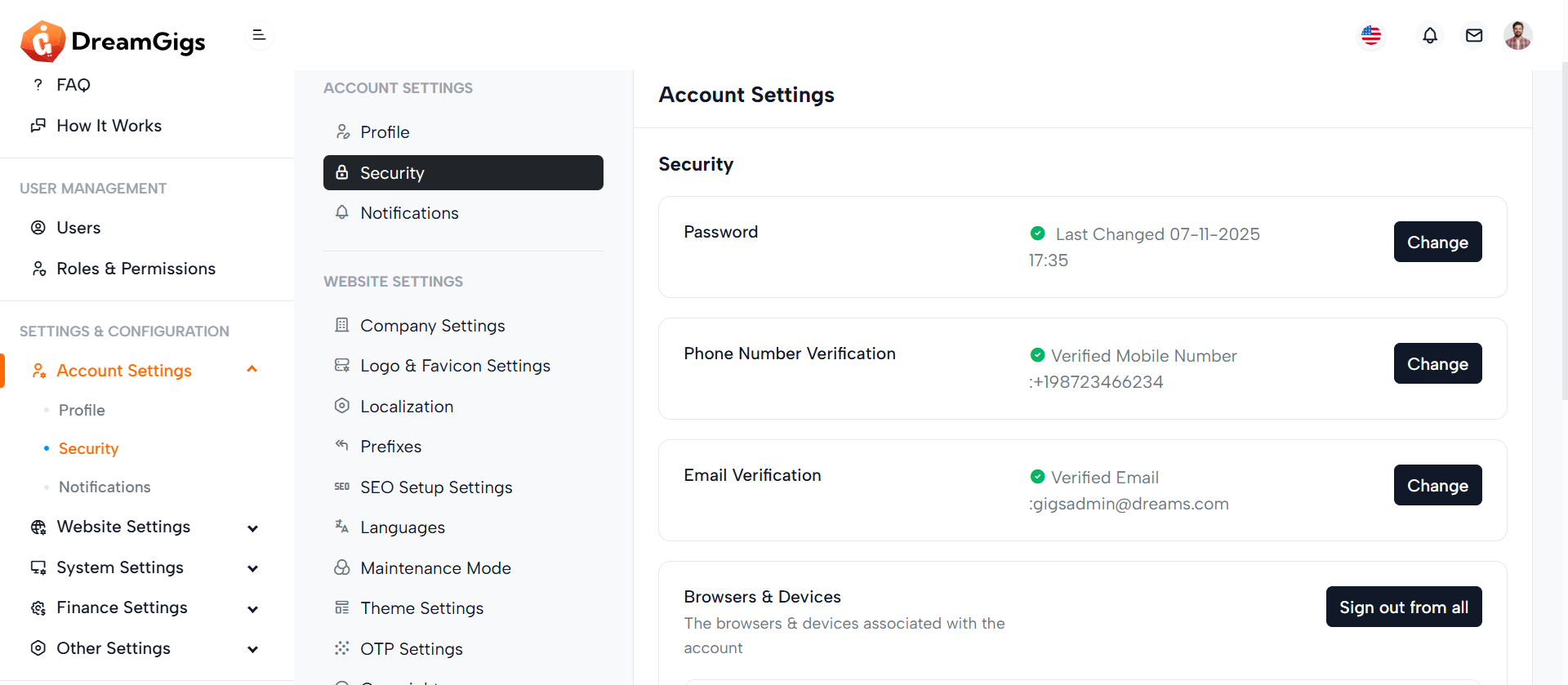
Purpose:
The Security Settings section empowers users to manage key aspects of their account security, including password changes, two-factor authentication (Google Auth), phone and email verification, account deactivation, and device management. It ensures users maintain full control and visibility over their account access and activity.
Layout:
This section is divided into modular cards, each focusing on a specific security feature. Each card contains a title, description, status or details, and relevant action buttons like "Change," "Remove," or toggles. The layout uses a 3-column grid structure to evenly distribute content across larger screens while maintaining clarity and hierarchy.
Responsive Design:
Built using the Bootstrap grid system (col-xl-*), this layout adapts seamlessly across devices. On smaller screens, columns stack vertically for readability, while action buttons remain accessible via flexbox utilities. The device management table is wrapped in a responsive container, ensuring it scrolls horizontally on mobile without breaking the layout.
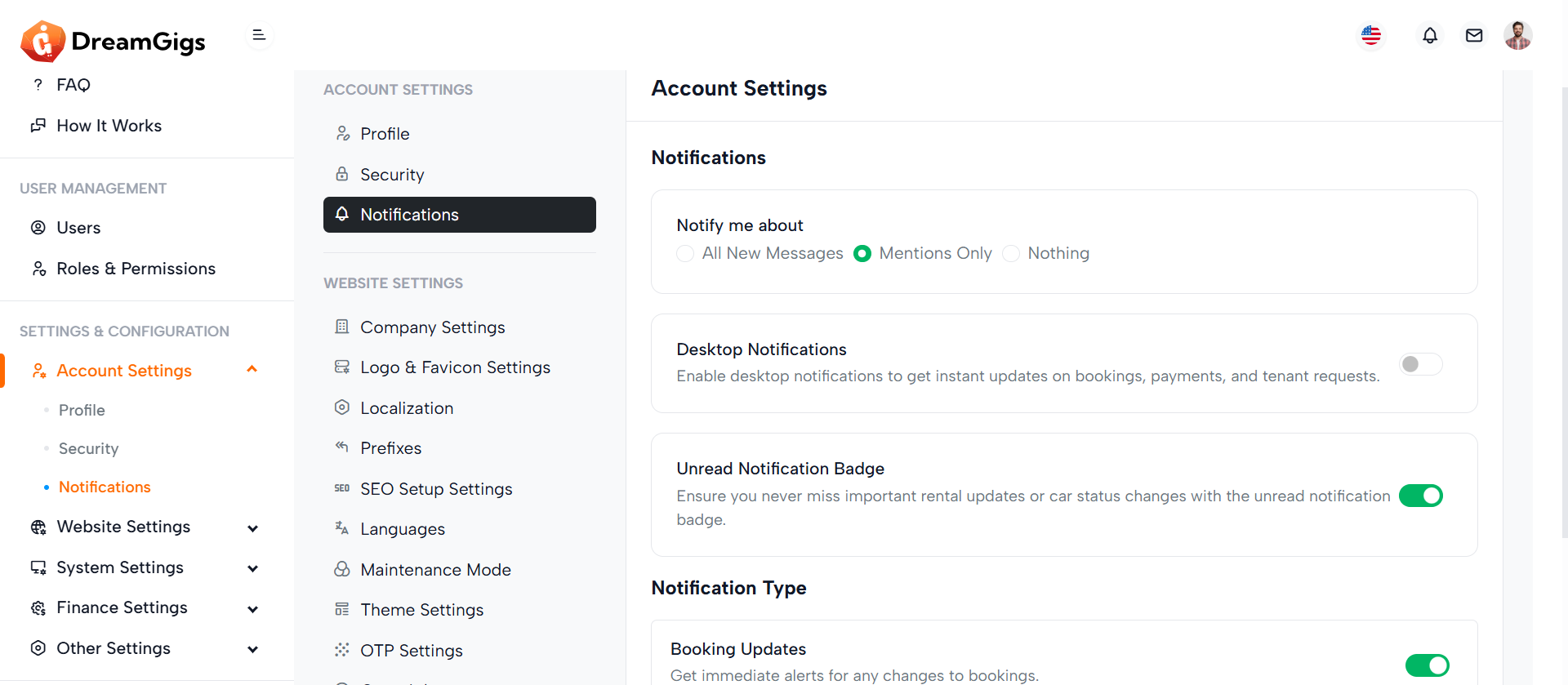
Purpose:
The Notification Settings form allows users to customize how they receive updates from the platform. It provides options for notification preferences, desktop alerts, unread badges, and specific event-based alerts (e.g., booking updates, payment notices, tenant notifications). This enables a personalized and user-controlled notification experience.
Layout:
The layout is structured into a card-based format for clarity and modularity. Each section (general preferences, desktop notifications, and notification types) is encapsulated within individual cards or list items. Radio buttons and switches provide intuitive input elements, while each setting includes concise headings and descriptions to enhance usability.
Responsive Design:
Built with Bootstrap classes like d-flex, col-*, and form-check, the form adapts smoothly across devices. On smaller screens, layout elements stack vertically, ensuring form readability and interactivity. The use of spacing utilities like gap-2, mb-3, and me-2 ensures consistent padding and margins for a polished experience on both mobile and desktop.
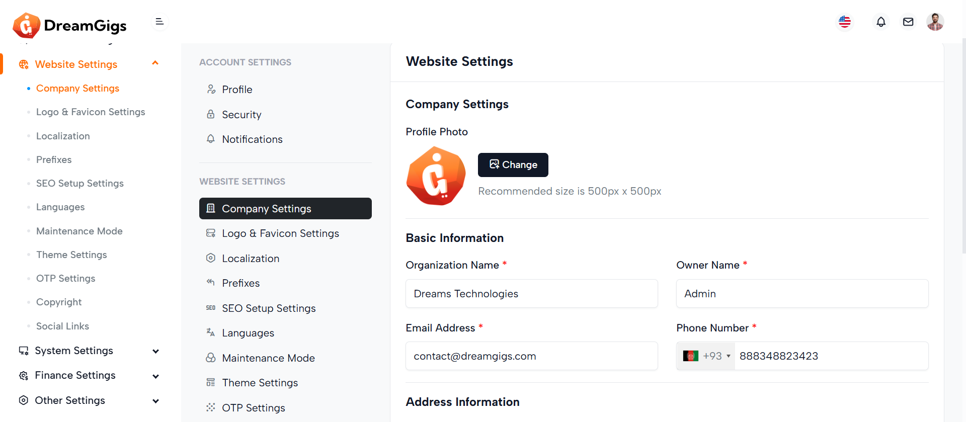
Purpose:
The form facilitates company settings configuration in an admin panel. It allows administrators to input and update key business details such as profile photo, organization name, contact info, industry, team size, and address. It's part of a broader system for managing general settings.
Layout:
Structured using Bootstrap, the form is divided into clear sections—Company Settings, Basic Information, and Address Information. Each section includes headers, skeleton loaders for pre-loading effects, and form fields with labels, validation errors, and Laravel localization support. Visual elements like image upload previews and select dropdowns enhance usability.
Responsive Design:
The layout is fully responsive, using Bootstrap grid classes (col-md-6, col-md-12) to ensure elements align neatly across devices. Skeleton loaders adapt for mobile or desktop views, and fields are spaced using margin and padding utilities to maintain readability. Select2 and file inputs are optimized for both touch and desktop interaction.
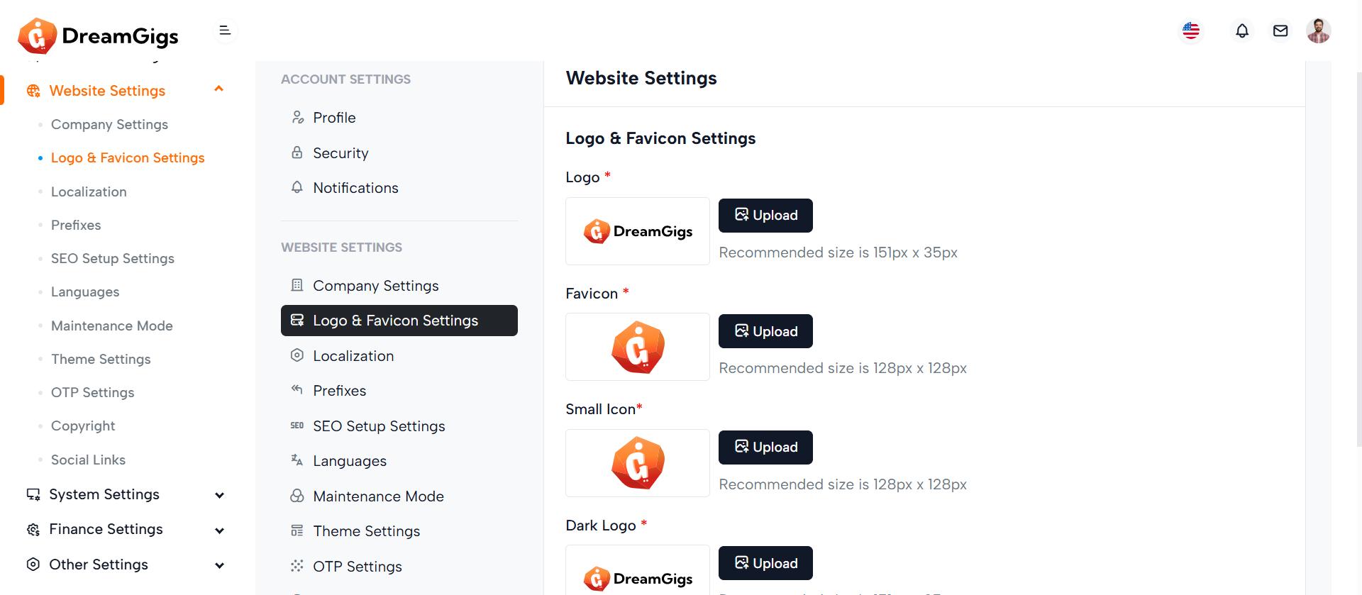
Purpose:
The form is designed for updating logo and favicon settings within a website's admin panel. It allows users to upload and preview various branding images, such as the main logo, favicon, small icon, and dark theme logo. These images personalize the website’s appearance and ensure consistent branding across different views and devices.
Layout:
The form is structured inside a Bootstrap card with clear divisions: header, body, and footer. Each image upload section includes a label, preview container, file input, and instructional text. Skeleton loaders provide visual placeholders during data loading. Image previews come with a delete button, allowing users to remove uploaded images.
Responsive Design:
The layout uses Bootstrap's grid and flexbox utilities to ensure responsiveness. Elements are aligned with d-flex, flex-wrap, and spacing classes, adapting smoothly to various screen sizes. The form maintains usability on both desktop and mobile devices by stacking content vertically on smaller screens.
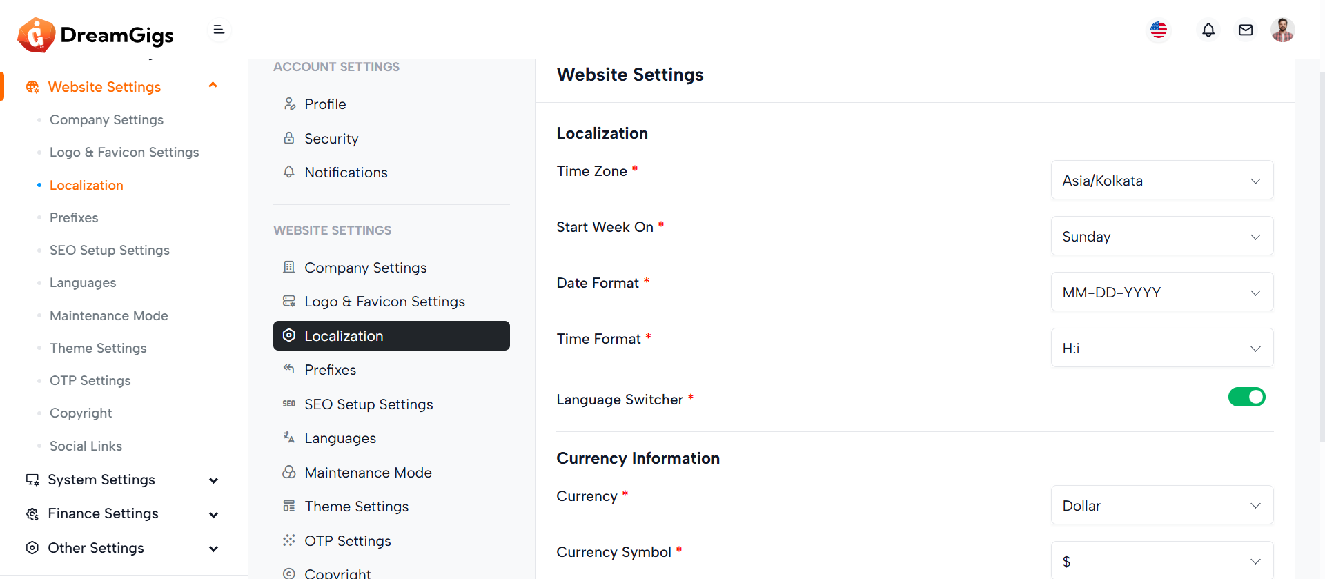
Purpose:
This form is part of a website settings panel used to configure localization and currency preferences for a web application. It allows admins to define time zone, date/time formats, default language, currency type, separators, and switcher toggles to tailor the application for global or regional use.
Layout:
The form is organized using Bootstrap’s grid system. It includes grouped sections: “Localization” and “Currency Information,” each with labeled rows and columns. Skeleton loaders provide a smooth user experience while data is being fetched. Fields are revealed dynamically via `real-input` and `real-label` classes.
Responsive Design:
Designed with responsiveness in mind, the form uses `col-md-8` and `col-md-4` to split labels and inputs effectively on medium to large screens. It ensures a clean single-column stack on smaller devices, keeping the interface accessible and mobile-friendly. The switcher controls and buttons also adjust fluidly for different screen sizes.
Purpose:
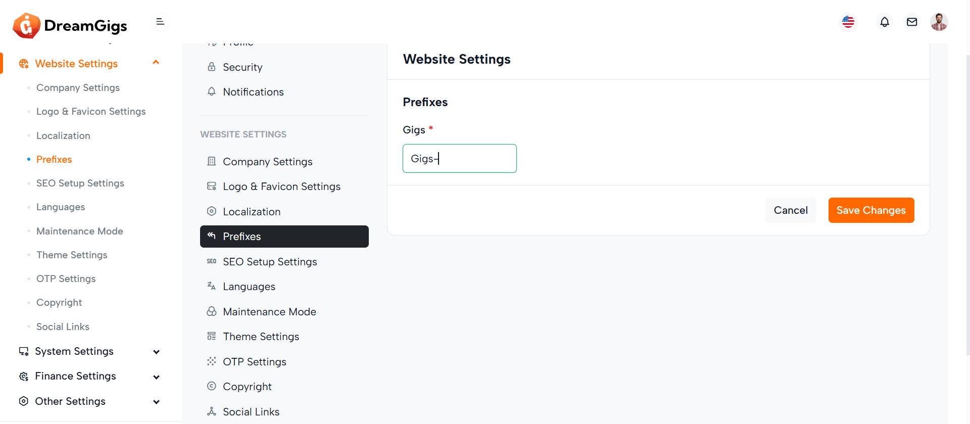
This form is part of the general website settings and is used to define custom prefixes for various system modules such as reservations, quotations, enquiries, companies, inspections, invoices, reports, and customers. These prefixes help in generating structured, identifiable document or record numbers across the platform.
Layout:
The form is enclosed within a card layout and follows a clean, modular structure. A section title precedes the input fields, and each prefix input is placed inside a Bootstrap column (col-md-3), making them appear in a grid layout. Each field includes a label, input, error message, and skeleton loaders for smoother transitions while data is loading. Action buttons are placed in the card footer for saving or canceling changes.
Responsive Design:
The form uses Bootstrap’s responsive grid (col-md-3), displaying up to four input fields per row on medium and larger screens. On smaller screens, fields stack vertically, ensuring usability and readability across all devices.
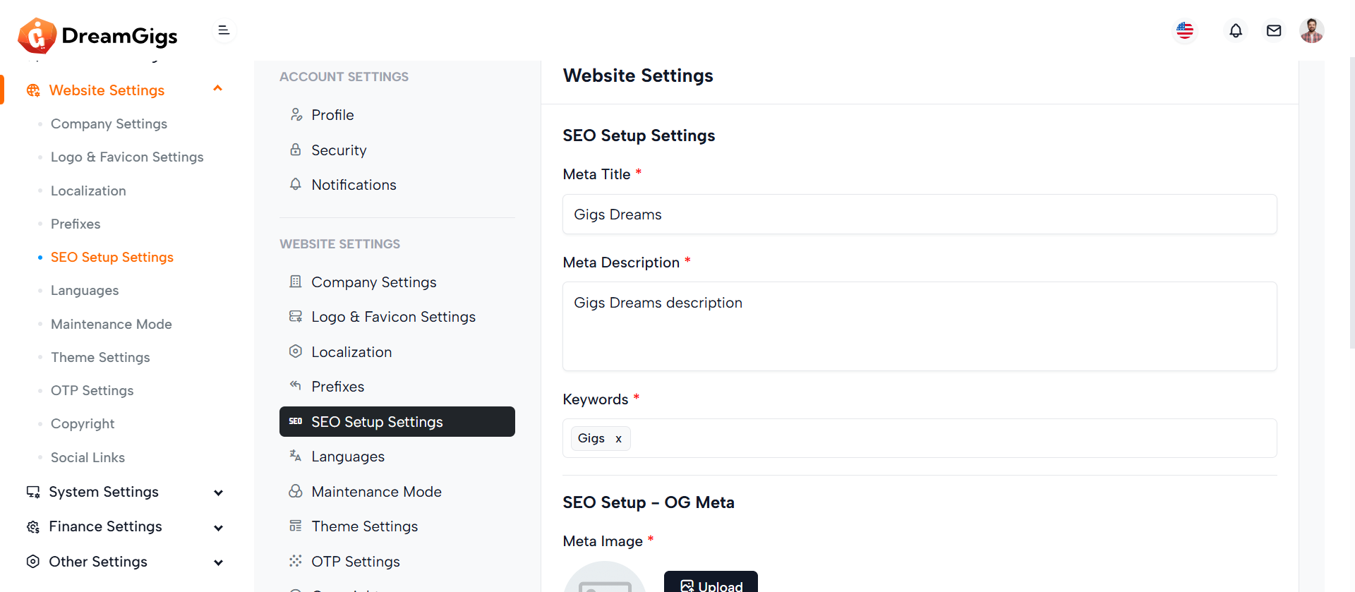
Purpose:
This form is used for configuring SEO-related settings for a website, allowing administrators to set both Site Meta and Open Graph (OG) Meta data. These settings help improve the website’s visibility on search engines and social platforms by defining meta titles, descriptions, keywords, and a meta image
Layout:
Structured within a Bootstrap card, the form is split into two main sections: Site Meta and OG Meta. Each section includes labeled fields for titles, descriptions, and keywords, along with skeleton loaders for better user experience during data fetching. The meta image upload field is enhanced with preview and delete functionalities. All interactive elements are conditionally revealed using the real-label class once the content is ready.
Responsive Design:
The form utilizes Bootstrap’s responsive utilities to ensure accessibility on all devices. Elements like image previews and upload buttons adjust layout-wise on smaller screens to maintain usability, stacking vertically for mobile while aligning horizontally on larger displays.
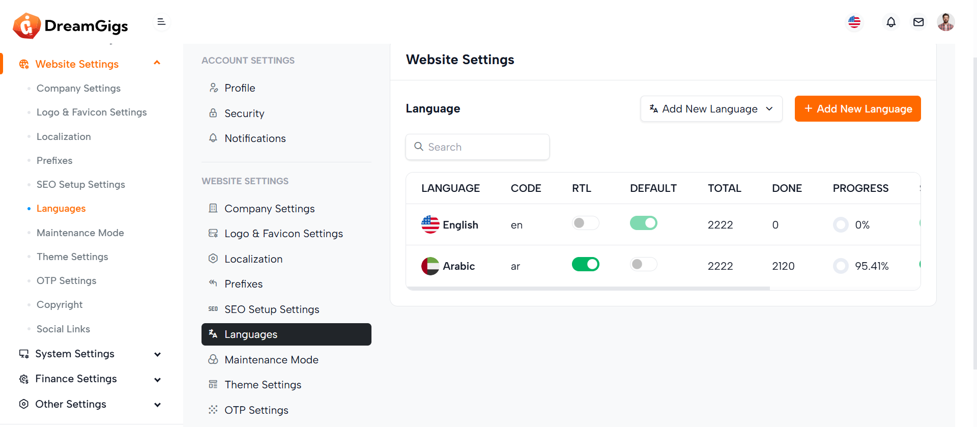
Purpose:
This section manages multilingual support for a website, allowing administrators to select, add, and manage different languages. It includes language switching, real-time search, and a dynamic table to display translation progress and statuses for each language.
Layout:
The layout is divided into three main parts: A header with a language dropdown and an "Add New Language" button A search bar for filtering language entries. A table section with skeleton loaders for initial loading, which switches to a fully functional data table (real-table) after content is loaded. The table includes columns for language name, code, RTL status, default flag, translation count, progress, and action buttons.
Responsive Design:
Built using Bootstrap’s utility classes, the layout adjusts fluidly for various screen sizes. Flex utilities ensure dropdowns, buttons, and the search bar align well on both large and small devices, while the tables are wrapped in .table-responsive to enable horizontal scrolling on mobile.
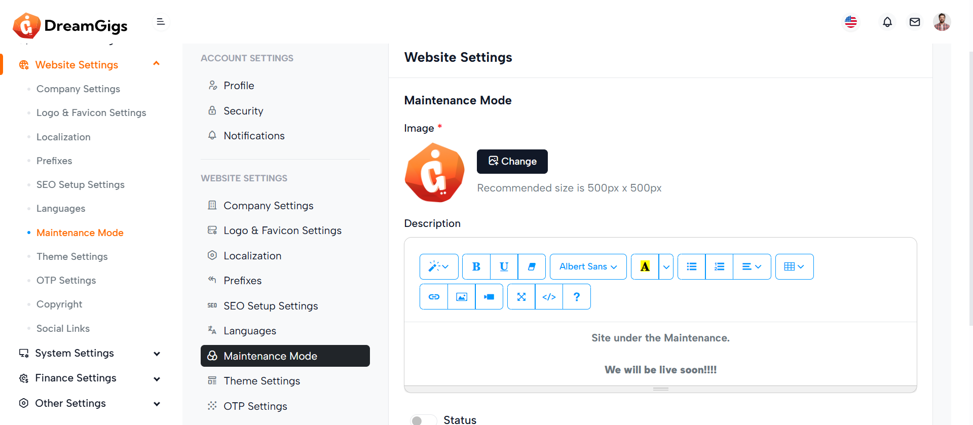
Purpose:
The Maintenance Settings form allows administrators to configure the website’s maintenance mode. This includes uploading a maintenance image, adding a custom description message, and toggling the maintenance mode status (enabled/disabled). It provides a centralized interface to notify users when the site is temporarily unavailable.
Layout:
The layout consists of a responsive data table wrapped in a 1. Header contains the section title.H 2. Body includes an image upload field (with preview and delete option), a rich-text description field (powered by Summernote), and a toggle switch to activate maintenance mode. 3. Footer provides action buttons (Cancel and Save Changes). Skeleton loaders ensure placeholders are shown during content loading, replaced by real elements once loaded.
Responsive Design:
Utilizing Bootstrap’s grid and utility classes, the form is fully responsive. Elements like image previews and upload fields adjust for different screen sizes. Flex-wrap and spacing utilities maintain alignment and readability on both desktop and mobile views.
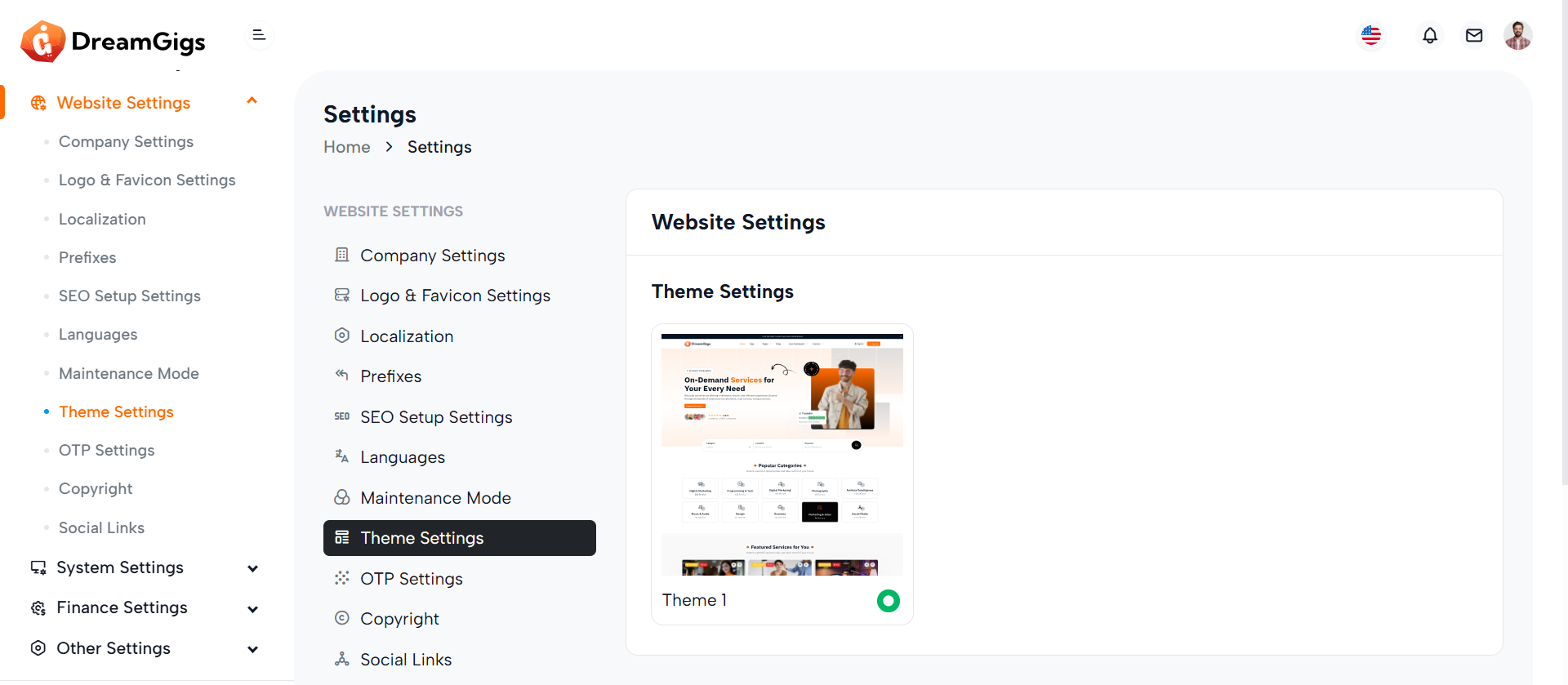
Purpose:
The Theme Settings section allows administrators to select the visual appearance of the website by choosing from available theme options. It supports a dynamic preview and selection mechanism, making it easy to switch between themes for branding or usability preferences.
Layout:
The layout is structured within a Bootstrap col-lg-9 container and wrapped in a card component. Inside the card body, each theme option is displayed in a grid (col-md-4) with an image preview, name label, and a radio button for selection. Skeleton loaders (card-loader) are used for loading states, while the actual theme cards are hidden initially (d-none real-card) and shown once content is ready.
Responsive Design:
The grid system ensures responsive behavior — on larger screens, theme options display side-by-side, and on smaller screens, they stack vertically for accessibility. The layout adjusts fluidly using Bootstrap’s responsive classes, maintaining usability across mobile, tablet, and desktop devices.
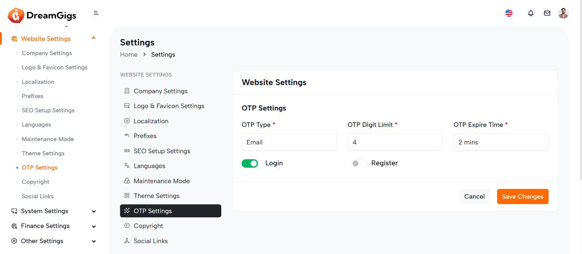
Purpose:
The OTP Settings form enables administrators to configure OTP (One-Time Password) preferences for secure user authentication. It provides options to select the OTP type (SMS or Email), digit length, expiration time, and toggle OTP enforcement for login and registration processes.
Layout:
The form is structured within a Bootstrap card component, offering clear visual separation of content. It begins with headers followed by grouped input fields distributed across a responsive grid using col-md-4 classes. Each input (select or toggle switch) is wrapped with loaders (skeleton) for a better user experience during data fetching, and hidden real inputs are revealed post-load using .real-label and .real-input classes. Error handling spans and labels are placed for validation feedback.
Responsive Design:
The layout is fully responsive using Bootstrap’s grid system. On larger screens, inputs align side by side, while on smaller devices they stack vertically, ensuring usability on all screen sizes. Switches and buttons remain accessible and aligned for optimal interaction across devices.
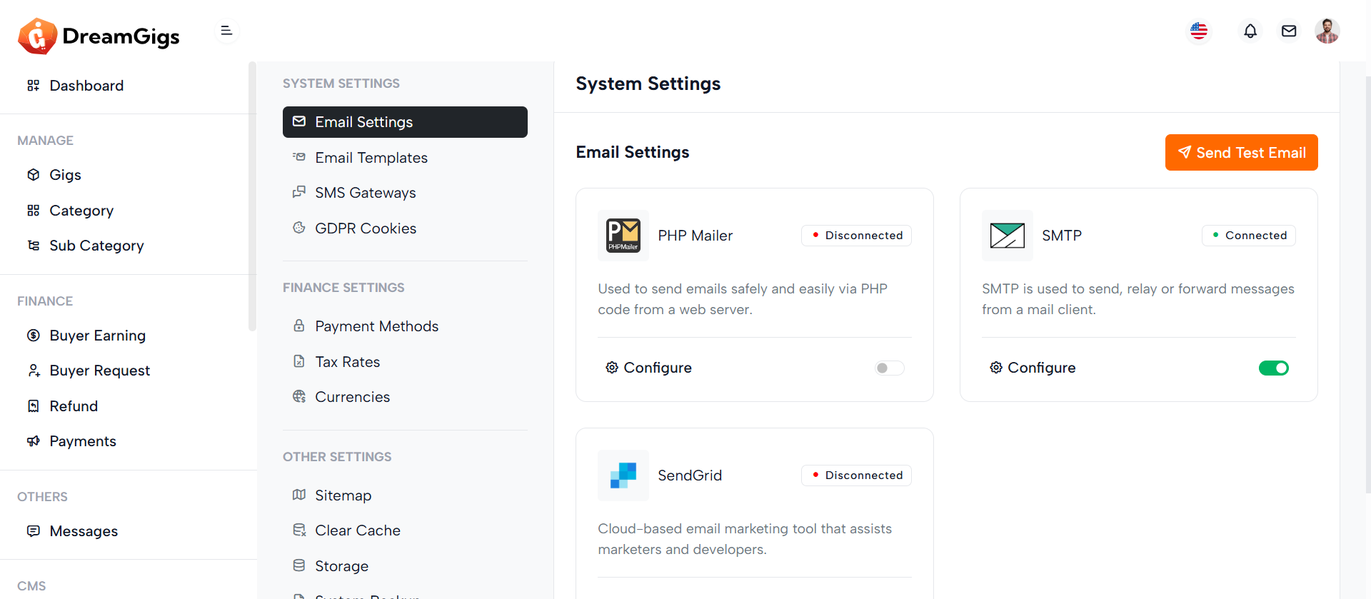
Purpose:
This section provides a mail configuration dashboard allowing users to manage and toggle between different email delivery methods: PHP Mail, SMTP, and SendGrid. It ensures that the platform can send system notifications or transactional emails reliably based on the selected mailer service.
Layout:
Each mailer method is displayed within a Bootstrap card containing an icon, name, connection status badge, info text, a “Configure” button, and a toggle switch to enable/disable the method. Initially, skeleton loaders appear during data fetch, and then the actual cards (real-card) are shown. Each card uses data-bs-target modals for configuration.
Responsive Design:
Designed with Bootstrap’s grid system (col-md-6) and d-flex utilities, the layout is responsive. On larger screens, two cards appear side-by-side, while on smaller screens, they stack vertically. Flexbox ensures content inside cards adjusts gracefully. The use of img-fluid img-border, flex-fill, and avatar classes ensures visuals and spacing remain intact across all device sizes.
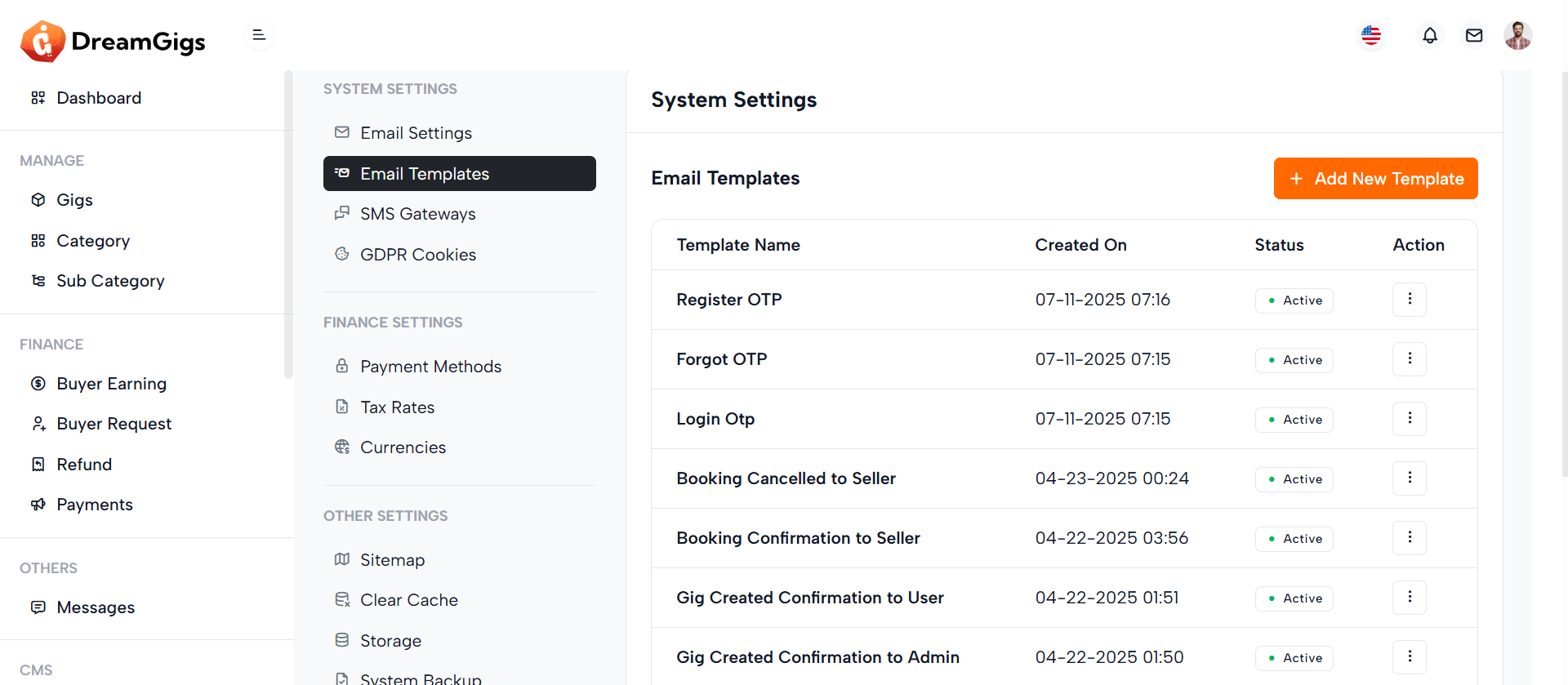
Purpose:
This section manages email templates within the application. It provides a dynamic table to view templates, a form modal for creating or editing them, a preview modal to view template content, and a delete confirmation modal. It enhances communication workflows by allowing admins to customize email and SMS messages for various notification types.
Layout:
The main layout includes a Bootstrap table with skeleton loaders initially shown while data loads, then replaced with actual template rows. The Create Template modal contains input fields for title, notification type, subject, tags, description, and SMS content, including dynamic placeholders. Two additional modals handle template preview and deletion confirmation. Form elements include validation error containers and toggle switches for status control.
Responsive Design:
Built using Bootstrap's grid system and modal dialogs, the layout adapts to all screen sizes. Elements like col-lg-12, modal-lg, and form-control ensure fields and content adjust properly, maintaining accessibility and usability on both desktop and mobile devices.
Purpose:
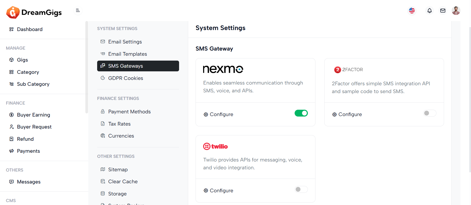
This section manages SMS gateway integrations under the broader "System Settings" area. It allows administrators to view, configure, and toggle the status of available SMS services like Nexmo, 2Factor, and Twilio. These gateways enable the system to send SMS notifications, such as OTPs or alerts.
Layout:
The content is structured within a card component. Each SMS gateway is displayed in its own card inside a responsive row. Each card includes the provider logo, connection status badge, a brief description, a Configure link that triggers a modal for settings, and a toggle switch to enable or disable the gateway. The layout is visually clean and uses spacing, icons, and color badges to improve readability and interaction.
Responsive Design:
The layout uses Bootstrap’s responsive grid (col-xxl-4 col-md-6) and d-flex utilities, ensuring the cards stack nicely on smaller screens while displaying in rows on larger ones. All controls and text scale appropriately across device sizes.
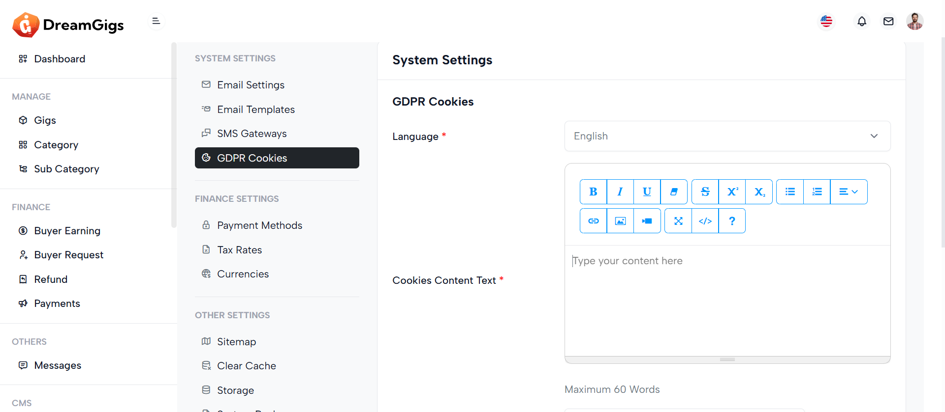
Purpose:
This form handles GDPR Cookies Settings in the System Settings panel, allowing admins to configure cookie consent content, button texts, position, visibility of decline options, and related links—ensuring compliance with data privacy laws.
Layout:
The form is structured inside a card with a header, body, and footer. Each setting (e.g., content text, position, button labels) is presented in row components with labels on the left and inputs on the right. Placeholder skeletons are used for loading states and are replaced with actual labels/inputs once data loads. Error messages are shown below fields for validation feedback.
Responsive Design:
Using Bootstrap’s grid (col-xl-4, col-xl-6, etc.) and utility classes, the layout adapts across screen sizes. On smaller screens, rows stack vertically for better usability. Skeleton loaders and hidden classes (d-none real-label) enhance UX by supporting smooth loading transitions and maintaining layout consistency
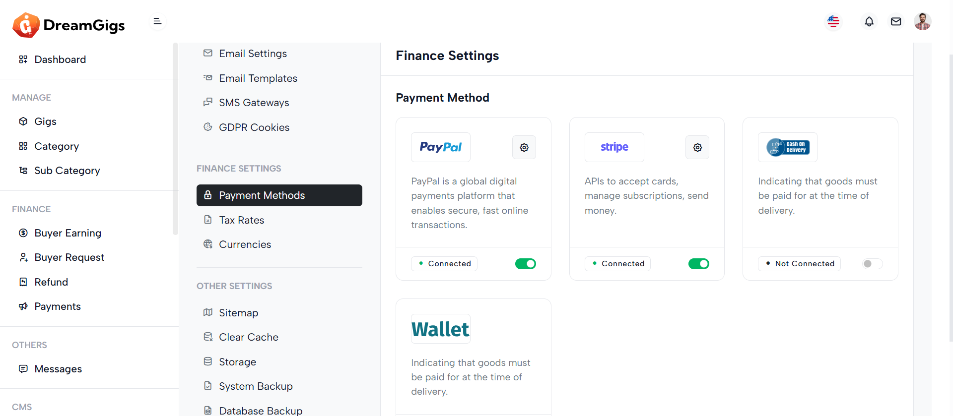
Purpose:
This section manages Payment Gateway Settings, allowing administrators to view, configure, and enable/disable services like PayPal and Stripe. It visually displays connection status, provides quick access to configuration modals, and enables toggling of gateway activation.
Layout:
Each gateway is wrapped inside a card using a column (col-xl-4) for grid placement. Inside the card, the body displays branding (logo), description, and a configuration icon. The footer contains the connection badge and a toggle switch. Skeleton loaders (label-skeleton) show during data loading, and actual content is revealed with d-none real-label toggled after loading.
Responsive Design:
Built with Bootstrap grid (col-xl-4 d-flex), the layout adapts gracefully across screen sizes. On larger screens, gateways display in a row. On smaller devices, cards stack vertically. Flex utilities (d-flex, justify-content-between) ensure proper spacing and alignment, while hidden labels maintain a clean experience during loading and content reveal.
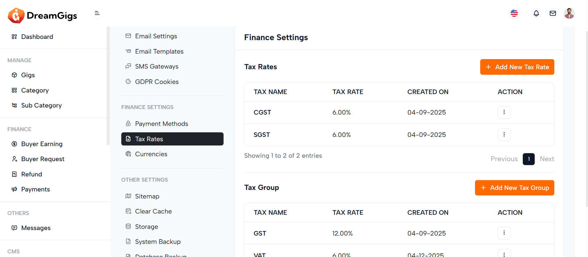
Purpose:
This interface allows admins to create, manage, and delete tax rates and tax groups used for billing, invoicing, or financial configurations. Tax groups can include multiple tax rates, providing flexibility in defining complex tax structures..
Layout:
Structured using Bootstrap modals, the layout includes three forms: Add/Edit Tax Rate, Add/Edit Tax Group, and their respective delete confirmation modals. Each form includes labeled input fields, status toggles, and validation error messages. Select inputs (like sub_tax) use Select2 for enhanced user experience. Footer actions include Cancel and Submit buttons, designed for clarity and user guidance.
Responsive Design:
Designed with Bootstrap 5 utilities, the modals are centered (modal-dialog-centered) and responsive (modal-md, modal-sm). Form controls stack vertically on smaller screens. The use of d-flex, justify-content-between, and w-100 ensures that elements like status toggles and submit buttons adjust gracefully on all devices, ensuring accessibility and usability on mobile, tablet, and desktop.
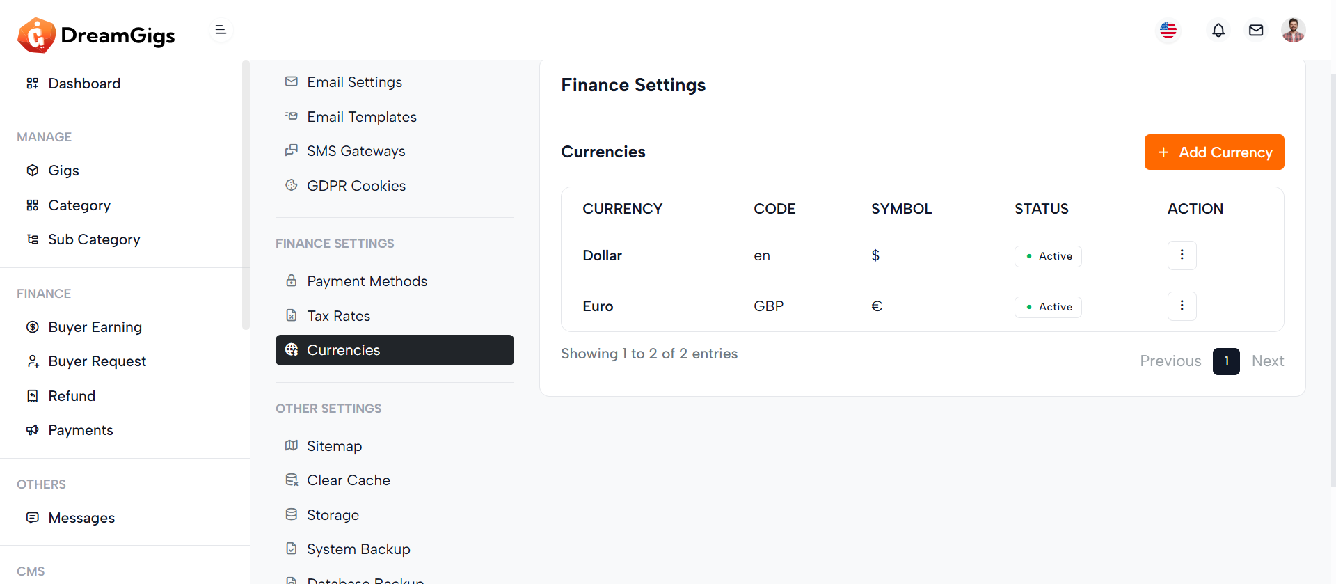
Purpose:
This modal interface is designed to add and delete currencies in an admin panel. It allows admins to define new currencies with their names, codes, symbols, exchange rates, and statuses, which are crucial for financial operations, multi-currency support, and accurate pricing conversions.
Layout:
Built with Bootstrap modals, the layout includes two primary sections: an Add/Edit Currency form and a Delete confirmation dialog. The currency form contains input fields for name, rate, code, and symbol, organized in a clean, user-friendly format using grid-based layout (row, col-md-6). A hidden toggle for currency status appears conditionally, enhancing flexibility for editing existing entries. The delete modal provides a centered confirmation message with visual emphasis using an icon.
Responsive Design:
Utilizing Bootstrap 5 classes like modal-dialog-centered, modal-md, and modal-sm, the design adapts smoothly across devices. Inputs stack vertically on smaller screens, and the grid layout ensures even distribution on larger viewports, maintaining usability across all screen sizes.
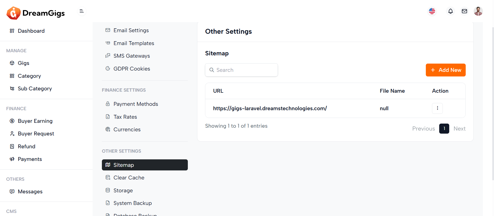
Purpose:
This interface manages sitemaps in an admin dashboard. The Add Sitemap modal allows users to input a new sitemap URL, which is essential for SEO and indexing purposes. The Delete Sitemap modal confirms the removal of a sitemap. A corresponding table lists all existing sitemaps with actions like deletion.
Layout:
The main layout consists of a responsive data table listing The UI is structured with two modals and a data table. The Add Sitemap form contains a single URL input and standard modal buttons for submission and cancellation. The Delete Sitemap modal uses a centered alert-style layout with icon, text, and action buttons. The data table includes columns for URL, file name, and actions, with dropdowns for contextual options.
Responsive Design:
Utilizing Bootstrap classes like modal-dialog-centered, modal-md, and responsive tables (table with class enhancements), the interface adapts well across devices. On smaller screens, elements stack vertically, ensuring the form and action buttons remain user-friendly and accessible on mobile and tablets.
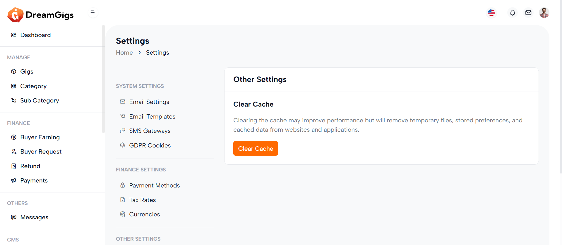
Purpose:
The "Clear Cache" feature provides administrators with a quick option to remove cached data from the system. This helps refresh stored preferences, optimize performance, and ensure that the most recent data is being used throughout the application.
Layout:
The interface consists of a card section introducing the purpose of cache clearing with a heading, description, and a trigger button. Clicking the button opens a small, centered modal for user confirmation. The modal includes a warning icon, confirmation message, and two actions — cancel or proceed with clearing the cache.
Responsive Design:
Built using Bootstrap classes like modal-dialog-centered, modal-sm, and d-flex, the layout adapts well to various screen sizes. The modal scales down on smaller devices while keeping buttons accessible and legible. The card layout and modal structure ensure the UI remains clean and functional across desktops, tablets, and mobile screens without breaking or overlapping content.
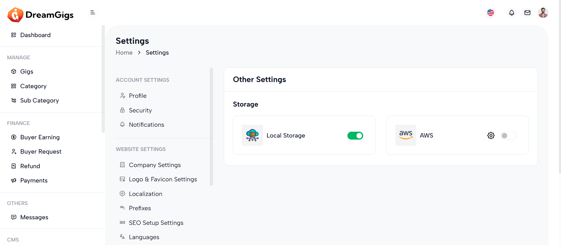
Purpose:
The "Storage" section allows users to manage and toggle between different file storage options, such as Local Storage and AWS. It helps administrators choose where application files like media, backups, and uploads should be stored, supporting both local and cloud environments for flexibility and scalability.
Layout:
This section uses a two-column card layout. Each storage option is presented within a card that includes an icon, label (with a loading skeleton effect), and a toggle switch to enable or disable the storage type. For AWS, an additional settings button opens a modal for configuration. Skeleton loaders are used for a smooth data-loading experience, which later gets replaced with actual labels and controls.
Responsive Design:
Utilizing Bootstrap’s grid system (col-md-6), the layout adapts seamlessly from desktop to smaller screens, stacking cards vertically on mobile devices. Flexbox classes (d-flex, align-items-center, justify-content-between) ensure proper spacing, alignment, and accessibility across all screen sizes.
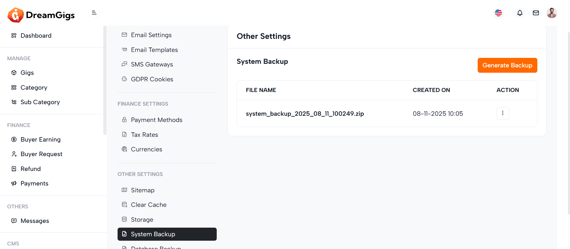
Purpose:
The "System Backup" section allows administrators to manage database backups efficiently. It provides the ability to generate, view, restore, and delete backups directly from the admin panel, ensuring data safety and facilitating easy recovery in case of data loss or corruption.
Layout:
This section is organized into two columns using Bootstrap's grid system. The left side includes a settings sidebar (via @include), while the right (col-xl-9) displays the backup interface. It contains a card with a header and body. The body includes a title, a "Generate Backup" button, and a responsive table that lists backup files, their creation date, and action options like restore or delete, accessible via a dropdown.
Responsive Design:
The layout is fully responsive using Bootstrap classes like row, col-xl-9, and table-responsive. On smaller screens, the backup table scrolls horizontally, and the interface components stack vertically for usability across devices without compromising functionality.
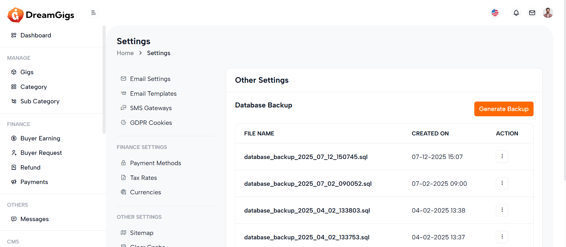
Purpose:
The Database Backup section provides administrators with tools to generate and manage database backups. It ensures data security by enabling backup creation and offering options to delete old backups when no longer needed. This helps maintain data integrity and prepare for disaster recovery scenarios.
Layout:
The layout follows a two-column structure. On the left is a sidebar (general_settings_side_menu), and on the right is the main content area (col-xl-9) with a card component. The card includes a header titled "Other Settings" and a body that displays the "Database Backup" section. It features a button to open the Generate Backup modal and a table (#backup-list) to list backup files. Additionally, two modals handle generating and deleting backups, each with confirmation prompts and action buttons.
Responsive Design:
The interface leverages Bootstrap’s responsive grid and utility classes (row, col-xl-9, table-responsive) to ensure optimal display on all screen sizes. Elements stack neatly on smaller devices while maintaining usability and readability.
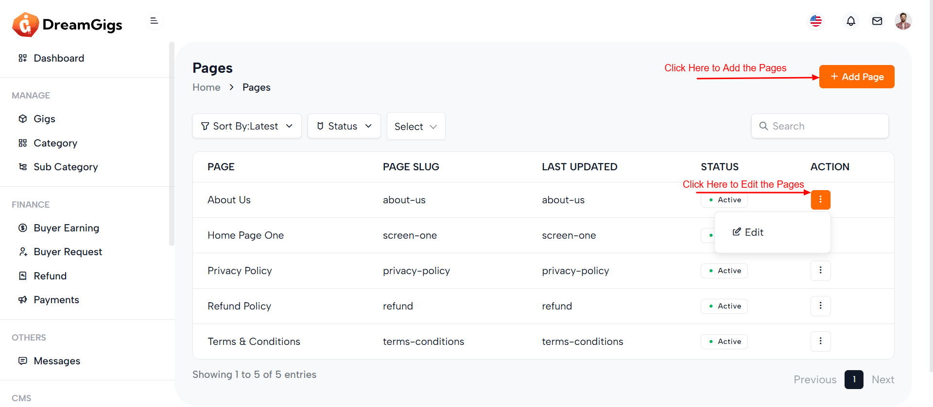
Purpose:
This component provides an administrative interface to manage website pages, including viewing details and deleting pages. The data table (#page_datatable) lists pages with relevant metadata like the page title, slug, last updated date, status, and available actions. The modal (#delete_page) is a confirmation dialog triggered when a user attempts to delete a page, ensuring that deletion is intentional.
Layout:
The layout is clean and structured using a Bootstrap-powered responsive table inside a .table-responsive wrapper. The table includes five headers and is designed to be dynamically populated via JavaScript or backend data. The modal is styled with centered content and includes an icon, a confirmation message, and two action buttons—Cancel and Yes, Delete.
Responsive Design:
The table-responsive class ensures the table adapts to small screens by enabling horizontal scrolling. The modal uses modal-sm and modal-dialog-centered to remain compact and centered on all devices, maintaining a user-friendly experience across screen sizes
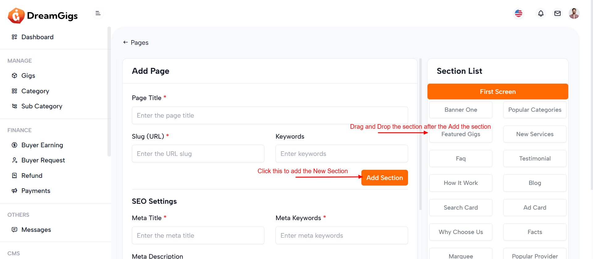
Purpose:
This section allows administrators to create and manage custom pages with detailed metadata, SEO settings, and dynamic content sections. It facilitates structured content entry with options for page title, slug, keywords, SEO configurations, and Open Graph (OG) properties. The interface also supports section-based page building via buttons and live section previews.
Layout:
The form is split into two primary columns using Bootstrap’s grid system. The left side (col-md-8) holds the main page creation form inside a card component, which is neatly divided into content and SEO blocks. The right side (col-md-4) displays a section list panel with buttons to toggle between screens and a container for dynamically rendered section cards or loading skeletons for improved UX during data fetch.
Responsive Design:
Leveraging Bootstrap classes like col-md-* and table-responsive, the layout gracefully adapts to different screen sizes. Input fields and buttons stack vertically on smaller screens, ensuring usability on tablets and mobile devices. The interface remains functional and readable across devices.
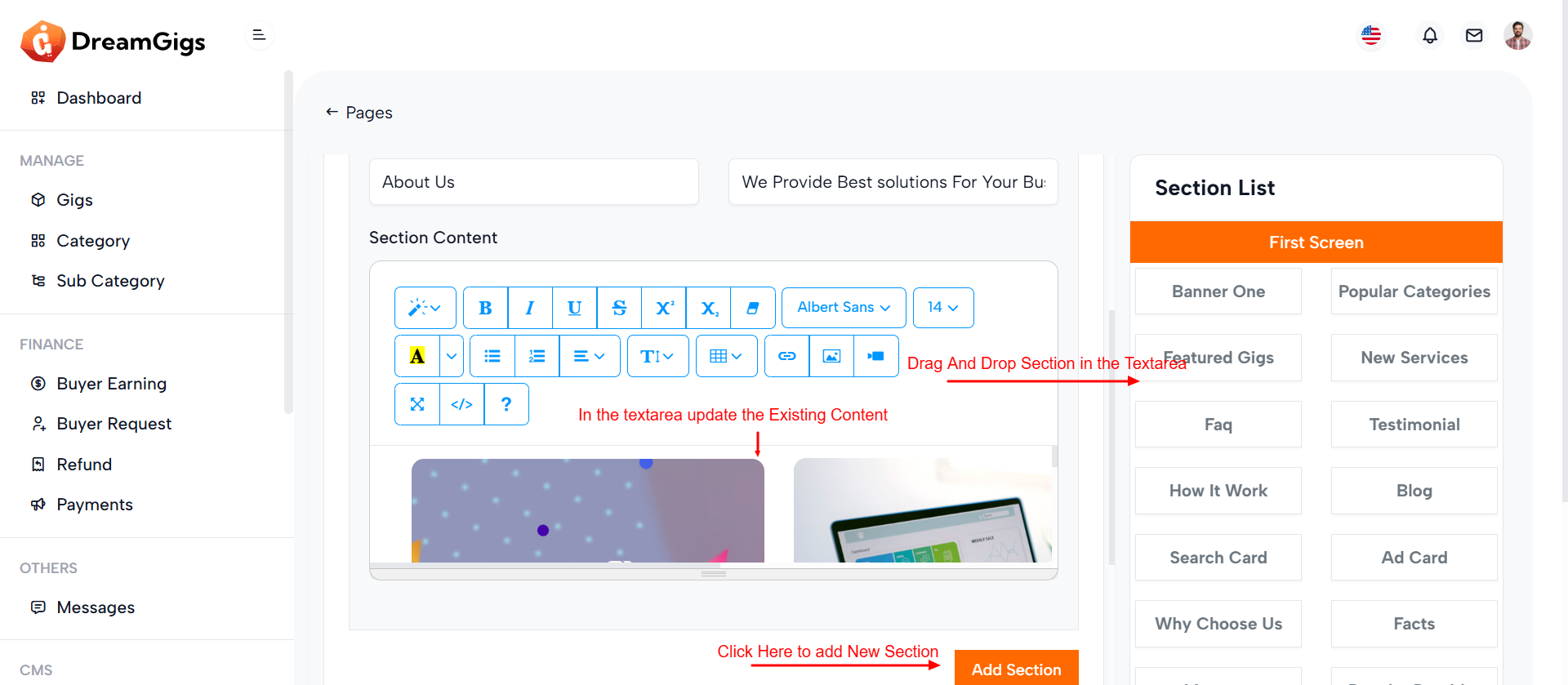
Purpose:
This interface provides a user-friendly form for administrators to edit existing pages within a content management system. It includes essential page attributes like title, slug, SEO metadata, and Open Graph (OG) tags, along with the ability to manage dynamic content sections using draggable text areas.
Layout:
The page is structured into two primary columns. The left column (8-column grid) houses the editable page form with all necessary fields wrapped inside a Bootstrap card component. It features skeleton loaders for a seamless loading experience and toggles real form elements once data is fetched. The right column (4-column grid) displays available sections or theme-related previews, with options like "Screen One" or "Screen Two" based on the page theme.
Responsive Design:
Built using Bootstrap’s grid system, the layout adapts to various screen sizes. Components like inputs, buttons, and tables stack vertically on smaller screens, ensuring usability across desktop, tablet, and mobile devices.
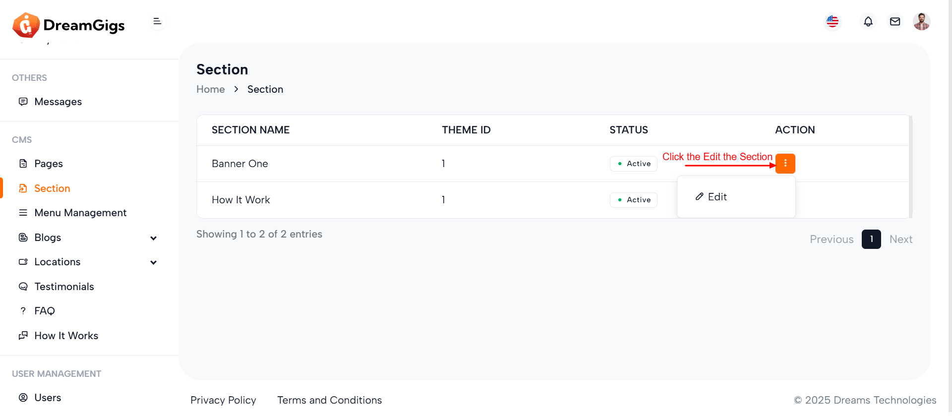
Purpose:
The form is designed for managing different banner sections in a content management system (CMS). It allows administrators to upload thumbnail images, input titles, descriptions, and assign vehicles for promotional display, providing structured content updates for various sections on a front-facing platform.
Layout:
The form is divided into three collapsible sections (section_id_1, section_id_2, and section_id_3), each tailored to specific banner configurations. Inputs include file uploads, text fields, textareas, and dropdowns, with labels and error feedback for validation. The modal layout encapsulates the form, providing a focused, non-intrusive user experience.
Responsive Design:
Using Bootstrap's grid system (col-md-* classes), the form ensures mobile-first responsiveness. Fields stack vertically on smaller screens and align horizontally on larger displays. Image previews, dynamic error handling, and modal behavior enhance usability across devices, maintaining accessibility and consistency in all viewports.
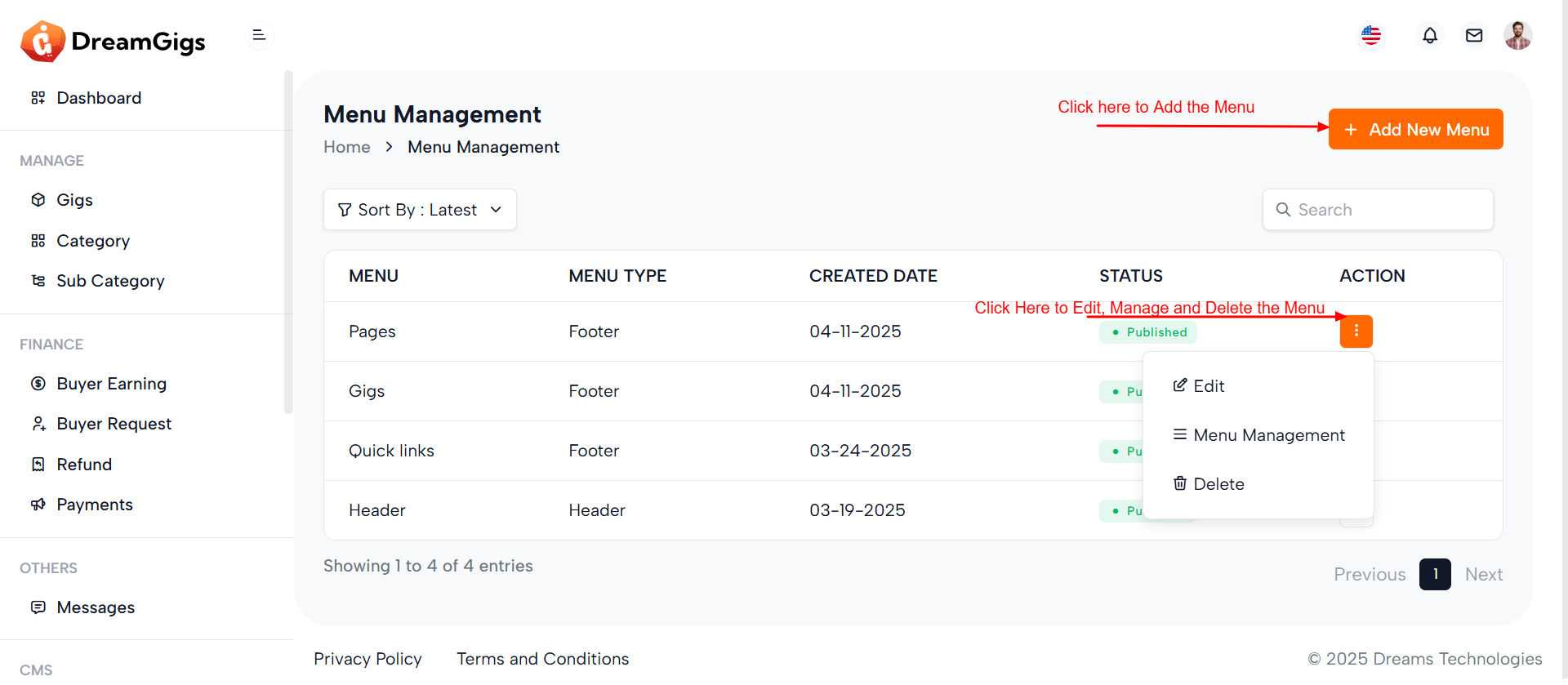
Purpose:
The provided code is a part of a Laravel Blade view that handles Menu Management in an admin dashboard. It allows administrators to create, edit, delete, and list site menus such as headers and footers. The modals (#add_menu, #edit_menu, and #delete_menu) facilitate CRUD operations using forms and Bootstrap modals. The main table showcases menu data dynamically, with a loading skeleton displayed initially for a better user experience during data fetching.
Layout:
The layout is structured with a header containing a breadcrumb and an action button to add new menus. Below it is a search bar and a filter dropdown. The menu list appears in a responsive data table, initially shown as a skeleton loader and later replaced with real data. The modals are well-structured with labeled inputs and error spans for validation. Each form is enclosed within its modal for separation of concerns.
Responsive Design:
The code uses Bootstrap 5’s responsive utilities to ensure usability across devices. Flexbox and grid-based classes (d-flex, row-gap, me-2, etc.) are employed for responsive alignment and spacing. Modal dialogs are set to modal-md or modal-sm, adapting appropriately for different screen sizes, maintaining a clean and functional interface on both desktop and mobile views.
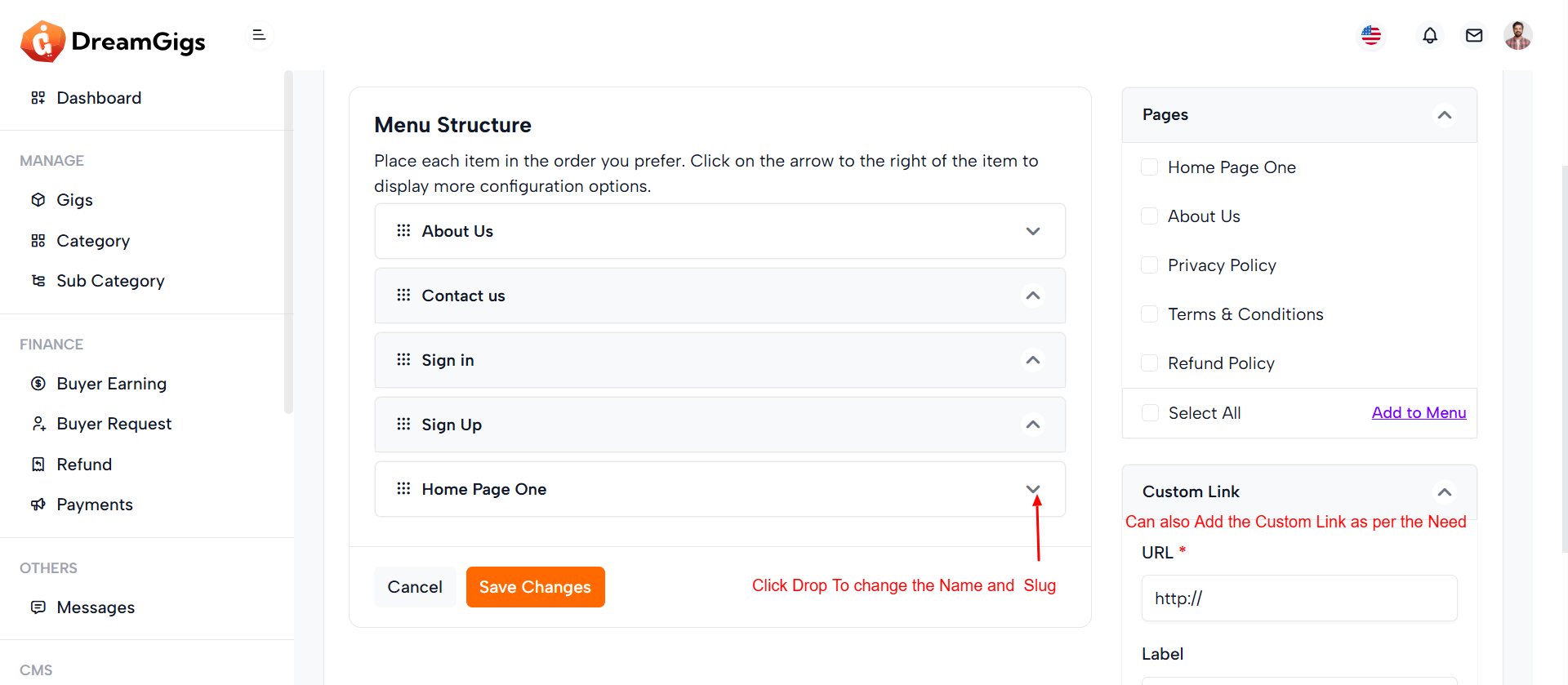
Purpose:
The given HTML snippet represents an admin interface for managing website navigation menus. Its primary goal is to allow administrators to select, edit, and reorder menu items, either by choosing from existing pages or adding custom links. The interface provides the flexibility to structure menus according to the site's navigation needs, enhancing user experience and content accessibility.
Layout:
The layout is organized into a two-column structure. The left column (8 columns wide) contains the main menu editing area, including a dropdown to select a menu, a sortable list of menu items, and a form to save changes. Skeleton loaders are used for a smooth loading experience, replaced by real form elements once data is ready. The right column (4 columns wide) holds an accordion with sections for adding predefined pages and custom links. Interactive controls like checkboxes and inputs are used for item selection and configuration, with clearly defined action buttons (e.g., "Add to Menu").
Responsive Design:
The layout uses Bootstrap's responsive grid system (col-md-*), ensuring adaptability across screen sizes. Elements stack vertically on smaller screens, maintaining usability on mobile devices. Skeleton loaders enhance perceived performance during loading, providing a modern, user-friendly, and responsive experience.
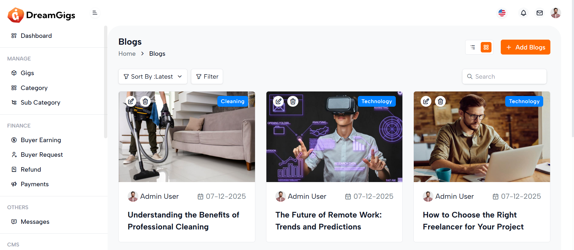
Purpose:
This HTML snippet defines an admin interface for managing blog posts. It enables administrators to view, filter, sort, search, and manage blogs efficiently. The page includes controls for toggling between list and grid views, adding new blogs, filtering by category, and searching by title. Each blog card offers quick edit and delete actions, along with details like title, author, date, image, and tags.
Layout:
The layout is structured using Bootstrap's grid system. The top section includes breadcrumbs for navigation and action buttons for adding blogs or switching views. Below that, sorting and filtering options are provided via dropdowns and collapsible panels. The main content is a grid of blog cards (blog-item) organized in rows and columns, each displaying a thumbnail, author info, publication date, and title. Each card also has edit and delete controls. A “Load More” button at the bottom allows for dynamic content loading.
Responsive Design:
The layout is fully responsive using Bootstrap classes like col-md-6 and col-lg-4 to adjust the number of columns based on screen size. The design adapts from a multi-column grid on desktops to a single-column stack on smaller screens. Action buttons and dropdowns are flexibly aligned, ensuring a consistent and user-friendly interface across devices.
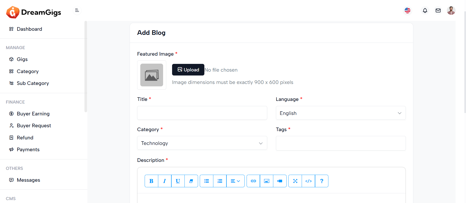
Purpose:
The "Add Blogs" section provides administrators with a structured form interface to create new blog posts within the admin panel. It allows input for essential blog details including the featured image, title, language, category, tags, and description. This form streamlines the blog publishing process, ensuring that all required information is gathered in one place and submitted securely via a POST request to the server.
Layout:
The layout is card-based and cleanly organized using Bootstrap's grid system. It starts with a back-link to the main blog list, followed by a form wrapped inside a card component. The form includes a featured image uploader with preview, and input fields arranged in two-column rows where appropriate. Text inputs and select dropdowns are used for structured data, and a rich text editor (e.g., TinyMCE or CKEditor) is used for the description field. The form ends with action buttons — "Cancel" and "Create New".
Responsive Design:
The design is responsive and mobile-friendly, utilizing col-md-6 and col-md-12 classes to control field width across screen sizes. On smaller devices, columns stack vertically for better readability. Elements like the image preview, upload button, and select dropdowns scale appropriately, ensuring a user-friendly experience across all devices.
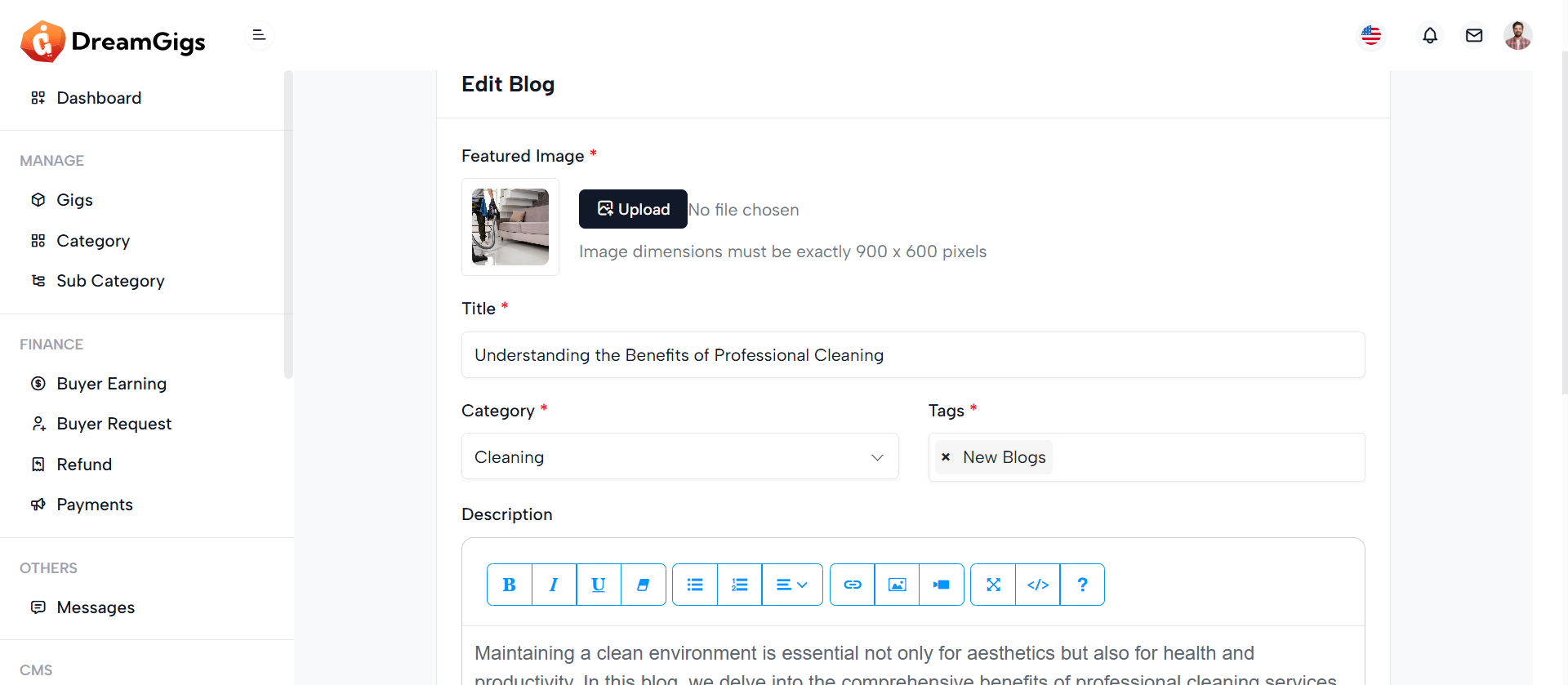
Purpose:
The "Edit Blogs" section enables administrators to update existing blog content efficiently through a pre-filled form. It allows editing of key blog attributes including the featured image, title, category, tags, and description, as well as toggling the blog's publication status. This form is crucial for maintaining up-to-date content and correcting or enhancing blog posts as needed.
Layout:
The layout uses a card-based structure and leverages Bootstrap’s responsive grid system. The form is wrapped within a .card element, split into the card-header, card-body, and card-footer. The featured image is displayed with a preview and upload option. Input fields are clearly grouped: title spans the full width, while category and tags share a row. The description uses a rich text editor for flexibility. A status toggle switch and action buttons (“Cancel” and “Save Changes”) are placed in the footer for convenience and usability.
Responsive Design:
This interface is fully responsive. On medium and larger screens, form fields are arranged side-by-side using col-md-6, while on smaller devices, they stack vertically for easier navigation. The image preview, text inputs, selects, and buttons adjust fluidly across screen sizes, ensuring that content editing is user-friendly whether on desktop, tablet, or mobile devices.
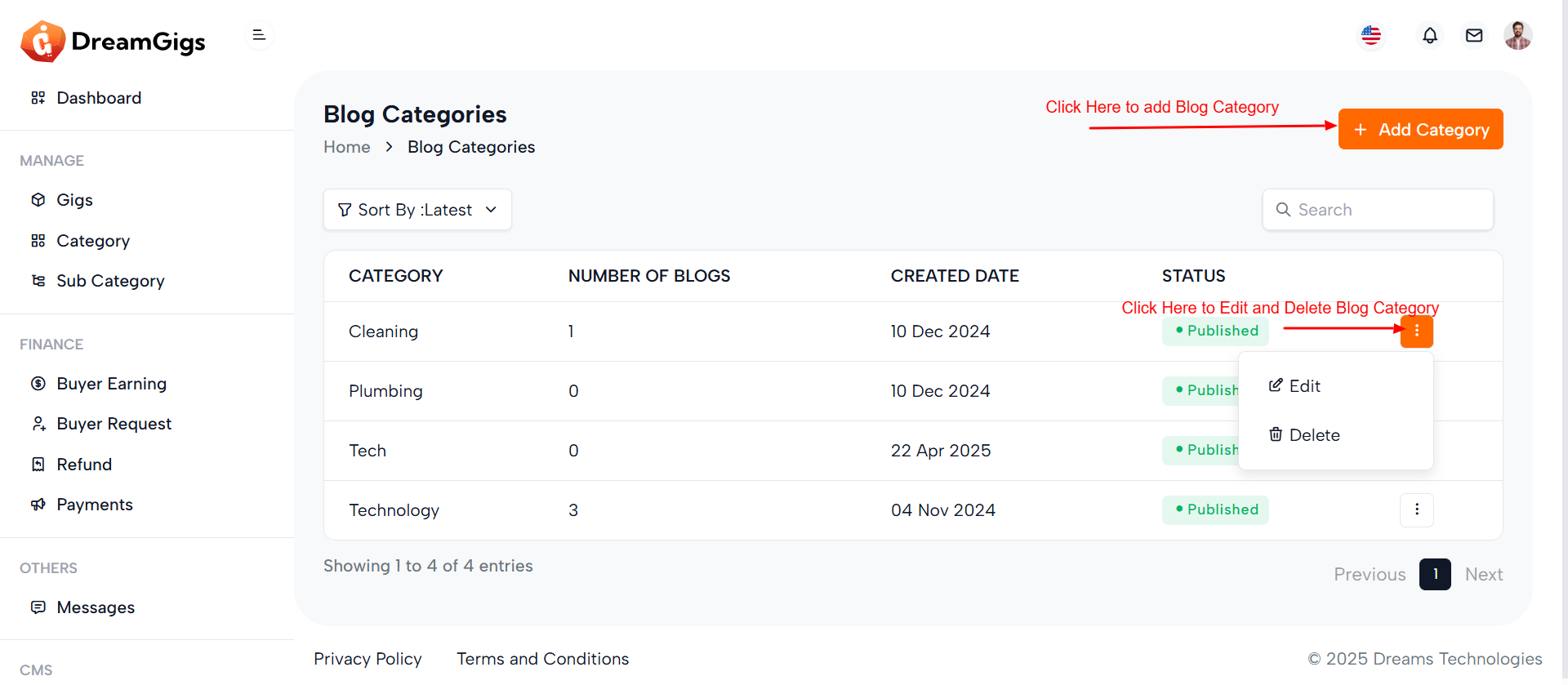
Purpose:
This interface is designed for managing blog categories within an admin dashboard. It allows administrators to view, sort, search, create, edit, and delete blog categories. Each category displays key metadata such as the number of associated blog posts, creation date, and publication status. Through modals, users can add a new category, edit existing ones, or confirm deletions—making the category management process seamless and intuitive.
Layout:
The layout features a breadcrumb navigation at the top, followed by a toolbar with sorting and search options. The main section includes a responsive data table displaying category information. Each row has action options (Edit/Delete) via a dropdown. Modals are provided for category CRUD operations: 1 “Add Category” includes a language selector and name input. 2 “Edit Category” pre-fills category info for editing. 3 “Delete Category” offers a confirmation prompt.
Responsive Design:
Built with Bootstrap, the layout adapts smoothly to all screen sizes. The breadcrumb, buttons, and action dropdowns stack or align based on viewport width. Inputs, filters, and modals adjust gracefully to mobile devices, ensuring an accessible and user-friendly experience on both desktop and mobile platforms.
Purpose:
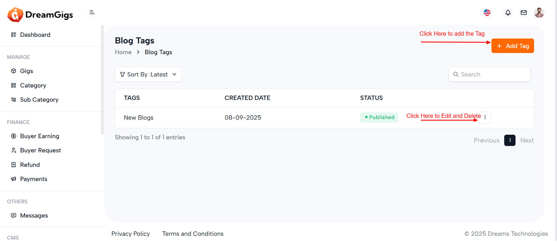
This interface facilitates the management of blog tags within an admin panel, allowing administrators to view, add, edit, and delete tags efficiently. Each tag displays relevant metadata including its name, creation date, and publication status, helping users organize and filter blog content effectively. Admins can control visibility through status toggles and ensure tags are language-specific via language selection in the modal.
Layout:
The main layout consists of a responsive data table listing all tags, with columns for tag name, created date, status, and actions. Each row includes a dropdown for editing or deleting a tag. The page also includes Bootstrap modals for creating, editing, and confirming deletion of tags. Forms include language selectors and input fields with validation, enhancing usability. Status toggles in the edit modal allow admins to quickly publish or unpublish tags.
Responsive Design:
Built using Bootstrap’s grid and utility classes, the interface is mobile-friendly and adjusts neatly across devices. Tables, dropdowns, and modals scale appropriately, with form inputs and buttons stacked on smaller screens. The design ensures a smooth experience whether accessed from a desktop or mobile device, maintaining functionality and readability throughout.
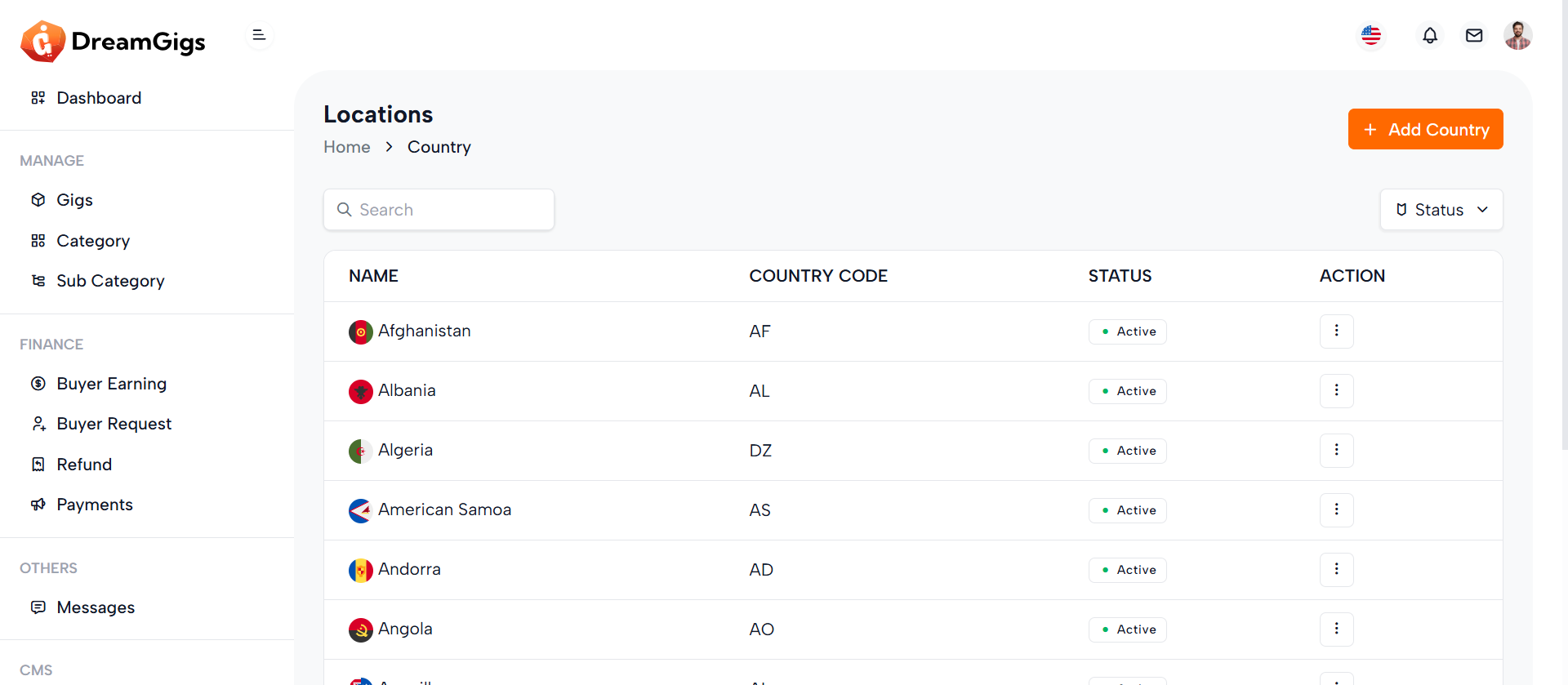
Purpose:
This interface enables administrators to manage countries within a CMS, allowing them to add, edit, and delete country records efficiently. Each country includes a name, a country code (typically ISO format), and a status (active/inactive). This setup is especially useful for systems needing location-specific configurations like e-commerce, logistics, or multilingual platforms. Bulk actions like select-all enhance efficiency in administrative tasks.
Layout:
The layout features a custom responsive table with selectable rows, columns for name, code, and status, and conditional display of the action column based on permissions. The table is followed by two modals: one for adding/editing countries and another for deletion confirmation. The form includes validation feedback and toggles for status updates. Input fields are clear and concise, improving user experience. The modals are designed using Bootstrap for consistency and usability..
Responsive Design:
The interface utilizes Bootstrap 5 classes for a clean, mobile-friendly layout. The data table is wrapped in a .table-responsive container to ensure horizontal scrolling on smaller screens. Modals are centered and appropriately sized (modal-md, modal-sm) to adapt across devices. Inputs and buttons stack neatly on mobile views, ensuring usability regardless of screen size.
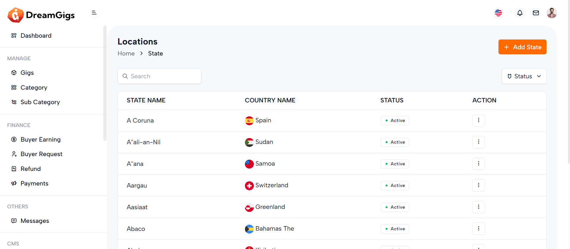
Purpose:
This interface is designed to manage states or provinces under specific countries in a CMS environment. Administrators can easily create, edit, and delete states, assign them to countries, and toggle their active status. The search bar and filter dropdown streamline navigation, while permission-based action visibility ensures secure role-specific access.
Layout:
The layout is structured around a responsive data table (stateTable) displaying states with columns for name, associated country, and status. A checkbox column allows for bulk selection. The action column appears conditionally, depending on the user’s permissions (edit or delete). Above the table is a search bar and a status filter dropdown, enhancing data handling. 1. Add/Edit Modal (#state_modal): Includes inputs for state name and country, along with a toggle switch for status. 2. Delete Confirmation Modal (#delete-modal): Provides a confirmation prompt before deletion.
Responsive Design:
The entire layout leverages Bootstrap’s responsive grid system and utility classes (flex-wrap, row-gap, table-responsive) to ensure usability on all devices. Modals are appropriately sized (modal-md, modal-sm) and remain accessible and centered on smaller screens. Form inputs and buttons adjust fluidly, providing a seamless experience across desktop, tablet, and mobile views.
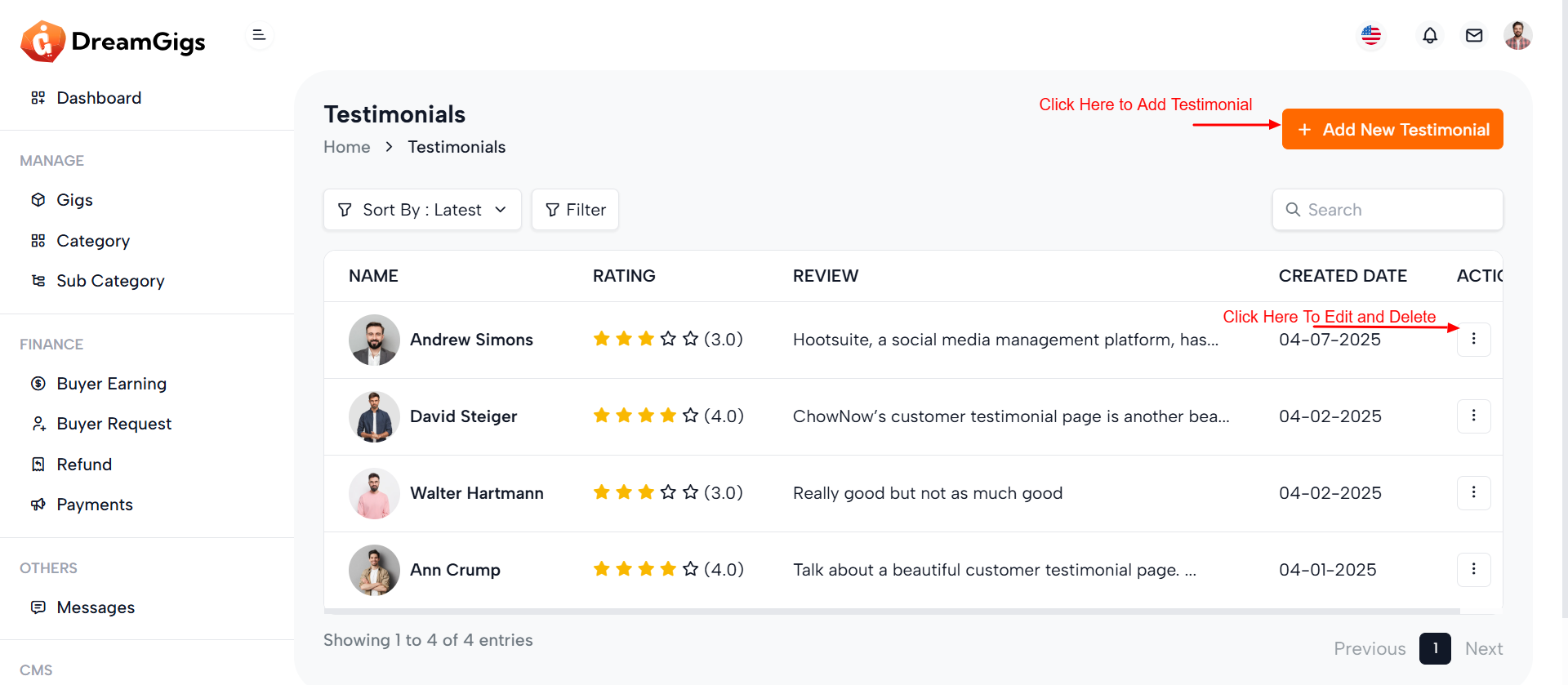
Purpose:
The testimonial management interface is crafted for admin users to efficiently manage customer feedback on a platform. It allows the addition, editing, viewing, and deletion of testimonials—capturing customer names, ratings, reviews, and images. This setup supports maintaining credibility and showcasing social proof on the frontend of the website
Layout:
The main section features a custom responsive data table (testimonialsTable) displaying all testimonials with columns for customer name, rating, review, creation date, and optionally, actions (if the user has permission). Three Bootstrap modals are used: 1. Add Testimonial Modal: Contains form fields for image upload, customer name, rating dropdown, and review textarea. 2. Edit Testimonial Modal: Pre-populated with selected testimonial data and includes a toggle for status. 2. Delete Testimonial Modal: Provides a centered confirmation prompt for deletion.
Responsive Design:
Utilizing Bootstrap’s responsive classes like table-responsive, modal-dialog-centered, and d-flex, the layout adapts across all screen sizes. Form controls and upload components stack vertically on smaller devices for better usability. Modals maintain appropriate sizing (modal-md, modal-sm) and ensure accessible interaction through consistent spacing, readable text, and mobile-friendly buttons. This design ensures a seamless admin experience on both desktop and mobile devices.
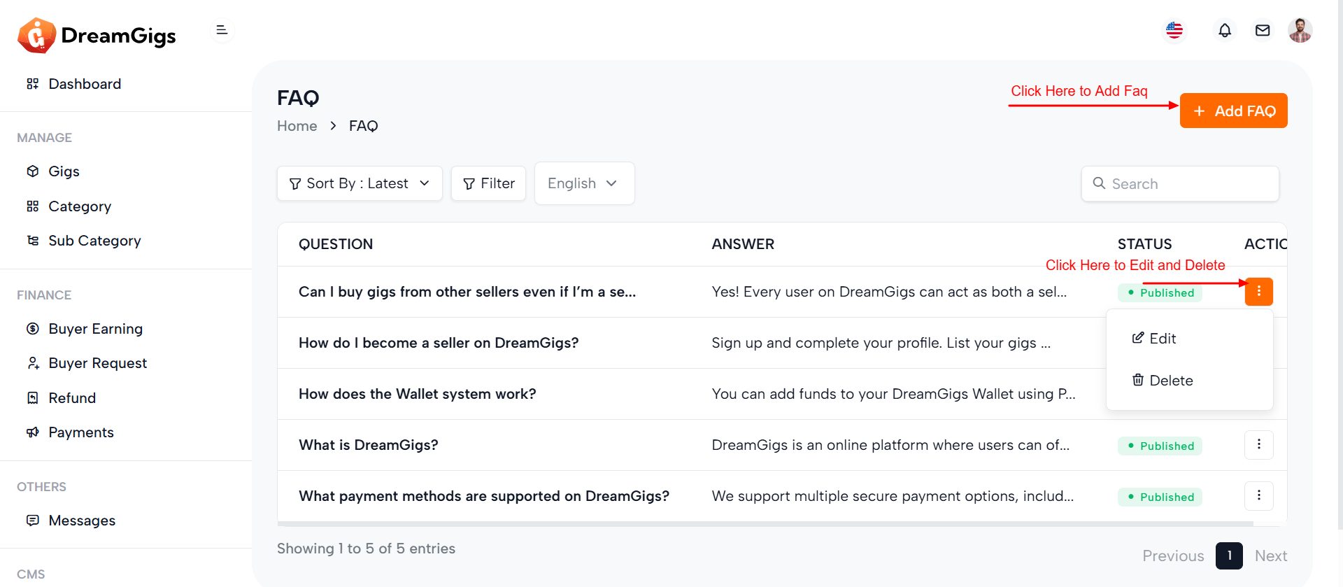
Purpose:
Ttiple languages. It helps maintain an informative knowledge base for users while supporting multilingual platforms. The interface enables admins to add new FAQs, modify existing ones, toggle status (active/inactive), and delete entries as needed.
Layout:
The main interface consists of a hidden data table (faqTable) that is populated dynamically via AJAX. It displays the question, answer, status, and actions (if permissions allow).Three modals handle FAQ operations: 1. Add FAQ Modal: Includes a dropdown for language selection, input fields for question and answer, and a submit button 2. Edit FAQ Modal: Pre-fills fields with existing data and includes a status toggle switch. 3. Delete FAQ Modal: Provides a minimal confirmation prompt with clear call-to-action buttons.
Responsive Design:
The structure leverages Bootstrap 5 classes like modal-dialog-centered, form-select, and d-flex to ensure a clean and adaptive layout across devices. Fields are spaced with mb-3, ensuring readability on both desktop and mobile. Dropdowns and textareas adjust fluidly within modal widths (modal-md, modal-sm), while buttons and toggles are touch-friendly for mobile users. The interface is fully responsive, providing a seamless experience on any screen size
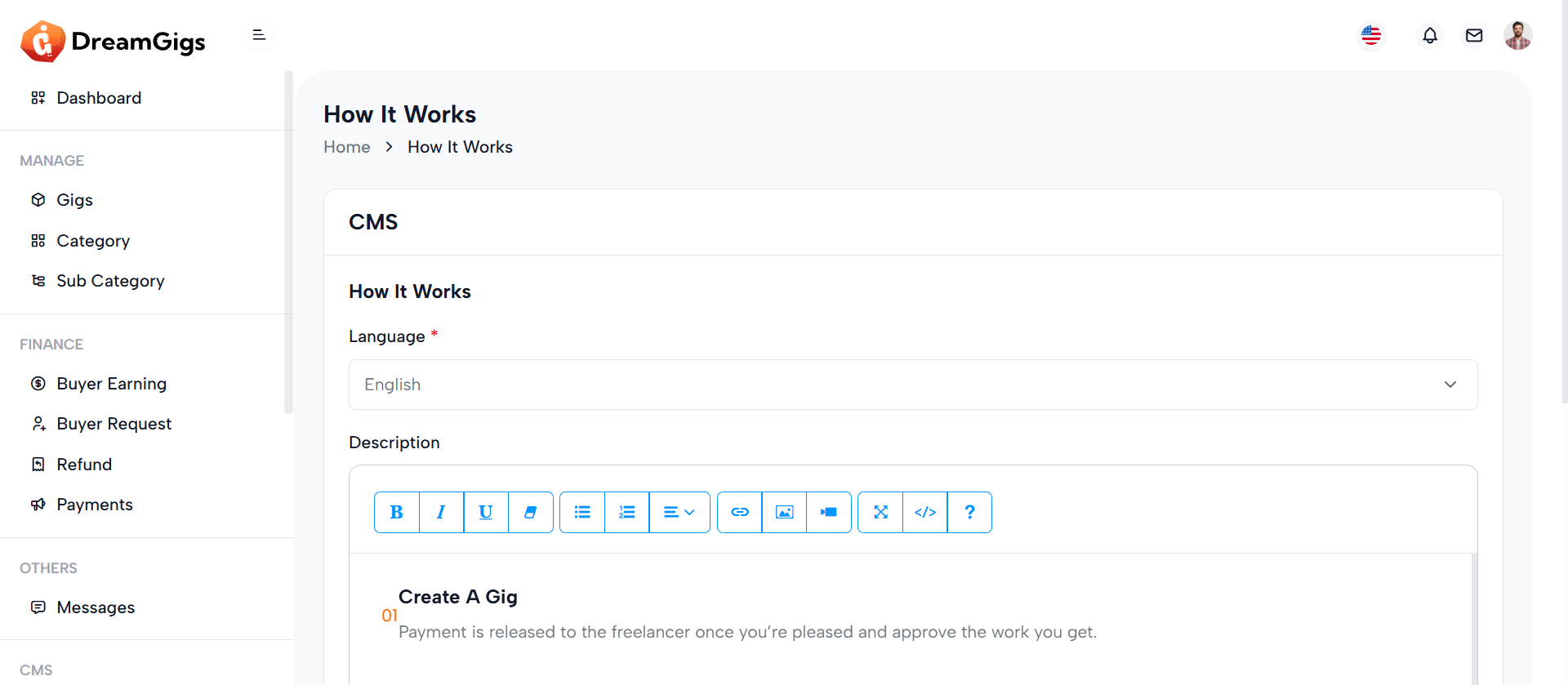
Purpose:
This form is built for administrators to manage the "How It Works" content for a CMS in multiple languages. It allows editing descriptions that guide users on how the platform or service operates, tied to a specific group_id.
Layout:
The form is encapsulated in a Bootstrap card layout with a header, body, and footer. The header includes the main title; the body contains a hidden group_id field, a language dropdown (triggering dynamic content loading), and a description field using a rich text editor (summernote). The footer houses action buttons (Cancel/Save) with permission checks for editing.
Responsive Design:
Built using Bootstrap utility classes, the form adapts well across screen sizes. Skeleton loaders offer a visually engaging experience while data loads, and all form controls (selects, textareas, buttons) are styled to be touch-friendly and mobile-responsive. The layout maintains usability and readability from desktop to mobile.
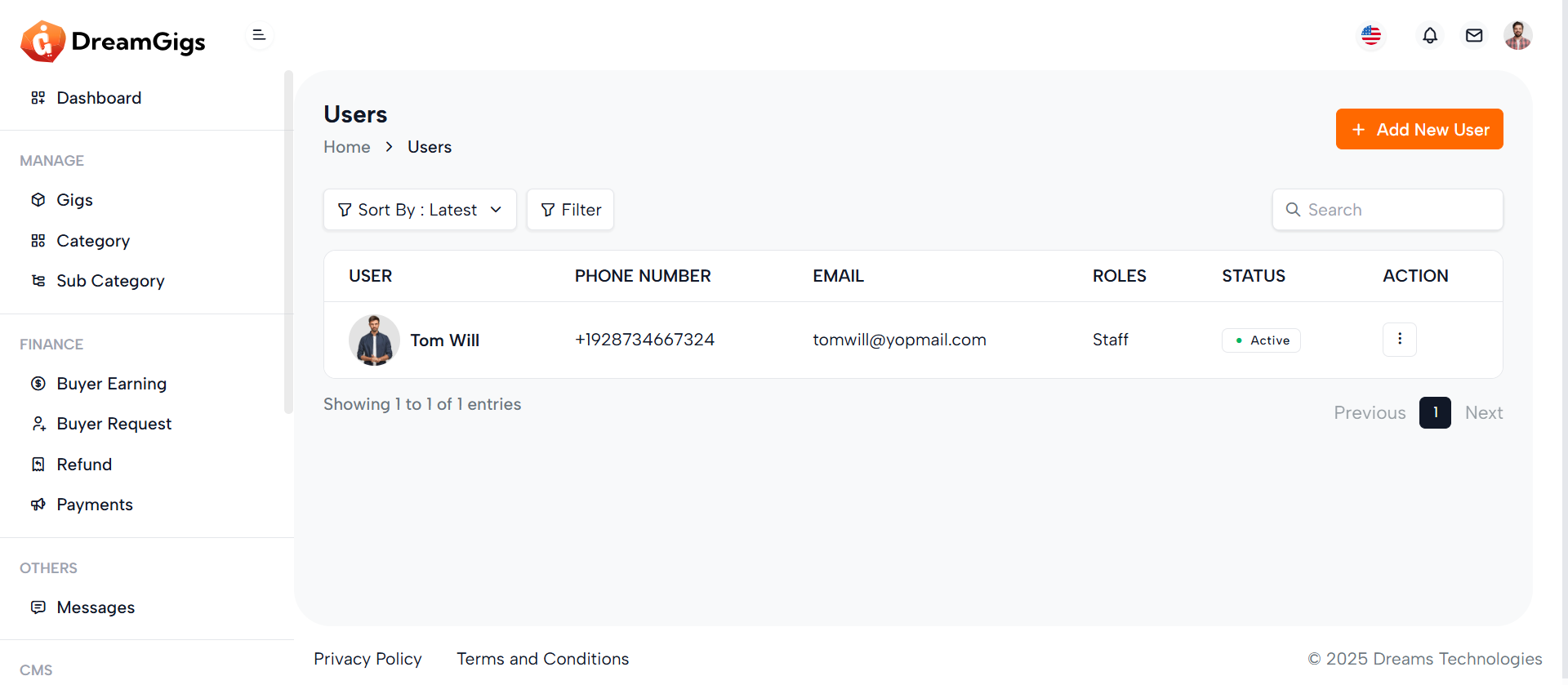
Purpose:
This interface is part of the User Management module in the admin panel. It allows administrators to view, add, edit, and delete users efficiently. The interface supports role assignments, secure user data input, profile image upload, and toggling user status. It provides essential administrative control over platform users.
Layout:
The layout is structured with a responsive data table (#userTable) inside a div that displays user information such as name, phone, email, role, and status. There are three modals: 1. Add User Modal: A large modal (modal-lg) with a comprehensive form for user creation, including image upload and form validation placeholders. 2. Edit User Modal: Similar structure to the Add modal but includes an ID hidden input, prefilled values, and a toggle for user status. 3. Delete Modal: A smaller modal (modal-sm) for confirming user deletion
Responsive Design:
The design uses Bootstrap’s responsive grid (col-md-6, modal-lg, table-responsive) ensuring adaptability across devices. Form elements and buttons stack properly on small screens, maintaining usability and visual clarity.
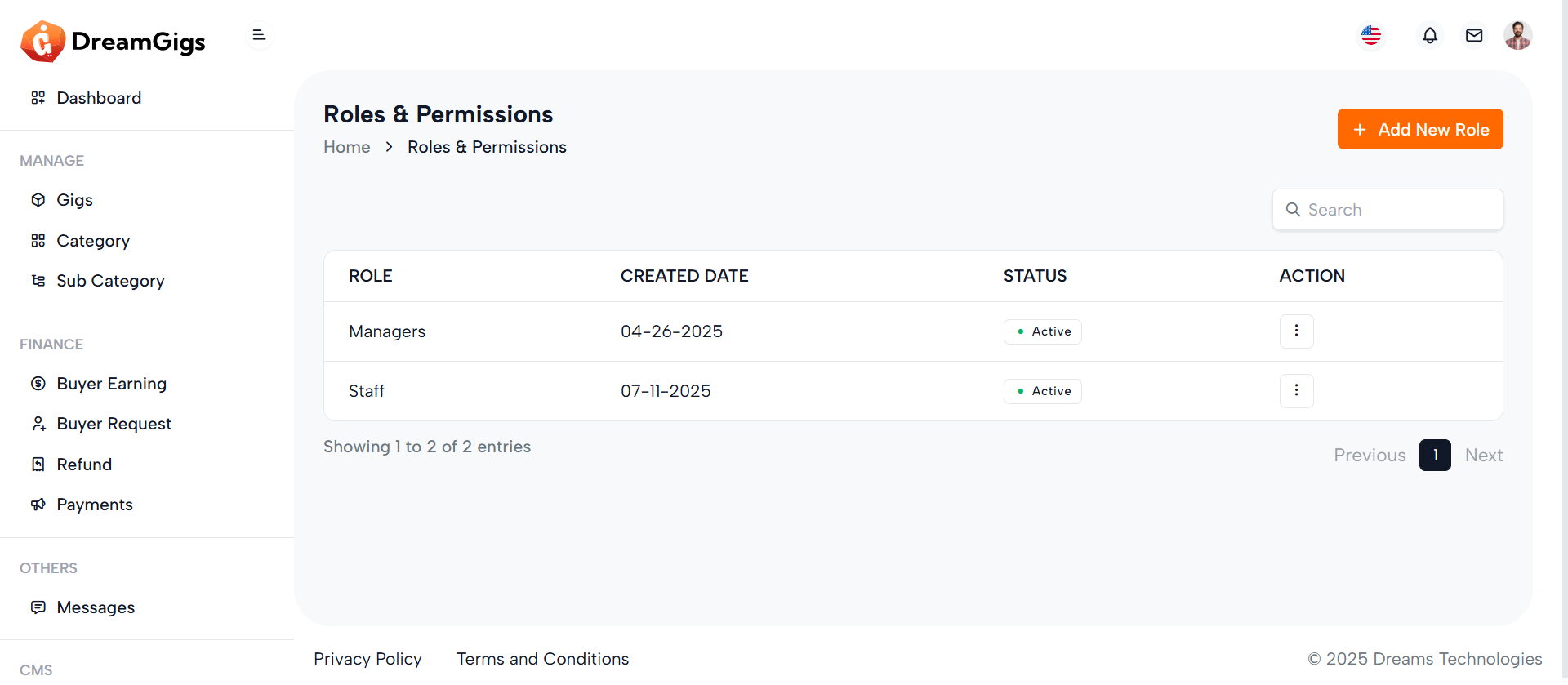
Purpose:
The modals provided are part of a user management interface, specifically for managing user roles. The "Add Role" modal allows administrators to create or update roles, while the "Delete Role" modal confirms role deletion. These modals enhance user experience by enabling inline management actions without page reloads.
Layout:
Each modal is structured using Bootstrap’s modal components. The "Add Role" modal includes a form with a text input for the role name, a hidden status toggle shown conditionally, and submission buttons in the footer. The "Delete Role" modal contains a confirmation message with iconography and two action buttons — cancel or confirm delete.
Responsive Design:
The design uses Bootstrap’s responsive classes (modal-dialog-centered, modal-md, modal-sm, etc.), ensuring proper display across devices. The layout adapts to different screen sizes while maintaining usability and visual clarity on both desktop and mobile views. Elements like buttons and form controls stack and resize as needed.
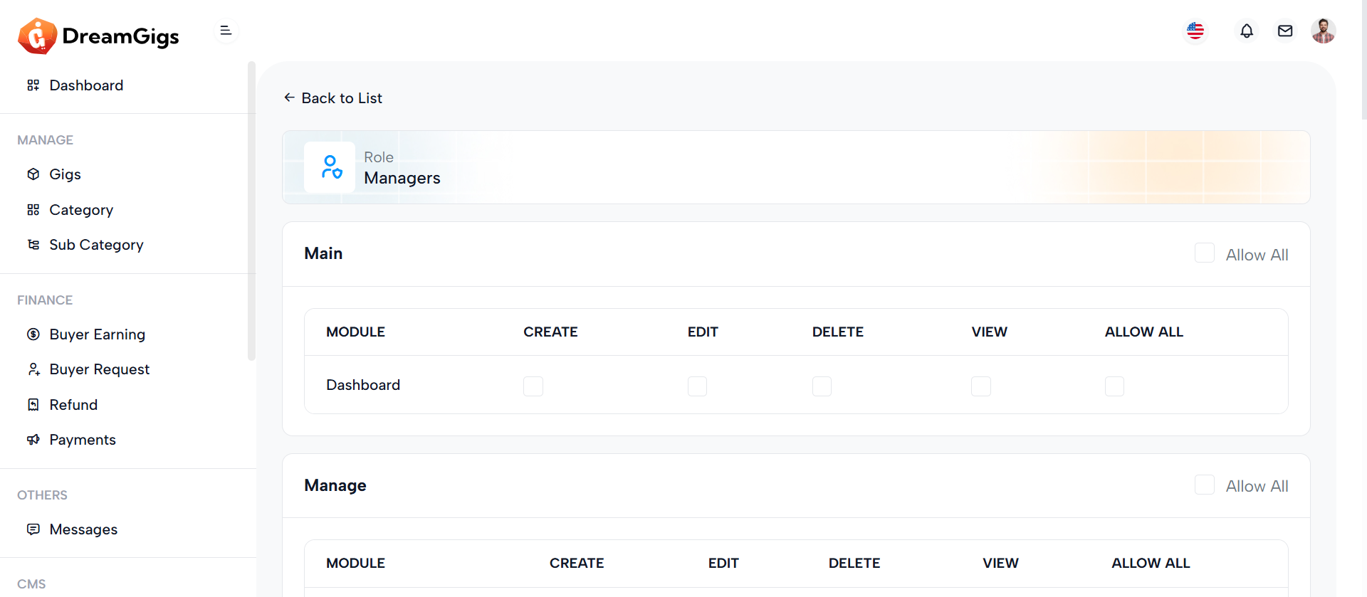
Purpose:
The permission form is designed for administrators to manage access control for different roles within a system. It allows assigning specific permissions—Create, Edit, Delete, View, and Allow All—for each child module under a parent module, ensuring granular control over user capabilities
Layout:
The layout leverages Bootstrap cards for each parent module, with a header displaying the module name and a "Select All" option. The body includes a responsive table that lists child modules as rows and permission types as columns. Each permission is represented with a checkbox, dynamically checked based on existing permissions. A final card at the bottom provides action buttons—Cancel and Submit—for saving changes.
Responsive Design:
The use of Bootstrap classes like table-responsive, form-check, and grid utilities ensures the form adapts across screen sizes. Tables become horizontally scrollable on smaller devices, while checkboxes remain accessible and clearly labeled, enhancing usability for mobile and desktop users alike
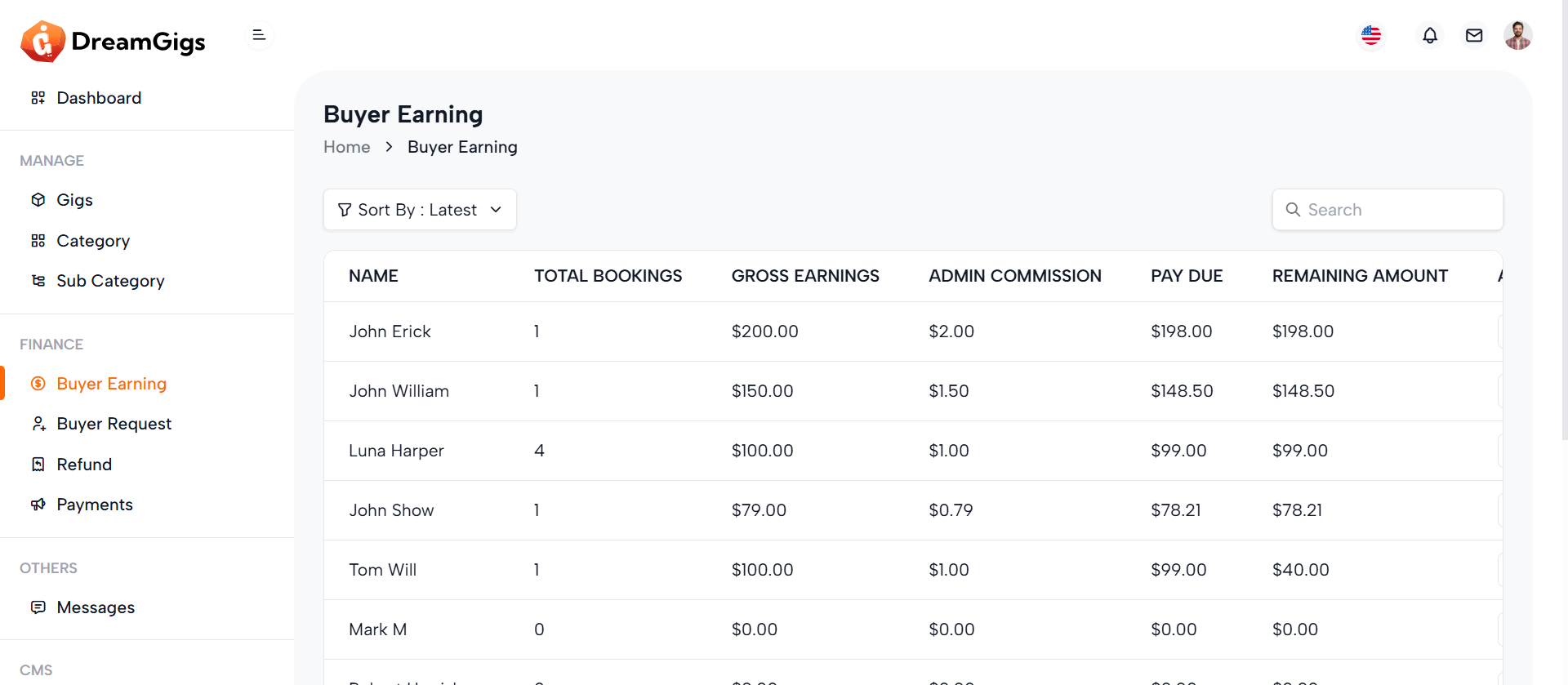
Purpose:
This page is part of the admin dashboard, specifically designed to allow administrators to manage and track buyer earnings. The goal is to provide a clear overview of earnings, payments, and pending transactions related to buyers. Admins can review data such as total earnings, admin earnings, buyer payment dues, and remaining amounts. The page enables effective financial management, giving administrators the ability to make adjustments, apply filters, and take necessary actions such as editing or deleting entries, all based on the permissions granted.
Layout:
The layout of the page is straightforward and functional. At the top, there's a breadcrumb navigation that helps users quickly understand where they are within the system. Below that, the page includes a table header with sorting options, allowing admins to view buyer earnings based on different criteria (e.g., "latest," "ascending," or "descending"). There is also a search bar for finding specific records. The main section of the page is a data table with financial information, which dynamically loads data. The table is initially populated with skeleton loaders (placeholders) to show the loading process. Once the data is ready, it is presented in a clean, organized manner with the ability to perform actions such as editing and deleting specific entries.
Responsive Design:
The page is designed to be responsive, ensuring it looks and functions well on all screen sizes, from desktop to mobile. Elements like the search bar and filter section are adapted for mobile use, either by collapsing or becoming scrollable. On smaller screens, the table supports horizontal scrolling, preventing data overflow and maintaining usability. The responsive design ensures that the admin interface remains user-friendly and accessible across various devices, allowing for efficient management of buyer earnings on the go. This admin page delivers a user-friendly experience with a focus on functionality and ease of navigation, making it an essential tool for managing buyer-related financial data in an organized and responsive manner.
Purpose:
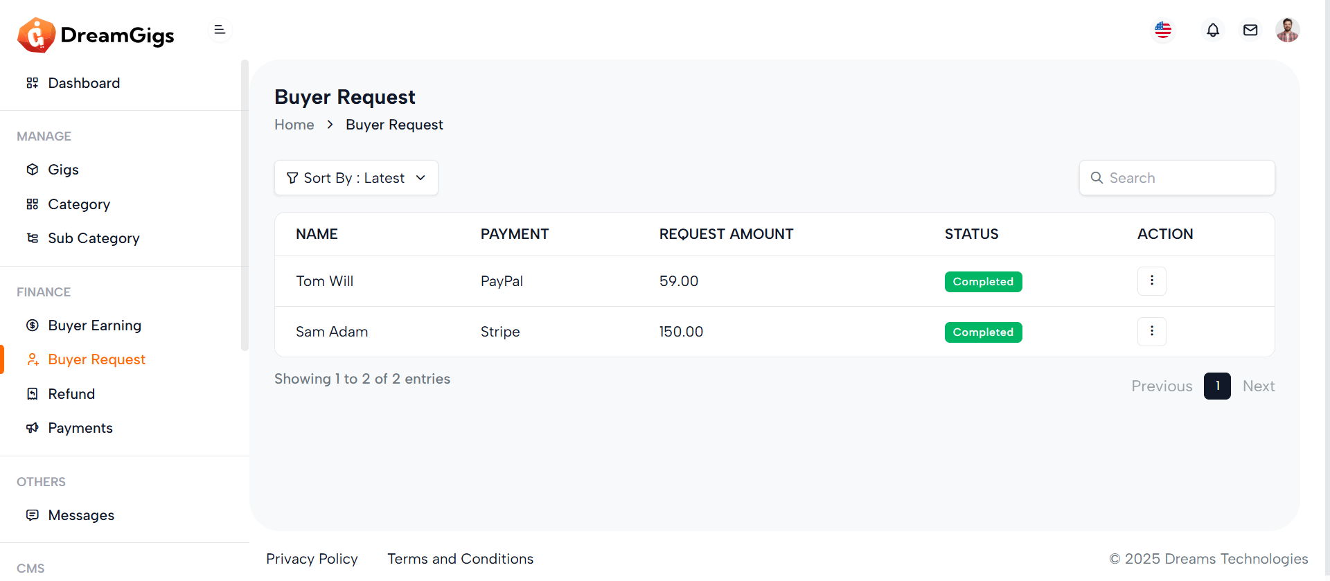
The purpose of this page is to manage buyer requests in an admin dashboard. This page serves as an administrative interface for reviewing and managing requests made by buyers. Admin users can utilize features like sorting, searching, and applying filters to view buyer requests that meet specific criteria. The table allows admins to see details like the buyer’s name, request amount, payment status, and request status. Additionally, admins can take actions such as editing or deleting requests based on their assigned permissions. The page provides an organized, efficient way for admins to handle potentially large datasets of buyer requests, improving overall workflow management within the platform.
Layout:
The layout of the page is structured to provide clear organization and easy access to the data. At the top, there’s a breadcrumb navigation system that helps users understand their current location within the admin panel. This is followed by a header section that includes a sorting dropdown and a search bar, allowing admins to sort the requests based on different criteria, such as "latest," "ascending," or "descending." Additionally, a filter section lets users refine their data based on language and other attributes. The core of the page is the data table, which displays buyer requests. Initially, skeleton loaders are shown in the table while data is being fetched, providing a better user experience during the loading process. Once the data is loaded, the table becomes fully functional with real data and actionable columns, such as "Edit" and "Delete" for modifying or removing requests, depending on the user’s permissions. The footer at the bottom provides consistent elements across all admin pages, ensuring a unified design.
Responsive Design:
The design is optimized for various screen sizes, ensuring the page remains usable and visually appealing across devices, from desktop monitors to mobile phones. The page employs flexbox and grid layouts, making it adaptable to different screen widths. On smaller screens, certain elements like the search bar and filter section are hidden or collapsed to save space, ensuring the interface doesn’t become cluttered. For example, the filter section can collapse, and the table becomes scrollable horizontally on mobile devices, preventing data overflow or loss of content visibility. The use of the table-responsive class ensures that the table adjusts to smaller screens by allowing horizontal scrolling. This is particularly helpful when dealing with multiple columns of data. Furthermore, icons and buttons are appropriately sized and spaced for mobile screens, making the interface touch-friendly. Overall, the page adapts to different screen sizes, providing a smooth and accessible experience across desktop, tablet, and mobile devices. This approach allows the page to function efficiently while maintaining an organized and responsive layout that adapts seamlessly to the user's device, ensuring that admins can manage buyer requests easily, whether they are using a desktop computer or a mobile phone.
Purpose:
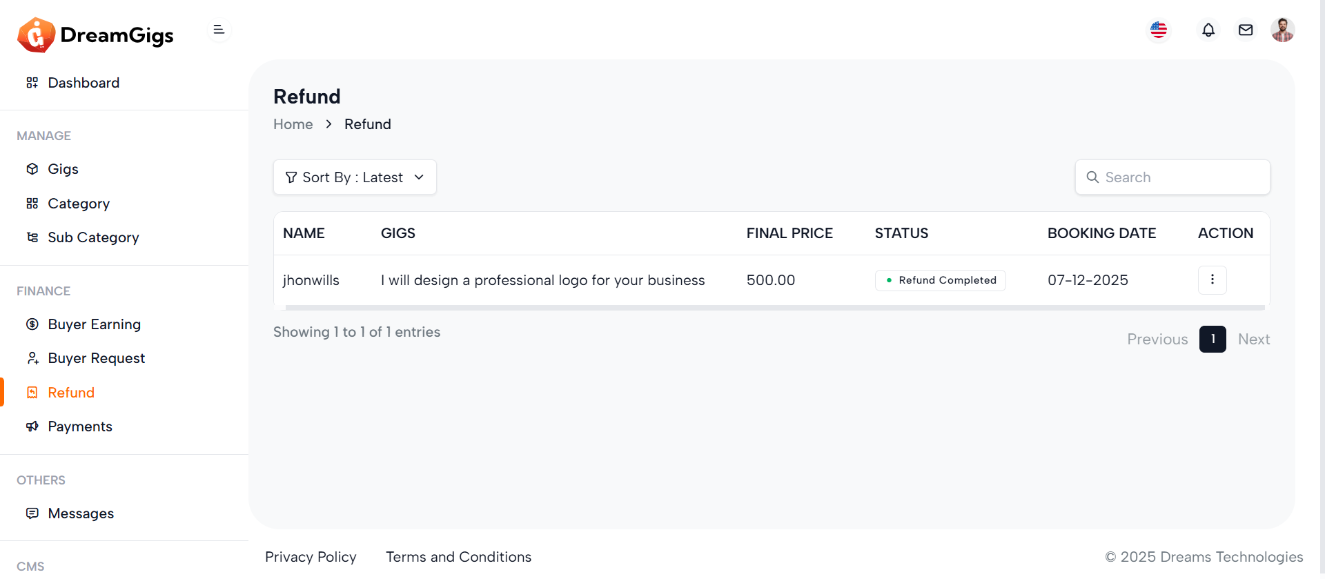
The Refund Management page is designed for administrators to manage and track refund requests related to services or purchases within a platform. This page allows admins to view detailed information regarding each refund, including the associated gig, final price, status, and booking date. The functionality helps ensure that all refund transactions are processed and monitored efficiently. With built-in sorting and search options, the page enhances the ease of navigation, allowing admins to quickly filter through refund records based on various criteria. It is an essential tool for ensuring customer satisfaction and transparency in refund operations.
Layout:
The layout of the Refund Management page is intuitive and organized to streamline the user experience. It features a breadcrumb navigation at the top, enabling admins to easily track their location within the admin panel. The table, which is the central component, displays refund data such as the customer’s name, gig details, final price, and booking date. Sorting options are available to help administrators sort refunds by different parameters, including the most recent or the oldest. Furthermore, the layout includes a responsive design for different screen sizes, ensuring usability on desktops, tablets, and mobile devices. For those who need to quickly access specific records, the page includes a search bar and filters, allowing for efficient data handling.
Responsive Design:
The Refund Management page is fully responsive, ensuring it provides a seamless user experience across a variety of devices. Whether accessed from a desktop, tablet, or mobile phone, the layout adjusts dynamically to fit the screen size and orientation. For example, on smaller devices, certain elements like the dropdown filters and search bar collapse into a more compact view, ensuring ease of use without compromising functionality. The table displaying refunds is also designed to adjust its width accordingly, so users can still view all relevant information without needing to zoom in or out. This responsiveness allows administrators to manage refund requests and perform necessary actions efficiently, no matter where they are or what device they are using.
Key Features:
1. Breadcrumb Navigation: Allows administrators to easily navigate back to the home dashboard or other parts of the admin panel. 2. Sort and Filter Options: Administrators can sort refunds by various parameters such as the latest, ascending, descending, last month, or last 7 days. Filters make it easier to narrow down results. 3. Refund Data Table: Displays refund information, including customer names, gig details, status, and final price, in an organized table. The data is easy to read, and each row is clickable for more details 4. Search Functionality: Administrators can search for specific refunds or bookings by typing keywords into the search bar. This function is particularly useful for handling large volumes of data. 5. Action Options: Admins can take necessary actions on the refund data if they have the appropriate permissions, such as editing or deleting records 6. Responsive Design: The page adapts to various screen sizes, providing an optimal viewing experience whether on desktop or mobile devices. This Refund Management page is a critical part of the administrative interface, helping to keep refund records organized and accessible while ensuring that refunds are processed in a timely and efficient manner.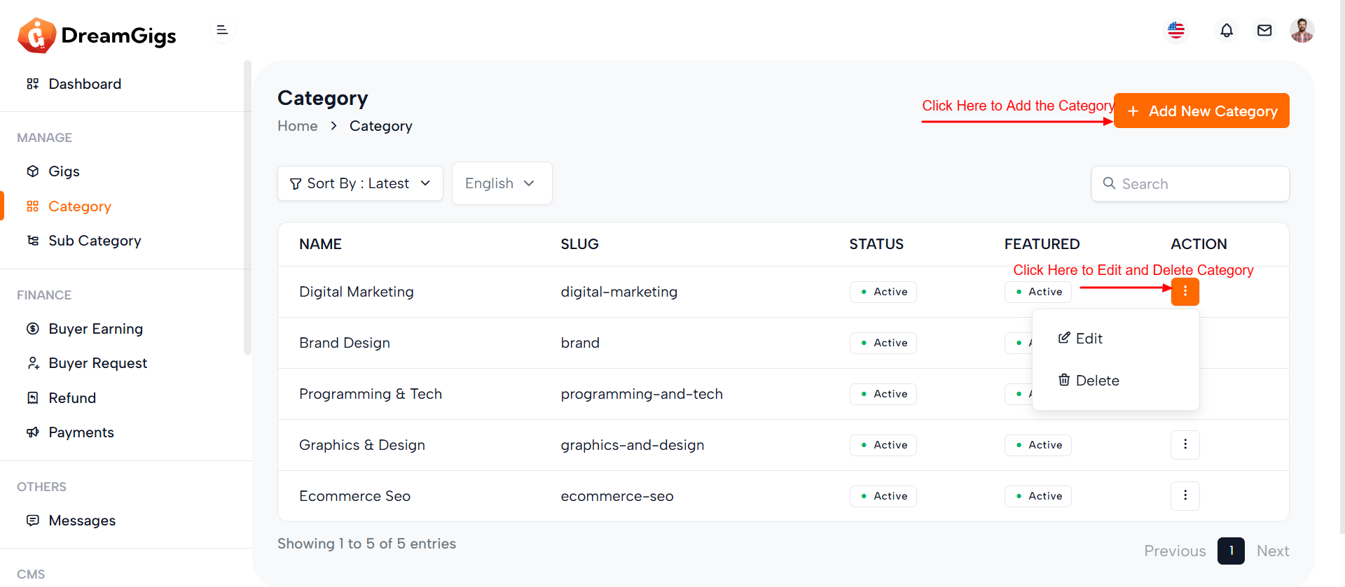
Purpose:
This page is designed for managing categories within the admin dashboard. The goal of this page is to provide administrators with the ability to view, sort, filter, and manage categories effectively. Admins can add new categories, filter them based on different parameters like language, status, and featured status. The page also offers the ability to sort categories based on various criteria (e.g., latest, ascending, descending), making it easier to manage large numbers of categories. Furthermore, it includes the ability to perform actions such as editing or deleting categories depending on the user's permissions.
Layout:
The layout is clean and well-structured, comprising several key sections: 1. Breadcrumb Navigation: At the top of the page, the breadcrumb navigation helps users understand their current position within the admin panel. It includes a link to the dashboard and highlights the current section, Category Management. 2. Add New Category Button: If the user has the necessary permissions, there is an Add New Category button, which opens a modal form for creating a new category. 3. Sorting and Filtering:A section of the page allows users to sort and filter categories. There is a dropdown menu to sort categories based on different criteria (latest, ascending, descending, etc.), and an input field for searching categories by name. Additionally, a filter for language and category status is available. 4. Category Table: The main content is a table that displays all the categories. The table is initially populated with skeleton loaders (placeholders) while the data is loading. Once the data is available, the table is populated with information like the category name, slug, status, and whether the category is featured. There is also an Action column that allows the admin to perform actions like edit or delete (based on permissions). 5. Responsive Design: The page is responsive, meaning it adjusts to fit various screen sizes. On mobile devices, certain sections like search inputs and filters are designed to collapse or become scrollable for a smooth experience.
Responsive Design:
The page is built with a responsive design, ensuring it looks good and functions smoothly across all devices—desktop, tablet, and mobile. For smaller screens: 1. The filter dropdowns and search bar adapt by becoming scrollable or stacking vertically. 2. The category table allows for horizontal scrolling, preventing data from being cut off on smaller screens. 3. The Add New Category button is always accessible to the user on mobile devices if permissions allow. Features 1. Category Management: Admins can view, search, sort, and filter categories. 2. Add New Category: A modal for adding a new category is available if the user has the necessary permissions. 3. Sorting & Filtering: Admins can sort categories by different parameters (latest, ascending, descending) and filter by language or status. 4. Action Column: Admins can edit or delete categories, based on their permissions. 5. Search Functionality: A search bar allows for easy searching of categories by name. This page ensures an efficient category management system with flexible sorting, filtering, and editing options, providing admins with all the necessary tools to handle large amounts of data effectively. The responsive design makes sure that it is equally functional on any device, ensuring ease of use no matter where the admin is managing the platform from.
Purpose:
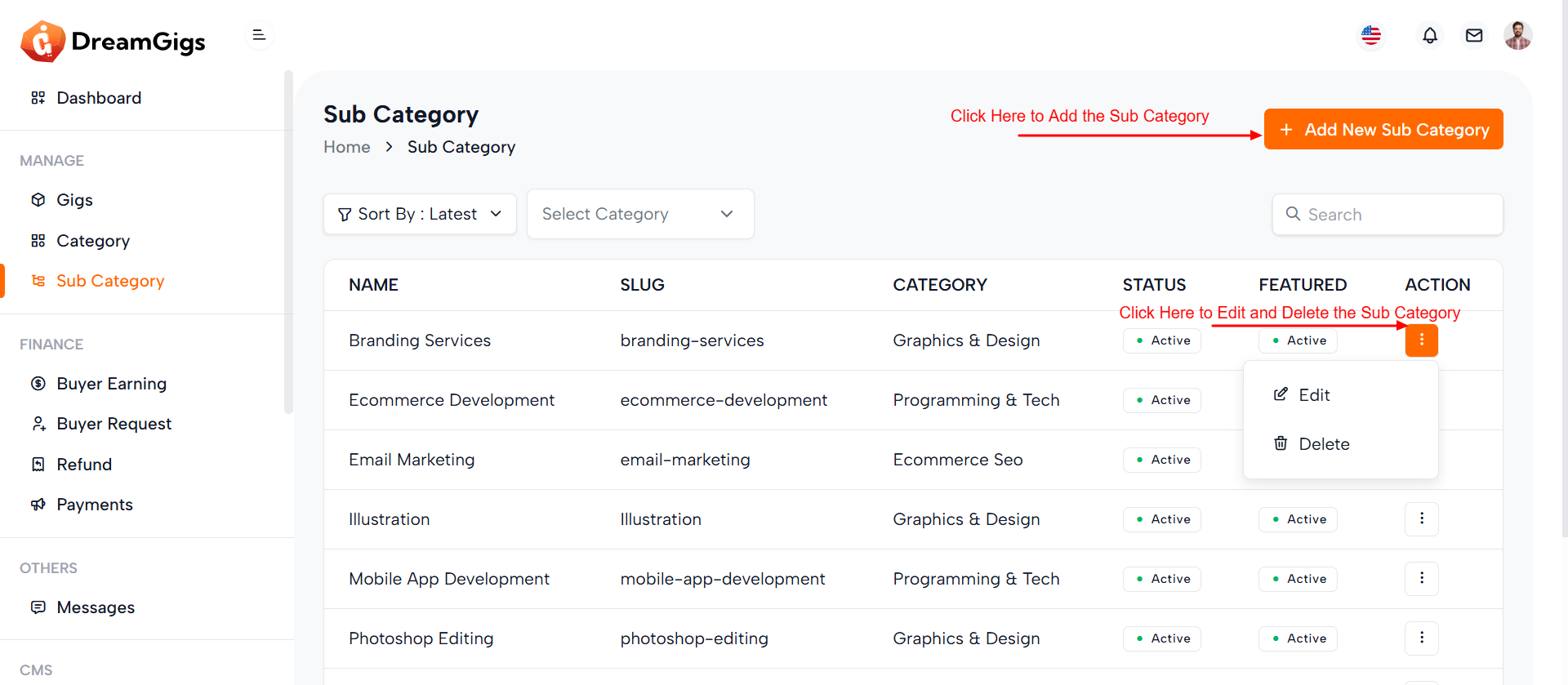
The purpose of this page is to provide administrators with an efficient interface to manage sub-categories within a system. It offers functionality for adding, updating, and organizing sub-categories under their respective parent categories. This management tool is essential for websites or applications that rely on structured content, as it enables administrators to maintain an organized and easily navigable category system. Additionally, the page incorporates sorting and filtering options, making it easier for users to quickly find specific sub-categories based on their status, name, or other criteria.
Layout:
The layout of this page is designed to facilitate smooth navigation and quick access to important actions. At the top, administrators will find breadcrumb navigation, offering an easy way to trace their steps back to the home or category page. Beneath that, the layout includes buttons and dropdown menus for sorting and filtering sub-categories, ensuring that tasks can be performed without unnecessary clicks. A central table displays all sub-category information in a concise format, and action buttons for editing or deleting sub-categories are provided for quick access. The overall layout ensures a clear and well-organized user experience.
Responsive Design:
The page’s design is fully responsive, ensuring that it adapts seamlessly to different screen sizes and devices. Whether accessed from a desktop, tablet, or smartphone, the layout adjusts dynamically to provide an optimized experience on all devices. Elements such as tables, input fields, and dropdown menus are designed to be touch-friendly on mobile devices and remain functional on larger screens. This responsiveness guarantees that administrators can efficiently manage sub-categories, even while on the go, without any degradation in usability or performance.
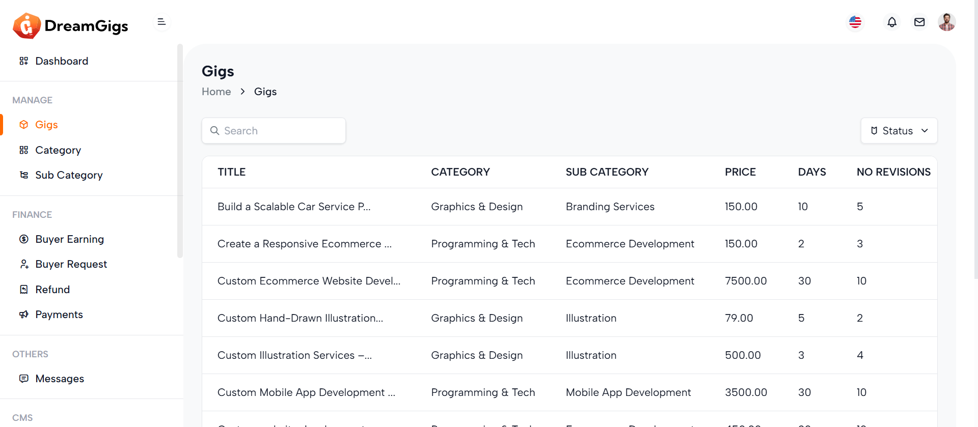
Purpose:
The Admin Gig List page provides the admin with an overview of all the gigs that have been created and published by sellers on the platform. The admin can manage these gigs by editing their status, modifying key details, and taking any necessary actions. This page is essential for controlling and overseeing the gigs available on the platform to ensure they meet quality standards and comply with platform guidelines.
Features:
1. Gig List View: Display all gigs added by sellers, including details such as gig title, status, seller, price, and other relevant information. 2. Edit Gig Status: Admin can change the status of a gig (e.g., from "Pending" to "Active", "Inactive", etc.). 3. Search & Filter: Admin can search for specific gigs by name, seller, or filter by status (active/inactive). 4. Edit Gig Details: Admin can edit gig details, including title, description, and price (if necessary). 5. Delete Gig: Admin can remove any gig if needed. 6. Sort Gigs: Admin can sort gigs based on various criteria (e.g., by seller, status, or creation date).
Summary:
The Admin Gig List page provides a simple but effective way for the admin to manage all gigs on the platform. It allows the admin to view, edit, sort, filter, and delete gigs, ensuring that the platform remains clean, organized, and compliant with the necessary standards.
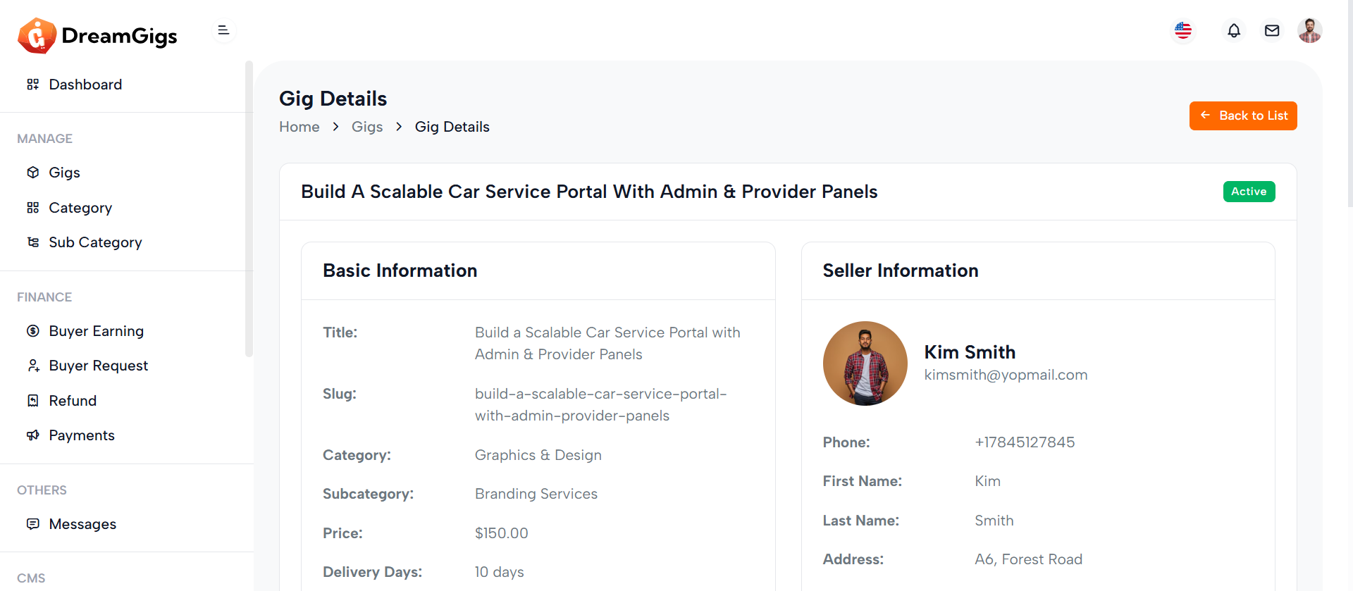
Purpose:
The Admin Gig Details Page is used by the admin to view all the detailed information about a specific gig, such as the gig title, description, price, status, and the seller’s information. This page also allows the admin to edit gig details and manage the gig status or visibility on the platform
Features:
1. Gig Information: Display all the detailed information of the gig, including the title, description, price, and status. 2. Seller Information: Show details about the seller, such as name, email, and the total number of gigs they’ve uploaded. 3. Edit Gig: Admin can edit the gig’s details, including title, description, price, and other relevant fields. 4. Change Status: Admin can change the gig's status (e.g., Pending, Active, Inactive). 5. Delete Gig: Admin can delete the gig if necessary, with a confirmation prompt to avoid accidental deletion. 6. View Order History: Admin can view the orders associated with the gig, including buyers, payment details, and order status.
Summary:
The Admin Gig Details Page provides admins with a comprehensive view of the information related to a single gig, including the ability to edit, change status, and delete the gig as necessary. The page also gives the admin access to order history and seller information, allowing for easy management and oversight of the platform’s content.
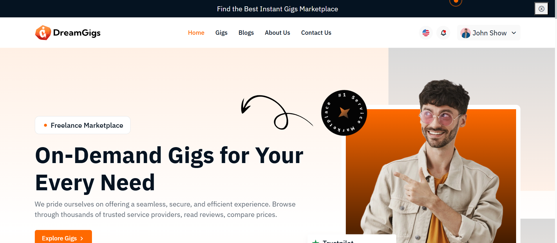
Purpose:
The Welcome Page serves as the public-facing entry point to your Laravel application. It introduces users to the platform with a visually engaging interface, highlighting key features, brand identity, and navigation links (e.g., login, register, or explore). It's designed to create a strong first impression and guide users to the next steps.
Layout:
The layout follows a single-page, scrollable design commonly used for landing pages: 1. Header/Nav Bar: Contains the logo and navigation links. 2. Hero Section: Features a large banner or intro text with a call-to-action (e.g., “Get Started” or “Explore Now”). 3. Content Sections (optional): May include features, testimonials, or about info. 4. Footer: Contains copyright info, secondary links. It uses: 1. Blade templating (@if, {{ }}) for conditional logic and dynamic content. 2. Laravel route helpers for linking to login, register, etc. 3. Inline and external stylesheets or assets to maintain consistent design.
Responsive Design:
The page is structured using: 1. Flexbox/Grid utilities (Bootstrap or Tailwind if integrated) to ensure elements adapt across breakpoints. 2. Mobile-first styling: Ensures navigation and layout adjust gracefully to screen size changes. 3. Responsive images and typography: Font sizes, images, and buttons resize to maintain readability and accessibility on mobile, tablet, and desktop devices. Key UX Enhancements: 4. Stacked nav and CTA buttons on mobile. 5. Optimized padding/margin for smaller screens. 6. Use of relative units (%, vw, rem) for adaptive scaling.
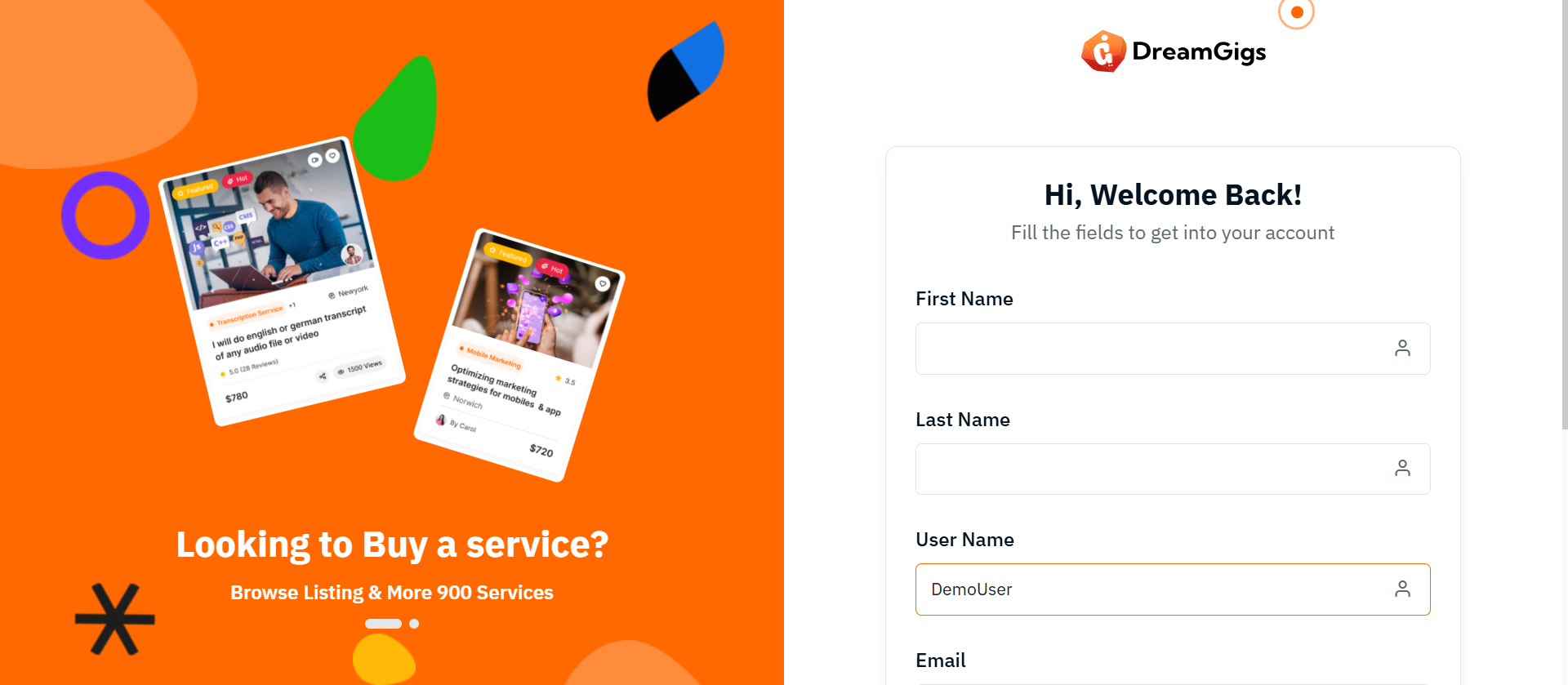
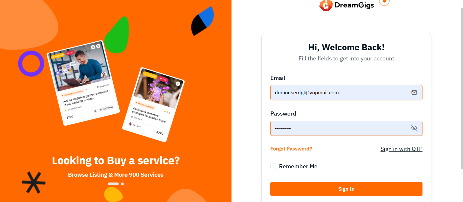
Purpose:
The purpose of this form is to provide a secure and simple login interface for users to access their accounts. It offers essential login fields such as email and password, ensuring user authentication. The form also includes options for users to reset their passwords or sign in via OTP, giving them flexibility based on their preferences. Additionally, it provides a "Remember me" checkbox for convenience in saving login credentials. The login process is designed to be user-friendly, with clear error messaging to guide users through the authentication process.
Layout:
The layout of the form is clean and structured, with each input field clearly labeled for user clarity. The email and password fields are placed one after the other, and the password field is grouped with an eye icon for toggling visibility. There is a separate section for links like "Forgot Password?" and "Sign in with OTP," offering alternative ways to log in. Below the form fields, the "Remember me" checkbox allows users to save their credentials.
Responsive Design:
The form is designed to be fully responsive. On smaller screens, the form maintains a user-friendly layout with appropriate spacing and easy-to-tap buttons. The use of a toggle for password visibility and social login buttons ensures a seamless experience across devices. Elements like the "Remember me" checkbox and login options adjust to maintain clarity and usability, even on mobile views.
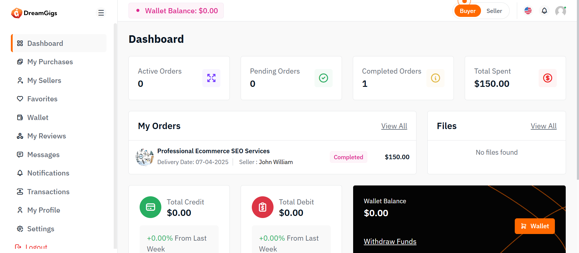
Purpose:
The Buyer Dashboard serves as a centralized hub within the platform where buyers can manage their activities efficiently. It provides a comprehensive overview of their order statuses, financial transactions, files, recent payments, notifications, and wallet balances. This dashboard enables buyers to stay informed about their account, purchases, and spending patterns with easy access to important actions and summaries.
Layout:
The dashboard layout is structured into clearly defined, responsive sections, including: Order Statistics Displays total counts of orders categorized by status: 1. Active Orders 2. Pending Orders 3. Completed Orders Total Spent Amount: Shows the cumulative amount the buyer has spent on the platform. My Orders List: A detailed table listing all orders with columns such as: 1. Order ID 2. Gigs Name 3. Order Status 4. Amount 5. Date Files Section: A file management area where buyers can view or download relevant documents or uploads associated with their transactions. Recent Payment Section: A file management area where buyers can view or download relevant documents or uploads associated with their transactions. Recent Notifications Section: Lists the latest notifications relevant to the buyer, such as order updates, promotional offers, or important announcements. Wallet Summary: Provides key wallet metrics, including:. 1. Total Credit Amount 2. Total Debit Amount 3. Current Wallet Balance 4. Withdraw funds Each of these sections is organized into cards, tables, or compact lists for clear and quick access.
Responsive Design:
The dashboard employs a mobile-first responsive layout using Bootstrap’s grid system (row, col-md-4, col-lg-3, container-fluid) and flexbox utilities. Wallet Summary: On desktop screens, multiple statistics and sections are displayed side-by-side for quick viewing. 1. On tablet and mobile screens, elements stack vertically for better readability and accessibility. 2. Tables are wrapped in table-responsive containers to allow horizontal scrolling on smaller devices. 3. Buttons and action links are easily tappable on mobile screens. The design ensures buyers can interact with key features (view orders, check payments, manage wallet) smoothly across all device sizes, enhancing user experience and platform engagement.
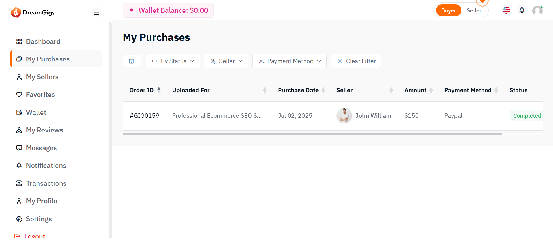
Purpose:
The My Purchases page provides buyers with a summary of all gigs they have purchased on the platform.It shows essential order details such as order ID, gig name, purchase date, seller, price, payment method, status, and actions like view/download. This page helps users easily track, manage, and access their purchases.
Features:
1. Order ID: A unique identifier for each purchase made on the platform. 2. Gig Name: The title of the gig purchased, linking to the details of the gig. 3. Purchase Date: The date the purchase was made. 4. Seller Name: The username or business name of the seller who offered the gig. 5. Price: The total cost of the gig, including any applicable taxes or fees. 6. Payment Method: The payment method used for the purchase (e.g., credit card, PayPal, etc.). 7. Status: The current status of the order (e.g., completed, pending, canceled). 8. Actions: Options to view or download the purchased gig (if applicable). This could include viewing the order details, downloading files, or accessing other purchase-specific actions.
Responsive Design:
Bootstrap’s responsive classes (table-responsive, modal dialogs, flex utilities) ensure the interface adapts across devices. Elements realign, stack vertically, or scroll within containers, providing a mobile-friendly experience without sacrificing functionality.
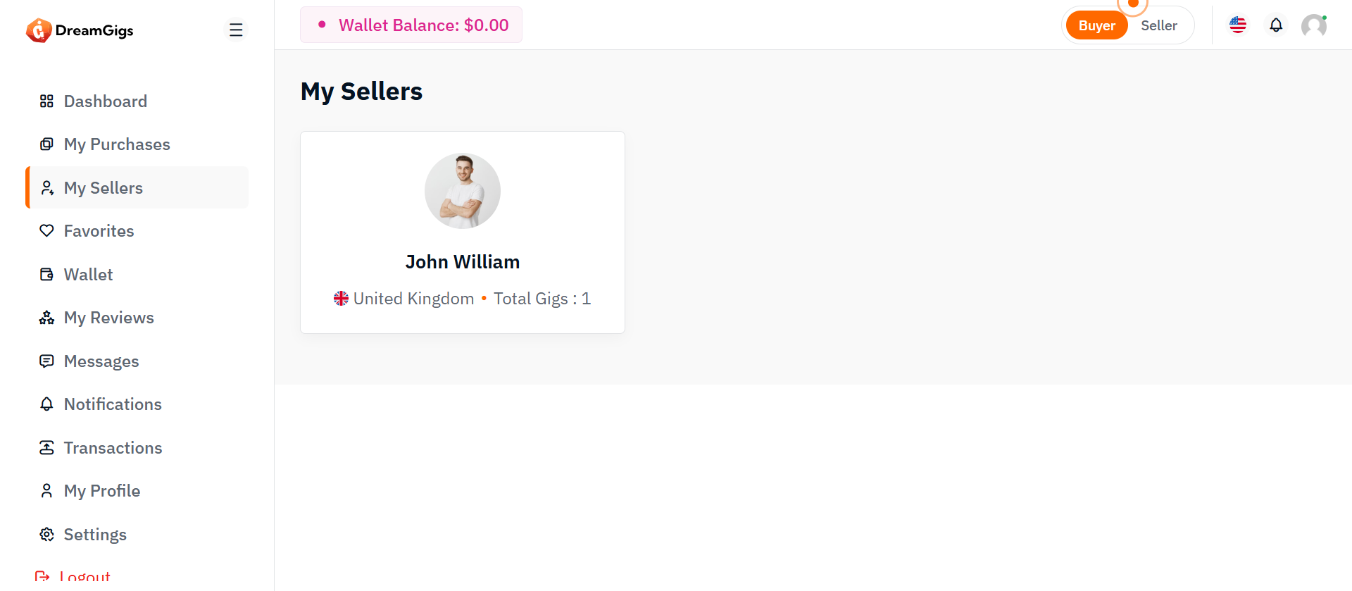
Purpose:
The Sellers Page is designed to allow sellers to view and manage information related to their completed gig bookings. This page will display essential details about each seller, including their name, country (with flag), and the total number of gigs that have been successfully booked and completed. This feature helps sellers monitor their successful transactions and keep track of their completed gigs.
Features:
The Sellers Page will focus on displaying completed gigs only. It will consist of the following key sections: Completed Gig Bookings List: A list of sellers with details on their completed gigs. 1. Seller Name: The name of the seller (business or individual). 2. Country: The country where the seller is located, accompanied by their respective country flag. 3. Completed Gigs Count: Displays the total number of gigs successfully booked and completed by the seller. Each seller’s information will be shown in a card format with the following fields: 1. Seller’s Name: Clickable to navigate to the seller's detailed profile page. 2. Country with Flag: Country name and corresponding flag. 3. Completed Gigs Count: Number of gigs successfully completed by the seller.
Responsive Design:
The Sellers Page will use a responsive design to ensure usability across various devices: 1. Desktop View: Seller details will be displayed in a row or card layout for easy viewing. 1.Mobile View: The layout will adjust to display the seller information in a vertical stack, maintaining readability on smaller screens. 1. Interactive Elements: Clicking on a seller's name will redirect to a detailed view or profile page with more information on their completed gigs.
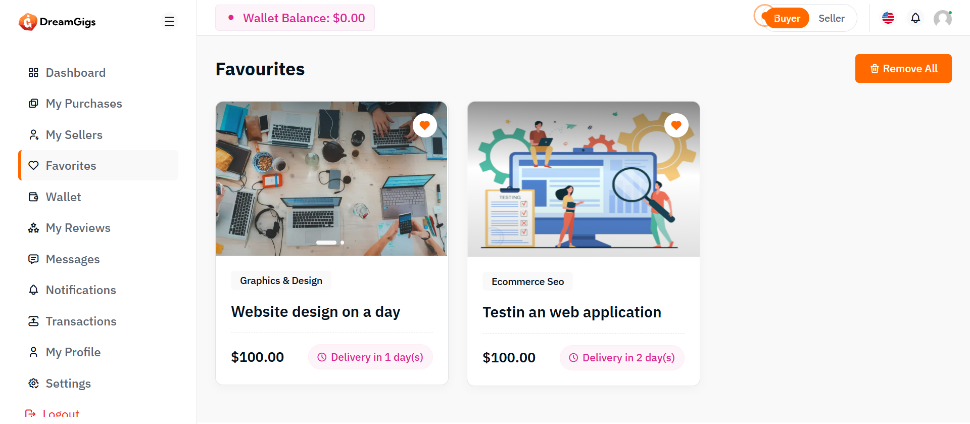
Purpose:
The purpose of the favorites page is to allow users to easily manage and view the gigs they have marked as favorites. It offers a quick way to review their saved gigs and provides options to remove them in bulk, enhancing the overall user experience.
Layout:
The layout is structured to display favorite gigs in a clean, grid format with each gig shown as a card. Each card features a slider for images, a title, price, and a badge, with an option to remove the gig from favorites. The page also includes a "Remove All" button for bulk actions and a "Load More" button for additional content loading.
Responsive Design:
The page is responsive and adapts seamlessly to different screen sizes. On larger screens, the gigs are shown in a 3-column grid, while on smaller screens, the layout adjusts to a 2-column or single-column grid to ensure the content remains easily accessible and visually appealing. The "Load More" button is centrally positioned for easy interaction across device.
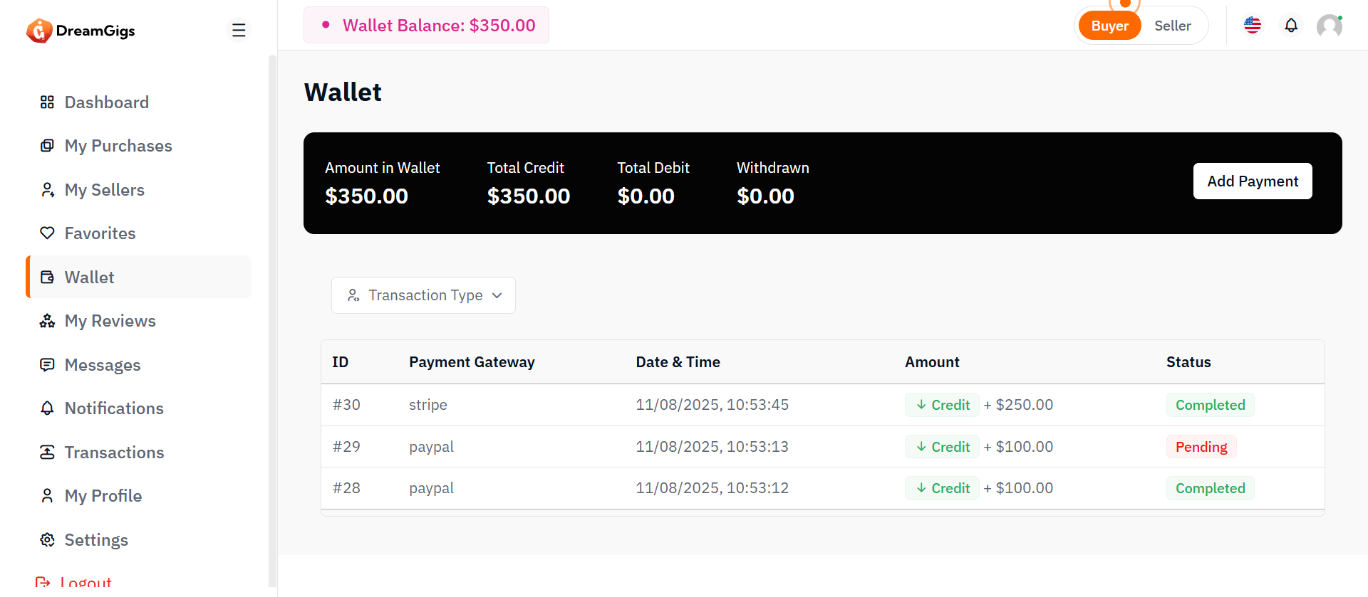
Purpose:
The User Wallet section is designed to provide users with a clear and organized view of their financial information. It allows users to check their wallet balance, view their credit and debit transactions, and track their withdrawal status. This section also provides functionality for users to filter transactions based on type (credit or debit), along with the ability to initiate payments or withdrawals. By offering easy access to wallet details and transaction history, the User Wallet aims to enhance the user experience by making financial management more intuitive.
Layout:
The layout of the User Wallet section is clean and structured, using Bootstrap 5 components for consistency and responsiveness. The wallet overview displays key information, such as the available balance, total credits, total debits, and the withdrawn amount. Below this, two tabs are available: one for viewing the wallet overview and another for reviewing withdrawn requests. Each section is accompanied by a transaction table displaying relevant details like transaction ID, payment gateway, date, amount, and status. Filters, including dropdowns for transaction types and reasons, provide users with the ability to refine the displayed data. Action buttons for adding payment methods or withdrawing funds are also included for a complete experience.
Responsive Design:
In terms of responsive design, the User Wallet section adapts seamlessly to various screen sizes, ensuring that users can easily navigate the interface across desktops, tablets, and mobile devices. The transaction tables are enclosed in a .table-responsive class, enabling horizontal scrolling on smaller screens. Additionally, filters and action buttons adjust their layout to fit smaller screens, improving accessibility. The tab navigation for switching between the wallet overview and withdrawn requests also adapts to a vertical format on mobile, providing a smooth and user-friendly experience on any device.
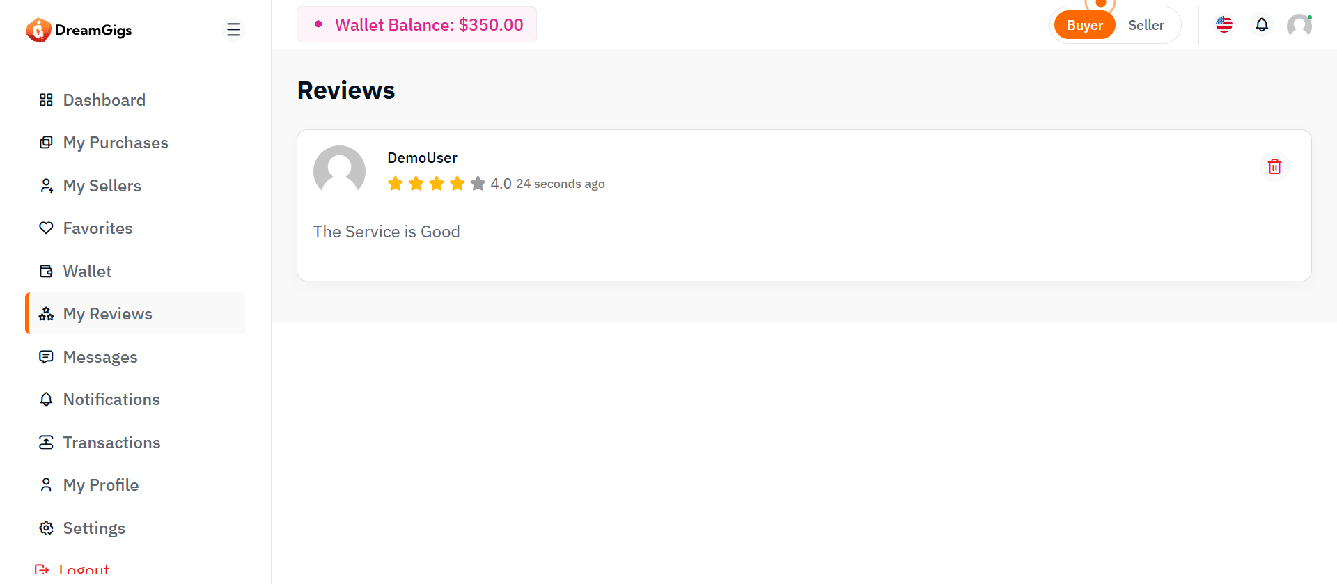
Purpose:
The Reviews Page is designed to display the reviews submitted by users, whether it’s a buyer’s or seller’s review. It organizes these reviews within a card layout, showing details like user information, review content, and rating, while also providing functionality to load more reviews when needed.
Layout:
The layout organizes reviews in a clean, easy-to-navigate card format. It starts with a title section, followed by a list of reviews that initially display skeleton loaders while content is fetched. Each review includes user info, rating, comments, and a delete option. A "Load More" button appears to fetch additional reviews.
Responsive Design:
The responsive design adapts well across devices. On smaller screens, the content stacks vertically for better readability, while on larger screens, elements are aligned to maximize space and ensure a clear presentation.
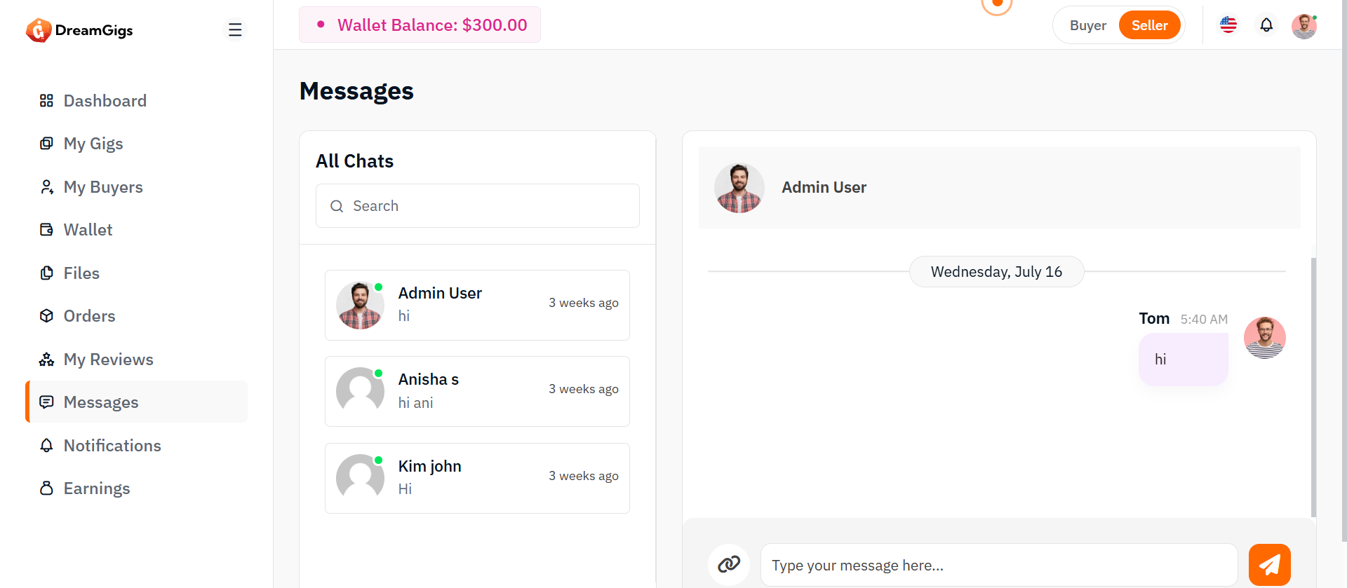
Purpose:
This page provides seller with a chat interface to manage and send messages to service providers. It allows viewing existing conversations, searching users, and exchanging text or file-based messages in real-time.
Layout:
The chat page adopts a two-column structure, with a sidebar on the left showcasing the list of users and the main chat interface on the right. The sidebar includes a searchable list of chat users, each displaying an avatar, name, last message preview, and timestamp. The main section comprises a chat header with user details, a scrollable message display area, and a footer containing the message input field, file attachment option, and send button. The layout is built using a combination of Bootstrap’s grid system and utility classes to manage spacing, alignment, and responsiveness efficiently.
Responsive Design:
The design is fully responsive, adapting fluidly across different screen sizes. On smaller devices, the sidebar stacks above the chat section, ensuring usability in vertical layouts. Scrollable areas like the message body are height-restricted to preserve visibility of the header and input controls. Image avatars and icons scale appropriately for touch interfaces, while text truncation maintains layout integrity in limited space. JavaScript enhancements allow dynamic interactions such as user switching and file uploading without layout disruptions, ensuring a seamless user experience across desktops, tablets, and mobiles.
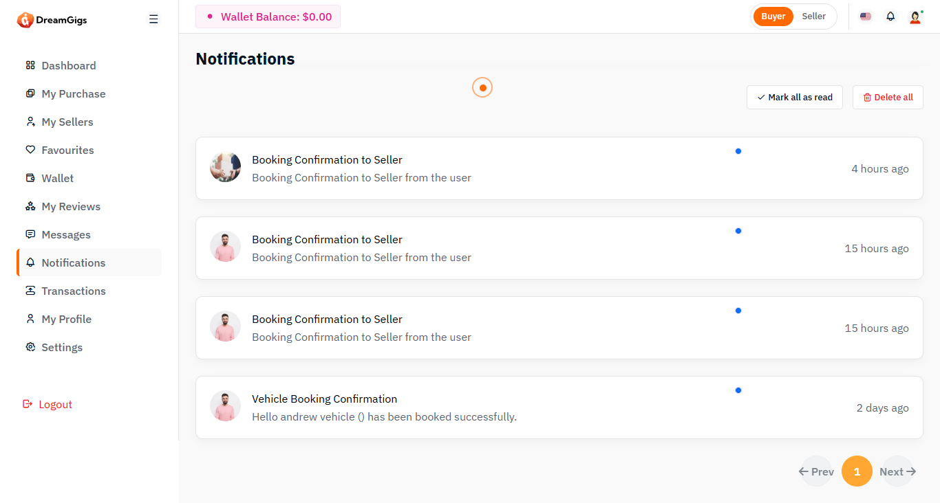
Purpose:
The notification page is designed to display system alerts, updates, and user-specific activities in a centralized interface. It allows users to view, manage, and interact with their notifications effectively through options like marking all as read or deleting all entries.
Layout:
The layout uses a single-column full-width design housed inside a page-wrapper. It features a header section titled “Notifications,” followed by a row that displays a control bar with action buttons and a dynamic notification list. Below that, pagination controls are provided for navigating through multiple notification pages. Bootstrap’s grid system is used to organize spacing, columns, and alignment.
Responsive Design:
The design is fully responsive and adapts across all screen sizes. On smaller screens, the header and action buttons stack vertically for better accessibility. Notification items are displayed in a block layout that adjusts fluidly, maintaining readability and functionality. Action buttons such as "Mark all as read" and "Delete all" remain accessible across devices, ensuring users can manage their alerts efficiently on both desktop and mobile platforms.
Purpose:
The Transactions page provides users with a detailed view of their financial activity, including debits, credits, and pending transactions. It's built to help users monitor their spending and earnings over time, view transaction history, and access in-depth details about each transaction. This interface enhances transparency and supports users in managing their financial records with precision.
Layout:
The layout is divided into three main sections: (1) a top-level status summary using card widgets that show key financial metrics such as total transactions, credits, debits, and pending balances; (2) an interactive filter section that allows users to narrow down transactions by type (credit/debit) and date; and (3) a data table that lists transactions in tabular form. The table includes pagination, actions, and modal pop-ups for each entry, offering an expanded summary view with all related financial metadata.
Responsive Design:
The design is fully responsive, built on a grid system that adapts to various screen sizes. Cards stack neatly on smaller devices, filters collapse into clickable dropdowns, and modals remain accessible without distortion. Skeleton loaders are also employed to improve perceived performance during data fetches, ensuring mobile users experience the same speed and structure as desktop users.
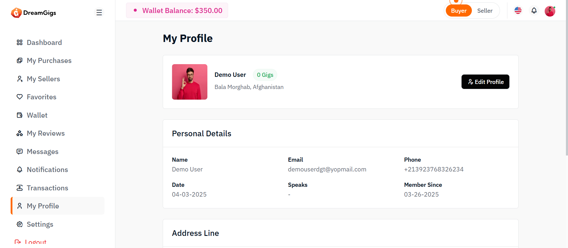
Purpose:
The profile view page enables users to view and manage their personal and account details within the platform. This includes their profile photo, name, contact information, language skills, address, and about me section. The page is designed to provide an intuitive and organized way for users to view their details, and it also offers easy access to edit their profile information. This functionality ensures users can keep their information up-to-date and maintain an accurate and professional presence within the system.
Layout:
The Profile View page uses a card-based layout to organize user information into distinct sections, such as Profile Overview, Personal Details, Address, and About Me. Each section is displayed in a clean, visually distinct card, making it easy to view and navigate the user's profile. The layout uses Bootstrap's grid system for responsive design, ensuring the profile elements are well-aligned and spaced across various devices.
Responsive Design:
The page is mobile-first, adapting to different screen sizes using Bootstrap's grid system and Flexbox. On smaller screens, the layout stacks content vertically for better readability, while on larger screens, it displays in multiple columns. The profile image and text resize based on the viewport, ensuring a smooth and consistent experience on all devices. The design remains visually balanced and user-friendly across mobile, tablet, and desktop screens.
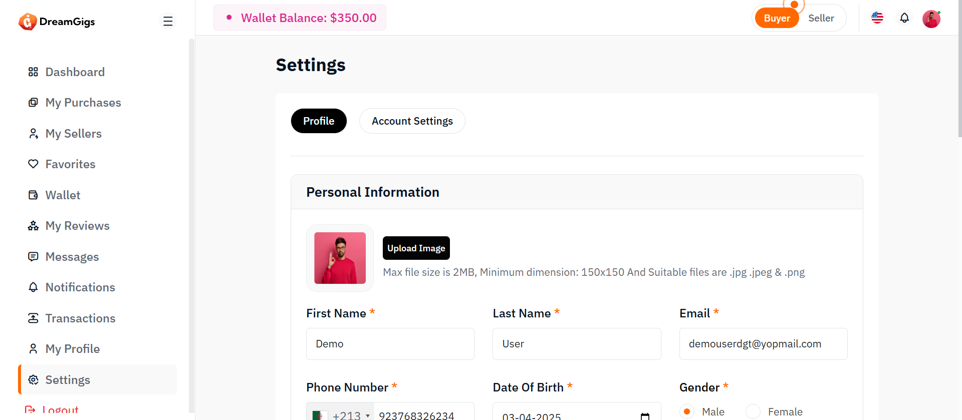
This Profile Settings Form allows users to update their personal, contact, and additional information in the application.It includes: 1. Upload and preview profile image 2. Edit personal information (name, phone, DOB, gender) 3. Request to change email 4. Add extra information (job title, languages known) It supports form validation (error messages for each field) and prepares the form data for submission (likely through AJAX or standard form POST).
Layout:
The form is organized into sections (cards), each grouping related fields: Personal Information 1. Profile picture upload 2. First Name, Last Name, Email (read-only), Phone Number, DOB, Gender 3. Address fields: Country, State, City, Address, Postal Code Change Email 1. Current Email, New Email, Confirm Email Other Information 1. Job Title 2. Languages Known (with tags input) 3. Tags (with tags input) 4. Skills (with tags input) 5. About me 6. Why work with me
Responsive Design:
Uses Bootstrap grid system (col-md-4, col-md-6, col-md-8, etc.) so that: 1. On large screens, inputs are shown side-by-side (3 per row, 2 per row, etc.). 2. On small screens (mobile/tablet), inputs stack vertically. Select2 enhances select dropdowns to make them more mobile-friendly. 4. Profile image upload and preview section uses flexible containers to adjust the layout based on device width. 5. The form structure (cards and sections) is fluid and adjusts based on screen size using Bootstrap's built-in responsiveness.
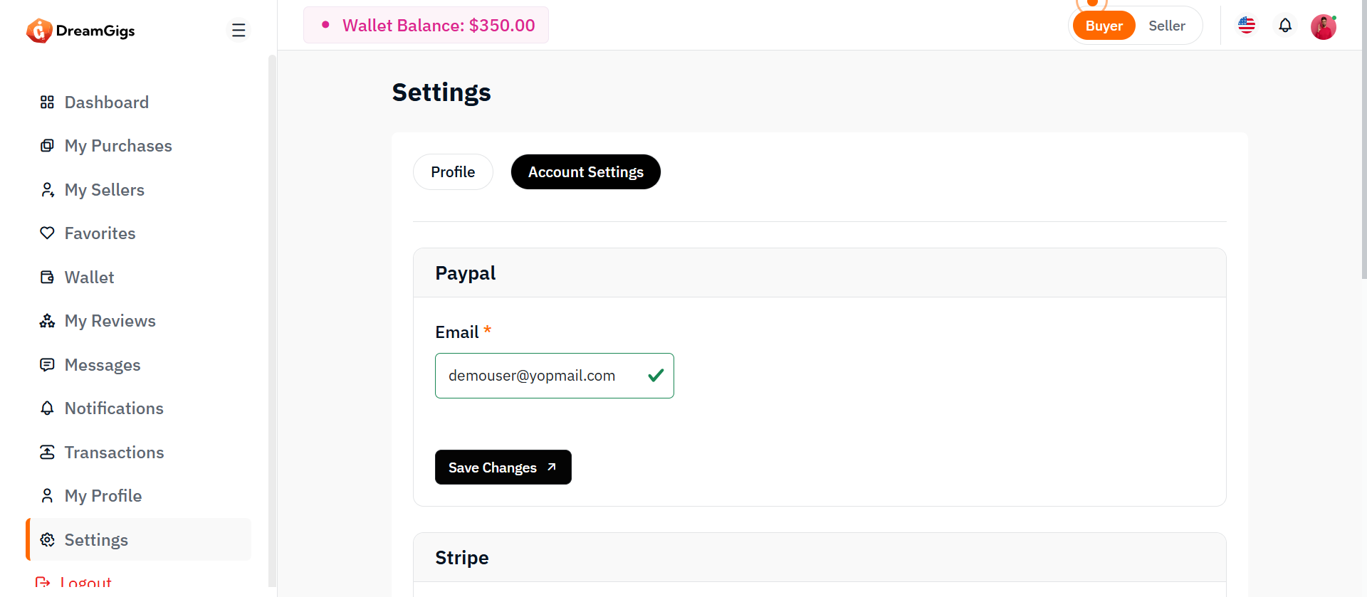
This section, labeled Account Settings, allows users to manage and update their payout/transaction methods such as: 1. PayPal credentials (email and password) 2.Stripe credentials (email and password) 3. Request to change email 4. Bank transfer details (account holder name, bank name, IFSC code, account number) Each method is handled through a separate form for clean separation of concerns. Users can save changes individually for PayPal, Stripe, or Bank Transfer settings without affecting others. Each field includes error validation placeholders (error-text) for real-time feedback during form submission (via AJAX or normal POST).
Layout:
The Account Settings layout is modular and separated into three main cards: 1. PayPal Settings Card Form with fields for PayPal Email and Password "Save Changes" button 2.Stripe Settings Card Form with fields for Stripe Email and Password "Save Changes" button 3.Bank Transfer Settings Card Form with fields for Account Holder Name, Bank Name, IFSC Code, Account Numbere "Save Changes" button
Responsive Design:
Built with Bootstrap 5's responsive grid system: 1. Fields are arranged side-by-side (col-md-4) on medium and larger devices (≥768px) 2. On small devices the fields stack vertically for easier mobile use. 3. Each form automatically adapts its width based on screen size — no manual scrolling required on mobile devices. 4. Buttons (Save Changes) are full-width below the fields when stacked on small screens. 5. Settings card sections (PayPal, Stripe, Bank) collapse naturally for a smoother vertical flow on mobile.
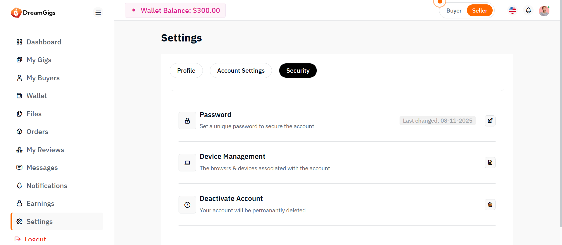
The Security Settings section provides users with control over their account security, including: 1.Changing password: Users can update their current password via a modal form. 2.Device management: Users can view and manage devices connected to their account. 3. Account deactivation: Users can initiate account deactivation for privacy or security reasons. Each action is grouped visually with intuitive icons and brief descriptions, ensuring easy understanding. Each field includes error validation placeholders (error-text) for real-time feedback during form submission (via AJAX or normal POST).
Layout:
The layout consists of two main parts: 2.1 Password Update Modal Modal: Bootstrap-based modal triggered when the user clicks "Edit" in the password section. Form: Includes three fields: 1.Current Password 2. New Password 3. Confirm Password Error Messages: Placeholder tags below each field for displaying validation errors. Action Buttons: 1.Cancel button 2."Save Changes" button
Responsive Design:
Bootstrap 5 classes are used for responsiveness: 1. d-flex, align-items-center, justify-content-between, flex-wrap, row-gap-3: ensures the layout adjusts to smaller screens by wrapping the content vertically. 2. Buttons (btn-sm, btn-primary) and icons adapt in size. 3. Modal (modal-dialog-centered) ensures it's vertically centered even on mobile devices. On small screens (e.g., mobile): 5. Icons and text stack nicely due to flex-wrap. 6. Modal resizes automatically to fit screen width. No horizontal scrolling required on mobile devices.
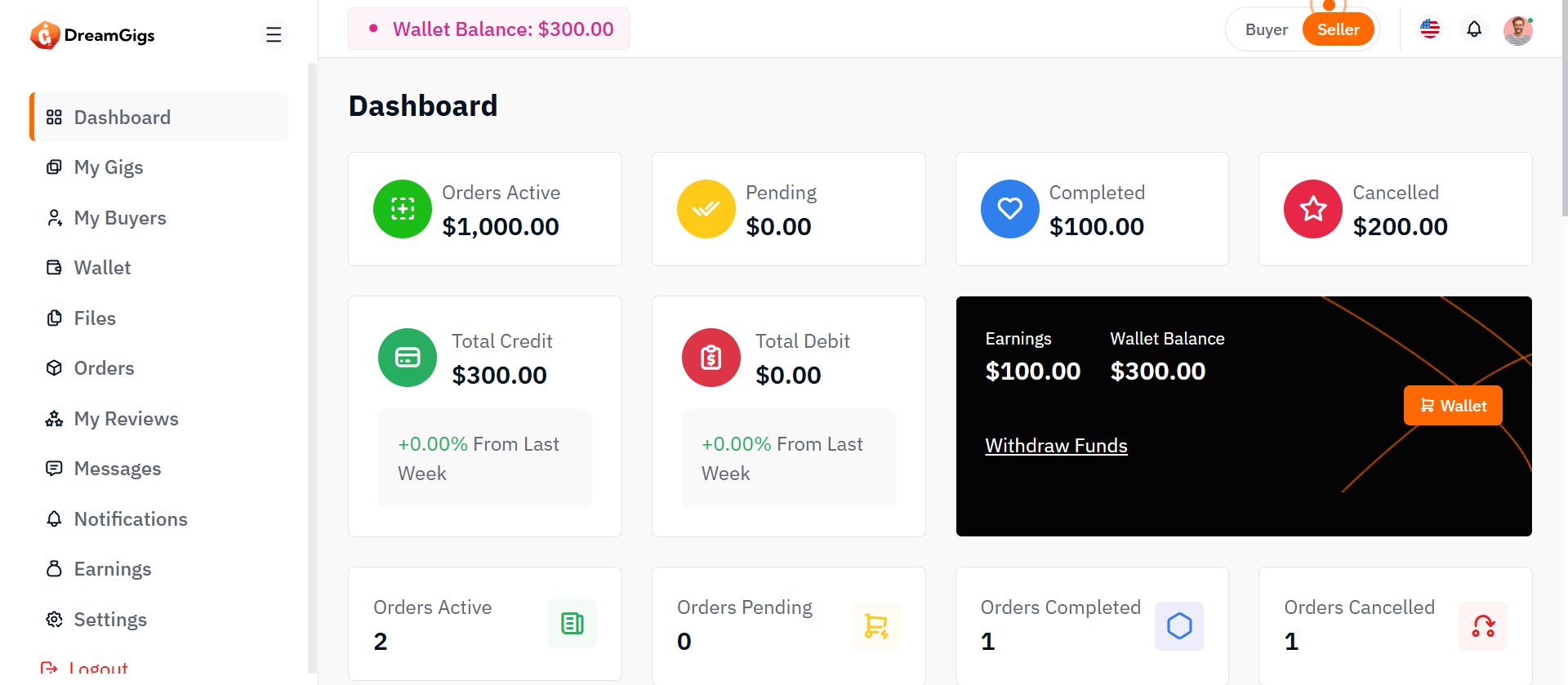
Purpose
The purpose of the Seller Dashboard is to provide a comprehensive overview of a seller's activities, performance, and financial status. It is designed to help sellers manage orders, track payments, monitor their financial health, and view key statistics related to their business. This dashboard enables sellers to stay organized and informed, allowing them to make data-driven decisions and enhance their business operations.
Layout
The Seller Dashboard is organized into the following key sections: 1. Recent Orders: A list of the latest orders placed by buyers, providing quick access to order details. 2. Files: A section for managing uploaded files associated with orders or products 3. Recent Payments: A list showing the seller's recent payments, including payment amounts and status. 4. Recent Notifications: Displays notifications related to orders, payments, and system alerts. 5. Financial Summary: Displays total credit, total debit, and wallet balance to help sellers keep track of their financial health. 6. Sales Statistics: A chart visualizing monthly gig counts and financial performance (revenue and withdrawals). Each section is designed to be intuitive and user-friendly, with easy access to essential metrics and actions.
Responsive Design:
The Seller Dashboard is built with a fully responsive design, ensuring optimal display and functionality across all devices. The layout automatically adjusts to different screen sizes, making it easy for sellers to access their data on both desktop and mobile devices. Whether on a desktop, tablet, or smartphone, the dashboard provides a consistent experience with features such as: 1. Fluid Grid Layout: The content and sections rearrange dynamically based on screen size. 2. Mobile-First Design: Prioritizing a seamless experience for mobile users while ensuring functionality on larger screens. 3. Interactive Elements: Charts, graphs, and tables remain interactive on all devices, with touch-friendly options for mobile users.
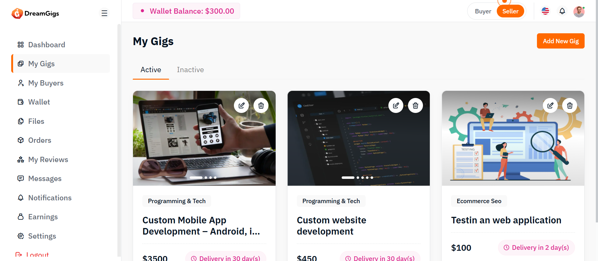
Purpose
The My Gigs page provides sellers with a centralized dashboard to manage all the gigs they have created.It displays all gigs — active and inactive — and allows users to perform essential operations such as adding, editing, activating/deactivating, and deleting gigs. This page is crucial for sellers to keep their offerings up to date, manage their presence on the platform, and ensure they maintain control over their services.
Features
1. List of Gigs: Display all gigs created by the seller, divided into Active and Inactive statuses. 2. Add New Gig: Button to create and publish a new gig. 3. Edit Gig: Ability to update gig details like title, description, pricing, images, and delivery time. 4. Delete Gig: Ability to permanently remove a gig from the platform. 5. Activate/Deactivate Gig: Toggle a gig’s status without deleting it, offering flexibility to pause offerings temporarily.
User Interaction
Add New Gig: 1. Opens a form where the seller enters all required information. 2. Fields: Title, Category, Description, Tags, Pricing, Delivery Time, Images/Videos. Edit Gig: 1. Opens a pre-filled form with the gig's current data allowing edits. 2. After saving, the updated details overwrite the old ones. Activate/Deactivate Gig: 1. Quick toggle or action button. 2. Deactivating a gig hides it from buyers but keeps it saved for future activation. Delete Gig: 1. Confirmation modal before deletion. 2. Deleted gigs are permanently removed and cannot be recovered.
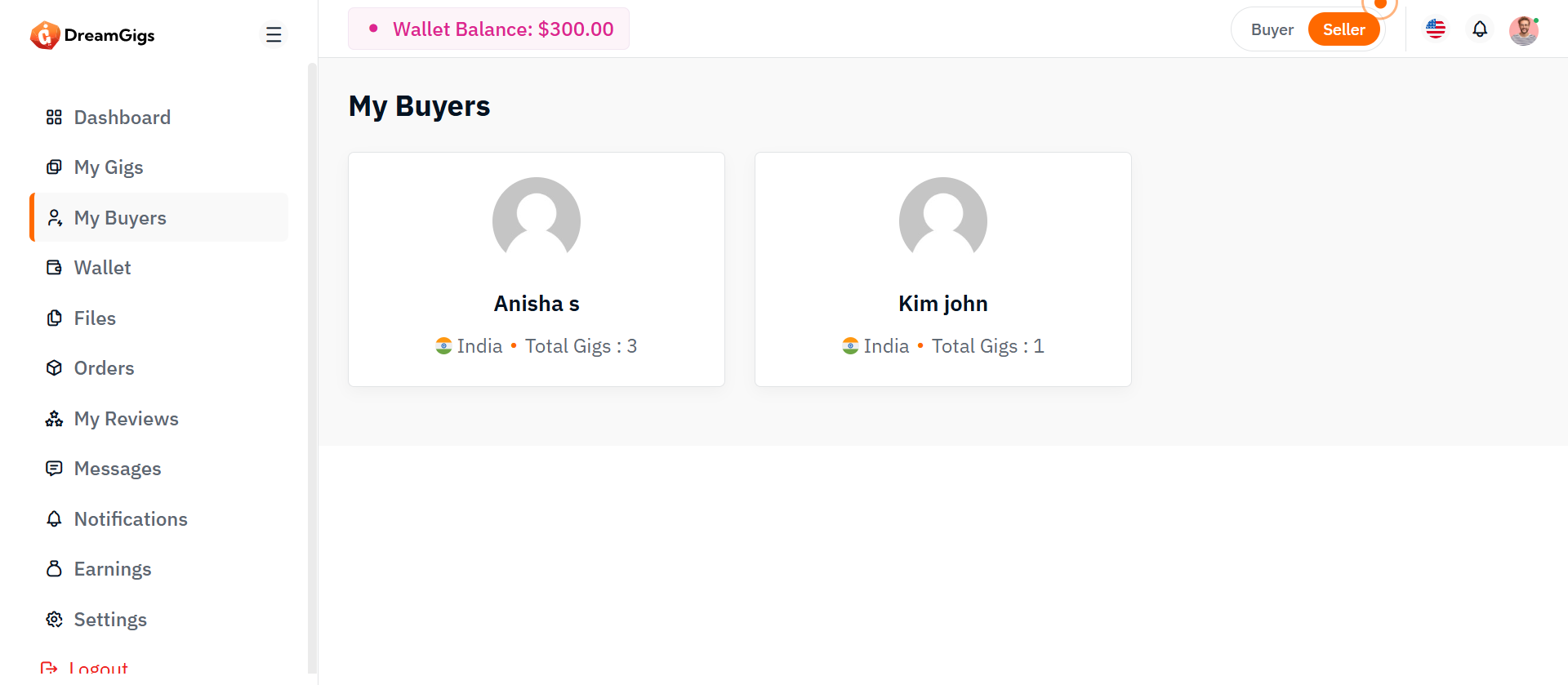
Purpose
The My Buyers page is designed for sellers to view the buyers who have purchased their gigs. It provides detailed information about each buyer, including their name, country (with flag), the total number of gigs they have purchased, and the status of the completed gig bookings. This page helps sellers track their buyers, their gig sales, and the progress of their transactions.
Layout
The My Buyers page will have the following sections: Purchased Gigs List: A list of buyers who have purchased gigs from the seller. It will include essential information such as the buyer’s name, country (with flag), total gigs purchased, and the status of completed bookings. 1. Buyer Name: The name of the buyer (business or individual). 2. Country: The country of the buyer, displayed alongside their country flag. 3. Total Gigs Purchased: The number of gigs purchased by the buyer from the seller. 4. Completed Gigs Count: The number of gigs that have been successfully completed. Each buyer’s information will be shown as a row or card containing these details.
User Interaction
The My Buyers page will feature a responsive design to ensure accessibility across devices: 1. Desktop View: The buyer information will be displayed in a grid or table format for easy viewing of each buyer's details. 2. Mobile View: The layout will adjust to a stacked, vertical format to ensure the content is readable on smaller screens. 3. Interactive Elements: Clicking on a buyer’s name will redirect to their detailed profile, where the seller can view more about the buyer’s activity and gig details.
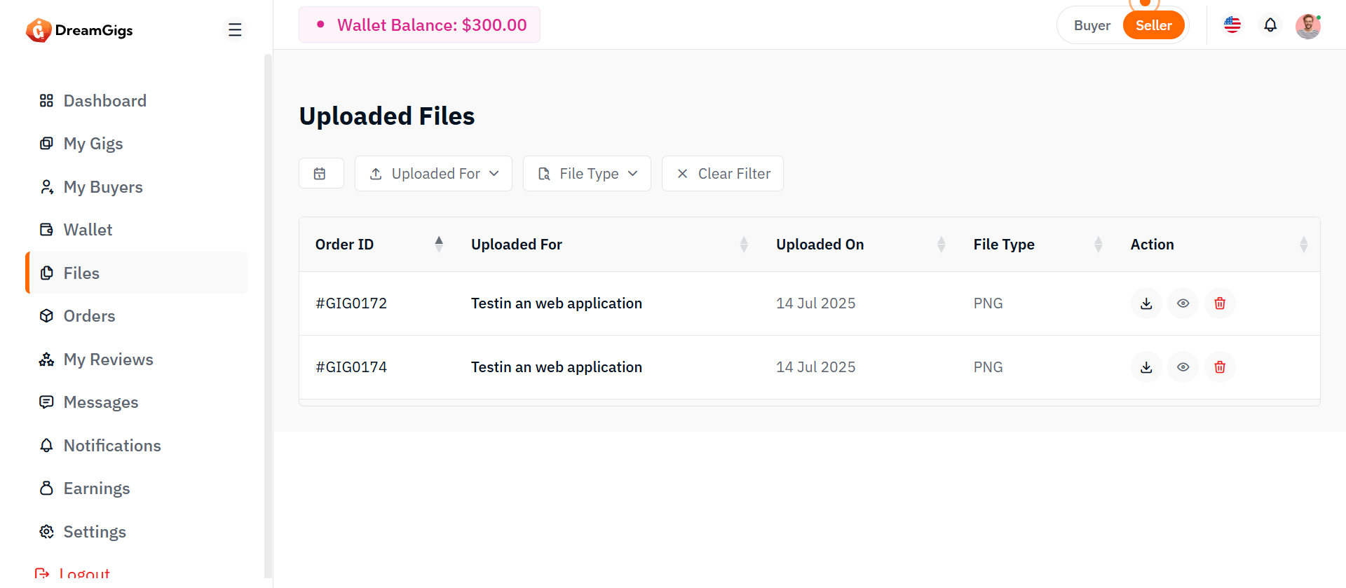
Purpose
The Seller Files List page allows sellers to view, manage, and organize all files related to their gigs and orders.This includes files uploaded by sellers themselves (e.g., gig media, delivery files) and uploaded by buyers (e.g., requirements, project files). It ensures full control over all shared assets and a clear workflow for file delivery and collaboration
Features
List All Files: Display all files associated with the seller (gig images, delivery files, buyer uploads). 1. View Files: Preview files directly (if supported) or view file metadata. 2. Download Files: Download any uploaded file. 3. Delete Files: Remove unwanted or outdated files (with confirmation).
Summary
Seller Files List is basically a mini file manager for your platform. No fancy unnecessary features. Stick to what’s proven to work: List — View — Download — Delete cleanly and securely. Simple, reliable, traditional structure — like how early major freelance marketplaces were built.
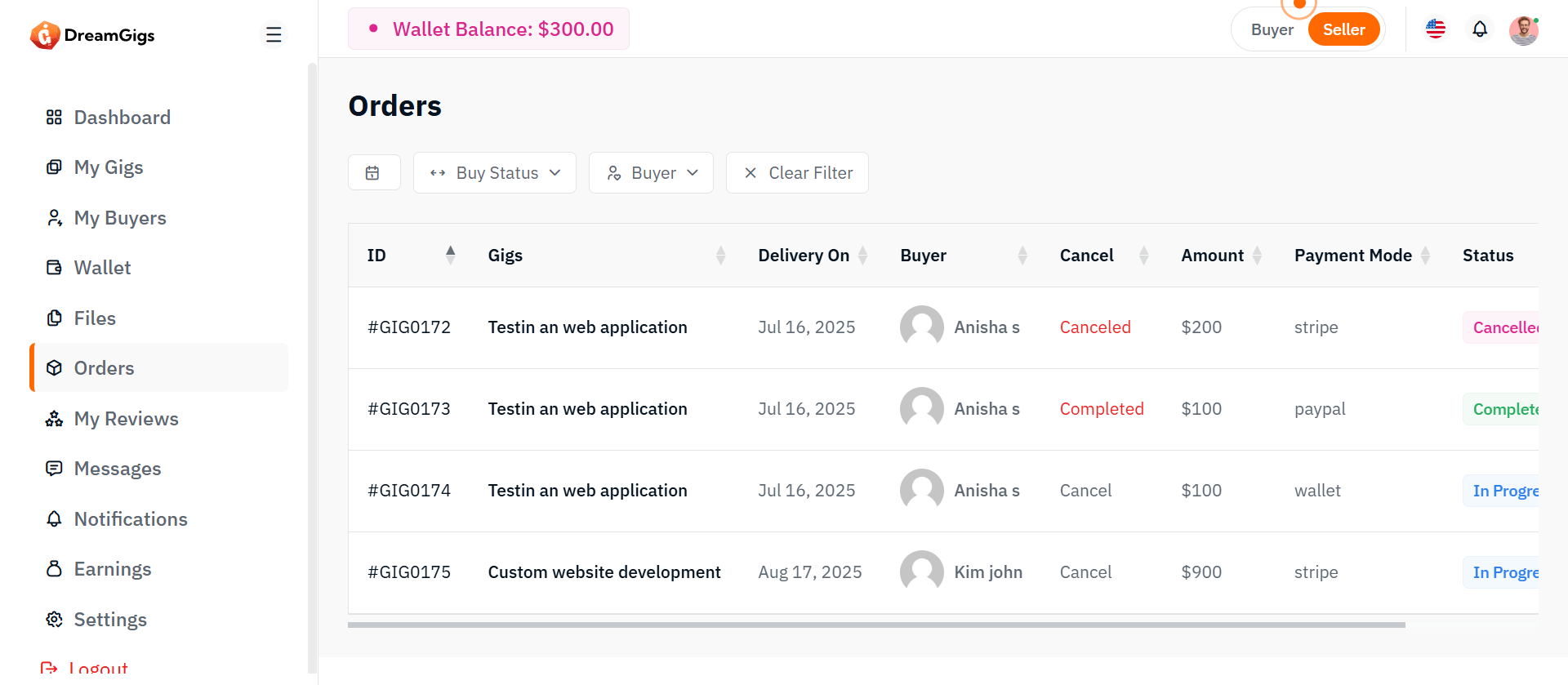
Purpose
The My Orders page allows sellers to manage all incoming orders for their gigs. It displays every order, provides advanced filtering, and allows sellers to change the status of orders based on their workflow (e.g., from pending to completed). This page is critical for fulfilling orders efficiently and maintaining a professional experience for buyers.
Features
List of Orders: Displays all orders related to the seller’s gigs. Filtering Options: Filter orders based on: 1. Buyer Name 2. Payment Method 3. Order Date (From - To) 4.Status (Pending, In Progress, Completed, Canceled) 5.Order Date (From - To) Search Functionality: Search orders by Order ID, Gig Name, or Buyer Name. Change Order Status: Update the status of an order manually when milestones are reached. View Order Details: Full page/modal showing detailed information for each order (messages, requirements, file uploads, etc.).
User Interaction
Filtering and Searching: Seller can narrow down the order list using filters. Combinations allowed (e.g., "Orders from JohnDoe paid by PayPal in April 2025"). View Order Details: Clicking "View" opens full details: buyer information, gig requirements, attached files, conversation history, and timeline.. Update Order Status: 1. Pending → In Progress 2.In Progress → Completed 3.Any → Canceled (with reason input) Important: Certain statuses should be one-way (e.g., once completed, no reverting back without admin intervention). Bulk Actions (optional future enhancement): Select multiple orders and change their status together.
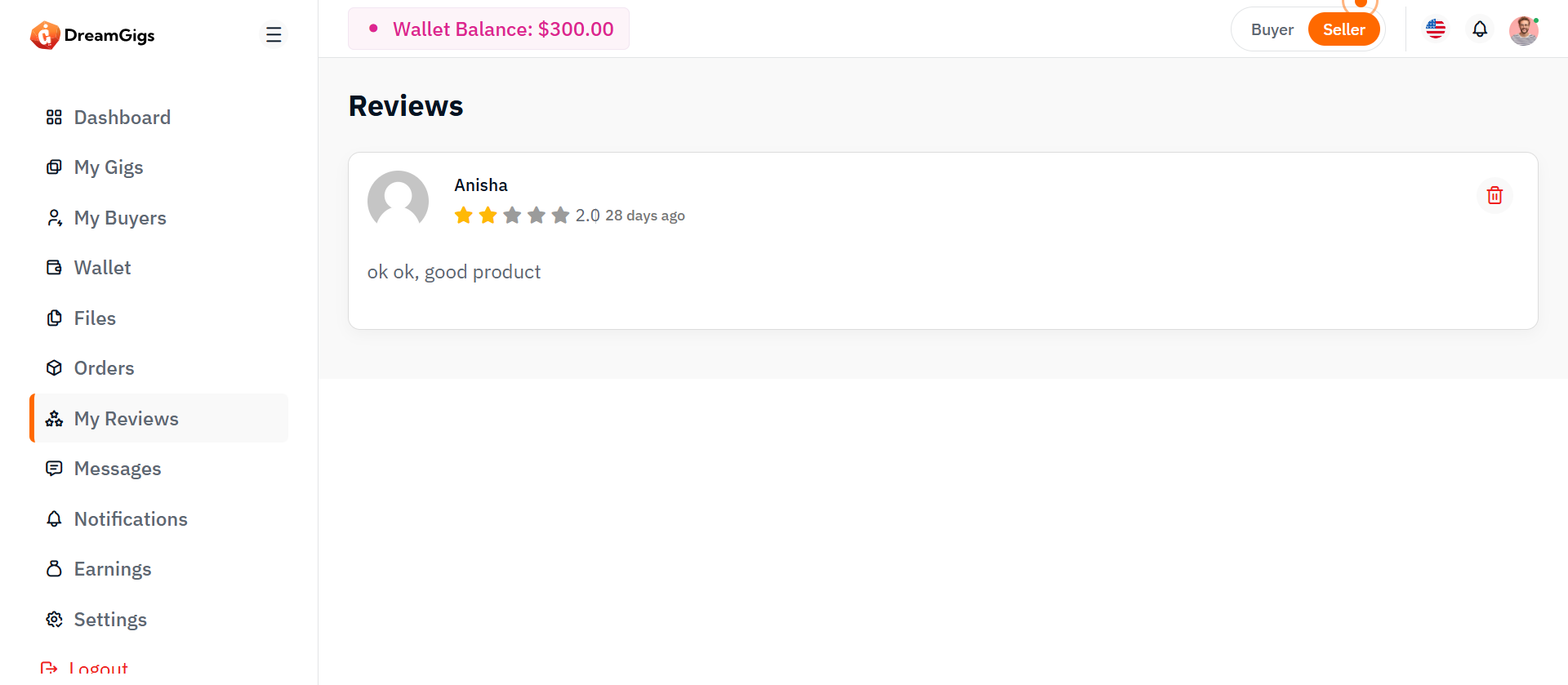
Purpose:
The reviews page provides a space for users to view feedback from other users, including ratings, comments, and time of submission. The layout is designed to be interactive, with a "Load More" feature for fetching additional reviews.
Layout:
The page consists of a list of user reviews, each showing the reviewer’s name, location, rating, and the content of their review. The reviews are initially displayed as skeleton loaders while data is being fetched, then transformed into actual review content once loaded. The "Load More" button allows for additional reviews to be loaded dynamically.
Responsive Design:
The page is responsive, adapting to various screen sizes. On larger screens, reviews are shown in a grid, while smaller screens stack the reviews vertically for easy reading. The "Load More" button is centered and remains accessible on all screen sizes.
Purpose:
This page provides buyers with a chat interface to manage and send messages to service providers. It allows viewing existing conversations, searching users, and exchanging text or file-based messages in real-time.
Layout:
The chat page adopts a two-column structure, with a sidebar on the left showcasing the list of users and the main chat interface on the right. The sidebar includes a searchable list of chat users, each displaying an avatar, name, last message preview, and timestamp. send button. The layout is built using a combination of Bootstrap’s grid system and utility classes to manage spacing, alignment, and responsiveness efficiently.
Responsive Design:
The design is fully responsive, adapting fluidly across different screen sizes. On smaller devices, the sidebar stacks above the chat section, ensuring usability in vertical layouts. Scrollable areas like the message body are height-restricted to preserve visibility of the header and input controls. Image avatars and icons scale appropriately for touch interfaces, while text truncation maintains layout integrity in limited space. JavaScript enhancements allow dynamic interactions such as user switching and file uploading without layout disruptions, ensuring a seamless user experience across desktops, tablets, and mobiles.
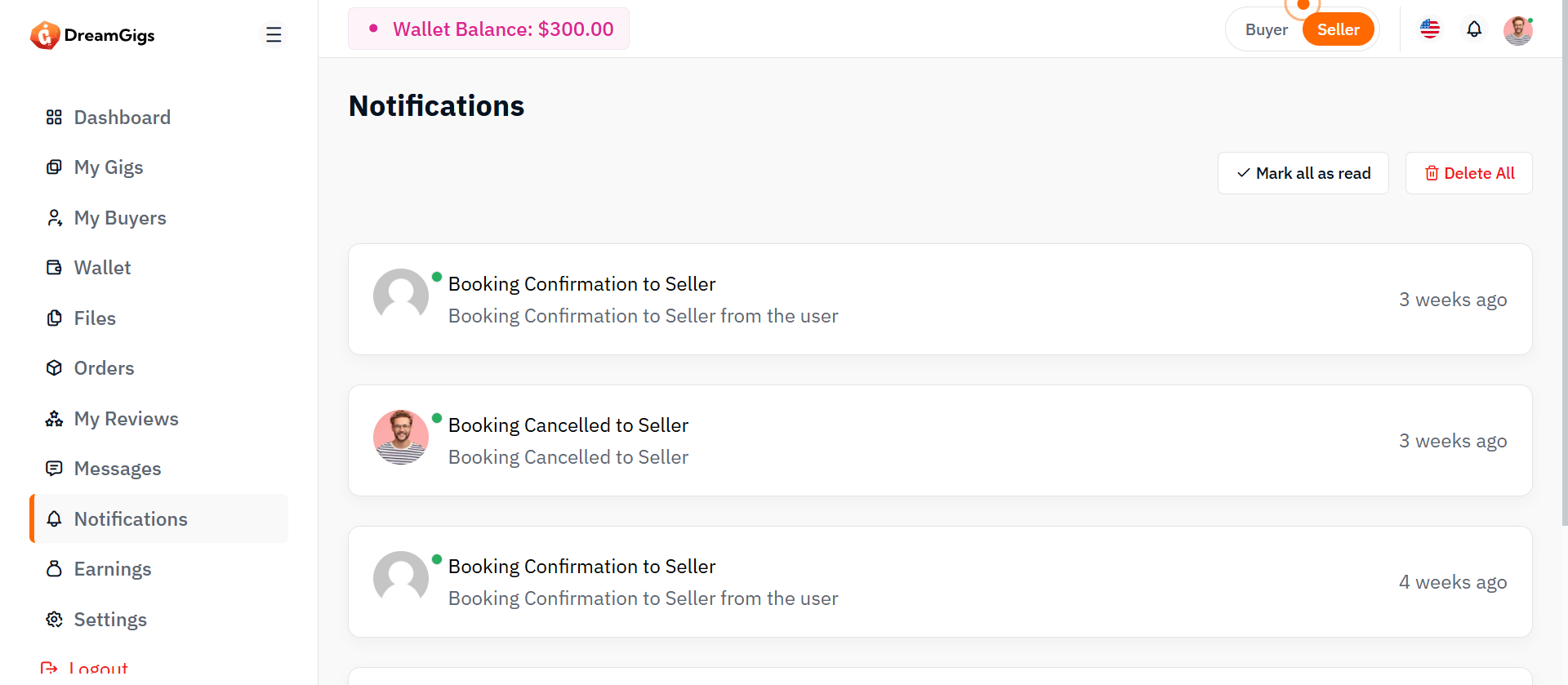
Purpose:
The notification page is designed to display system alerts, updates, and user-specific activities in a centralized interface. It allows users to view, manage, and interact with their notifications effectively through options like marking all as read or deleting all entries.
Layout:
The layout uses a single-column full-width design housed inside a page-wrapper. It features a header section titled “Notifications,” followed by a row that displays a control bar with action buttons and a dynamic notification list. Below that, pagination controls are provided for navigating through multiple notification pages. Bootstrap’s grid system is used to organize spacing, columns, and alignment.
Responsive Design:
The design is fully responsive and adapts across all screen sizes. On smaller screens, the header and action buttons stack vertically for better accessibility. Notification items are displayed in a block layout that adjusts fluidly, maintaining readability and functionality. Action buttons such as "Mark all as read" and "Delete all" remain accessible across devices, ensuring users can manage their alerts efficiently on both desktop and mobile platforms.
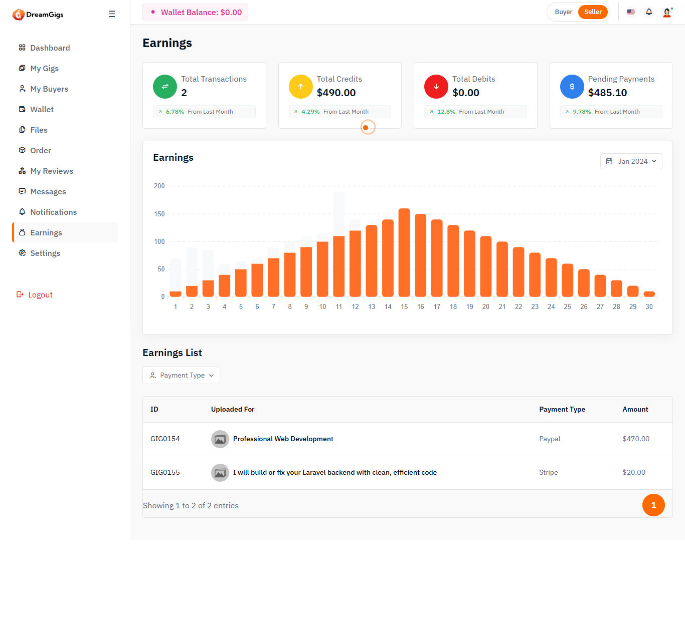
Purpose:
The earnings interface serves as a financial snapshot for users, offering transparency over their monetary activities within the platform. It consolidates key insights such as total credits, debits, transactions, and pending payments—allowing users to understand their cash flow and platform engagement at a glance. Additionally, it supports business analysis through filters and detailed transaction breakdowns.
Layout:
The structure divides information logically: summary cards on top present highlights with icons and trend indicators, followed by a dynamic graph area that visualizes earnings over selected timeframes. Below that, a filterable, searchable table organizes each transaction by ID, payment type, and amount. Each section is designed for clarity, quick access, and minimal user effort when navigating data.
Responsive Design:
To accommodate a range of user devices, the layout adapts fluidly. The summary cards realign into vertical stacks on mobile, ensuring readability, while dropdowns and table columns remain accessible without horizontal scrolling. The graph and modal components adjust in size and placement automatically, maintaining usability and aesthetic across screen sizes without sacrificing functionality.
Purpose:
The reviews page allows users to view feedback and ratings for a product or service. It features a user-friendly interface that displays both skeleton loaders (while data is loading) and real review content. Users can also load more reviews dynamically.
Layout:
The layout displays reviews in a list format. Each review has user information (name, avatar, location, and rating), followed by the review content (title and text). Skeleton loaders are shown while reviews are being fetched, and the "Load More" button allows users to view additional reviews.
Responsive Design:
The page is responsive, adjusting the review list layout based on screen size. On larger screens, multiple reviews are shown in a grid-style format, while on smaller screens, they stack vertically for easy readability. The "Load More" button is always centered and easily accessible across all devices.
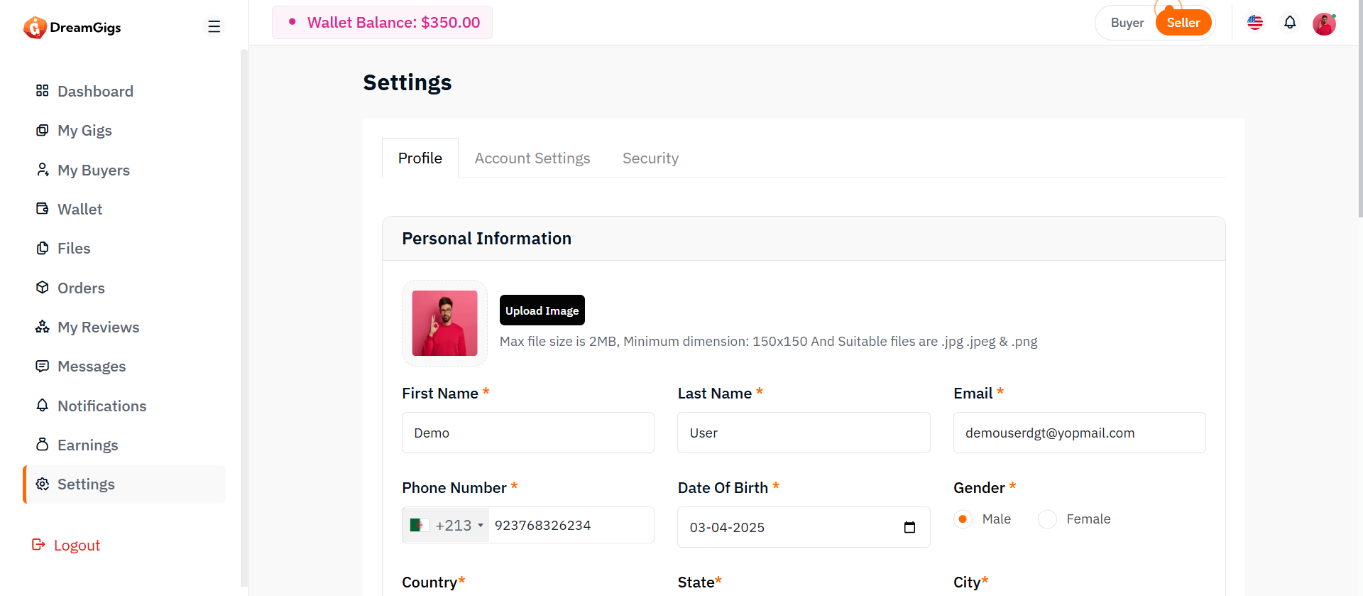
Purpose:
The Profile Settings section allows administrators to manage their personal information such as name, profile photo, and contact details. It ensures their displayed identity across the platform remains current and consistent.
Layout:
This section includes input fields for name, email (read-only), phone, and profile photo upload. A live preview of the uploaded image is provided alongside the image picker. The layout follows a single-column card design with clearly labeled fields and a photo uploader component at the top for visual emphasis.
Responsive Design:
Built with a responsive form structure using Bootstrap’s grid system (col-md-*, row), the fields and image uploader adjust fluidly for smaller screens. The image preview and form inputs stack vertically on mobile devices to maintain readability and usability.
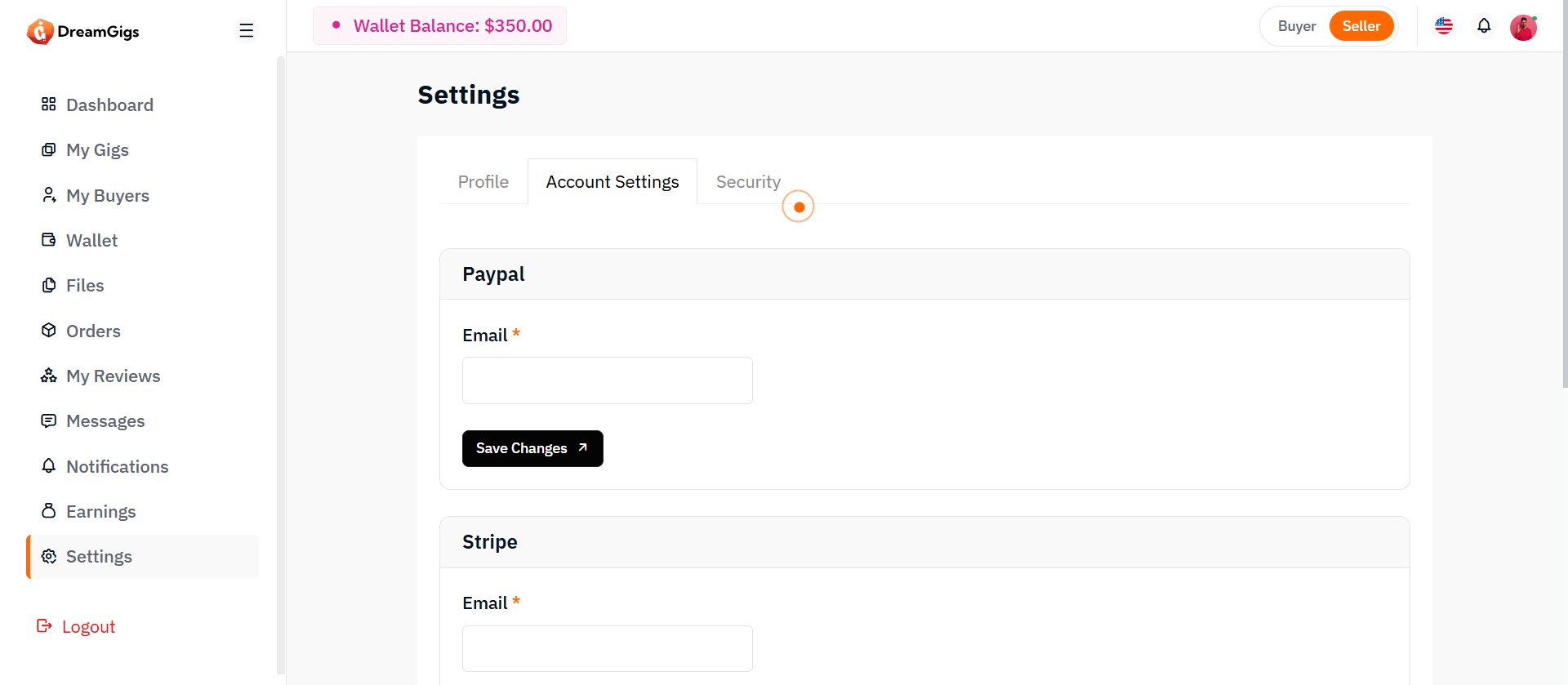
Purpose:
The Account Settings section enables admins to configure their preferred language and timezone. These preferences personalize the admin panel experience and affect how content and timestamps are displayed across the platform.
Layout:
This section is composed of dropdowns/select inputs grouped in a card layout. Each setting (language, timezone) is presented with a label and a dynamically populated select element. A form submission button is placed at the bottom of the card for saving preferences.
Responsive Design:
The layout uses col-md-* classes to maintain a side-by-side form on wider screens and a stacked layout on smaller devices. Dropdowns are styled to be mobile-friendly, with full-width tap targets and clear options for accessibility.
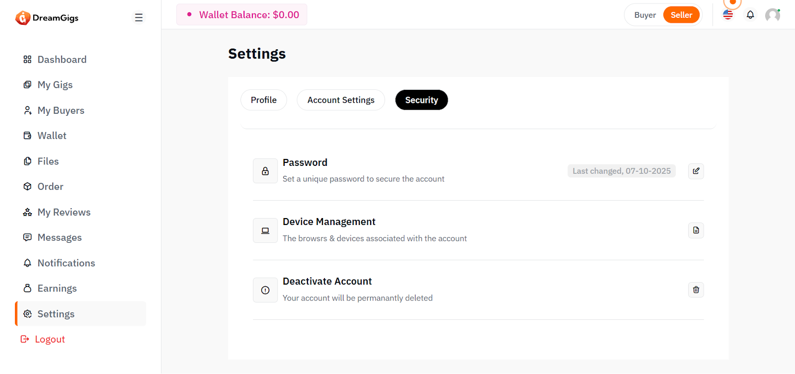
Purpose:
The Security Settings section allows administrators to update their password securely. It ensures account protection by requiring the current password and enforcing validation on new password entries.
Layout:
This section contains input fields for current password, new password, and confirm password. Each input is grouped vertically within a card. Labels and placeholders guide the user through proper password change steps, and a save button is provided at the end.
Responsive Design:
The form is responsive, using a vertical stack that is easy to follow on all screen sizes. Input fields expand to full width on smaller screens, ensuring ease of use on mobile. Password inputs support accessibility with type="password" and validation handling.
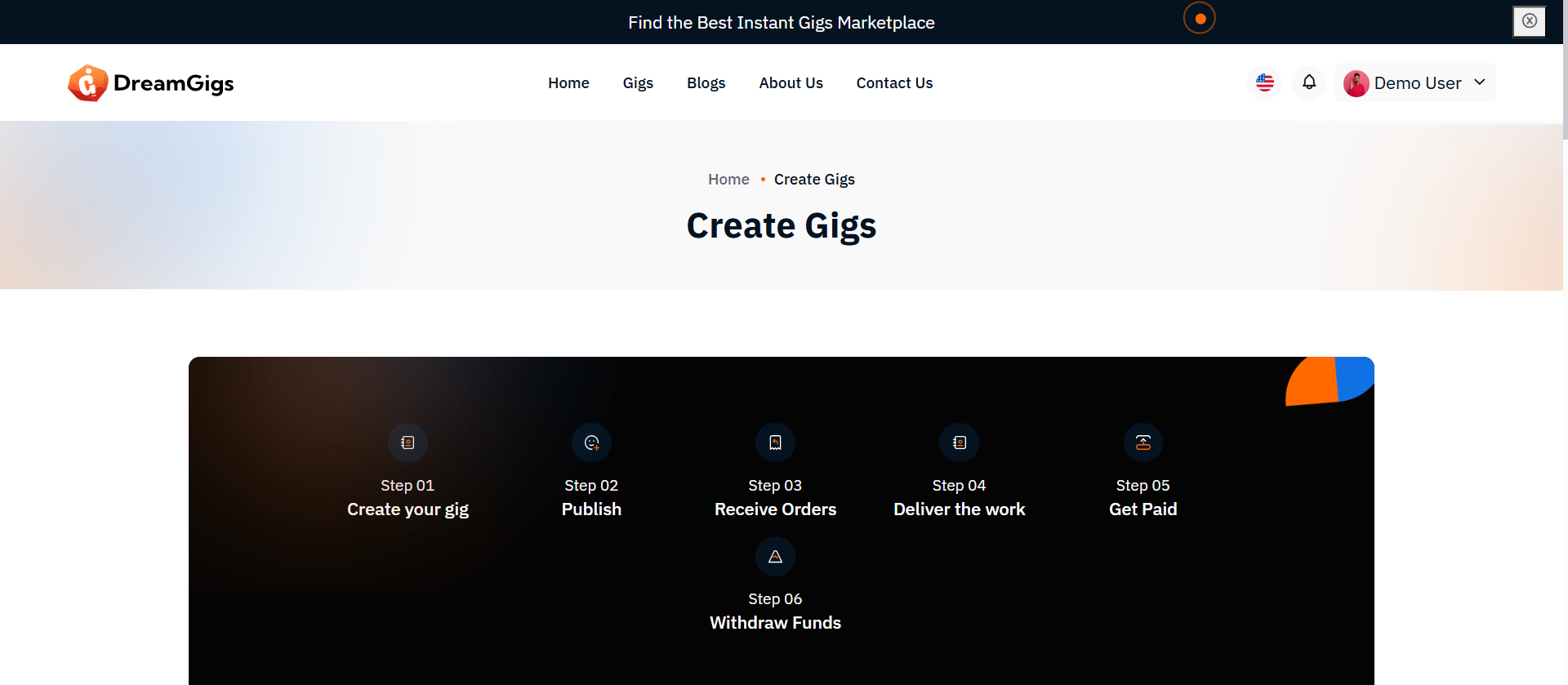
Purpose
The Add Gig page allows sellers to create and publish new service offerings on the platform. This form should be simple, direct, and require all essential information needed to display and sell the gig properly once published. This step is critical for populating the platform with high-quality gigs, ensuring consistency across listings.
Features
Input Gig Information: 1. Title 2. Category 3. Description. 4. ATags (keywords for search). 5. Price 6. Delivery Time 7. Media Upload (Images / Videos) Save & Publish: Directly publish the gig once the form is successfully submitted. Validation: Basic front-end and back-end validation for required fields.
Summary
The Add Gig process should be quick, simple, and reliable. No complicated steps. Sellers should be able to add their service in a few minutes and publish it immediately. Follow traditional platform standards — no need to overcomplicate what has worked for years.
Purpose
The Edit Gig page allows sellers to update the details of their previously created gigs. 1. It is essential for keeping gig information accurate, up-to-date, and competitive. 2. Unlike Add Gig, this page loads existing data into the form for the seller to modify. 3. This ensures sellers can easily maintain the quality of their services over time.
Features
4.Load Existing Gig Data: All fields are pre-filled with the current gig information. 5.Edit and Save Changes: Sellers can update any field (title, description, price, media, etc.). 6. Validation: Same validation rules apply as during adding a gig. 7.Update Media Files: Sellers can replace, add, or remove images and videos. 8.Status Management (optional): Sellers may also choose to deactivate the gig if needed.
Summary
Edit Gig should feel almost identical to Add Gig, but with the existing data pre-filled.No unnecessary steps, no overcomplication. Traditional flow: Open → Edit → Save → Update → Confirmation. Reliability, simplicity, and speed are the keys.
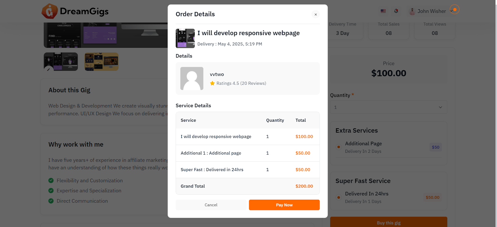
Purpose
The User Booking page allows buyers to purchase gigs and optionally add extra services or select fast-track delivery options (if available). This system is essential for streamlining the buyer’s experience, providing flexibility in gig selection, and offering value-added services to enhance orders.
Features
1. Select Gig & Options: Buyers can select the main gig, with optional extras like additional services or fast-track delivery. 2. View Order Details: Display a summary of selected options and pricing before confirming the order. 3. Dynamic Pricing: The price is adjusted based on chosen extra services or fast-track options. 4. Order Confirmation: After payment, the order is confirmed, and the buyer receives a detailed receipt.
Summary
User Booking should be intuitive, giving buyers full control over their purchases while offering flexibility in choosing extra services or fast-track options. The process should feel simple, fast, and secure, with everything the buyer needs to know presented in a clear and concise order summary. Traditional platform models, such as service-based upselling and clear pricing options, ensure the buyer has a great user experience while maximizing revenue for the seller.
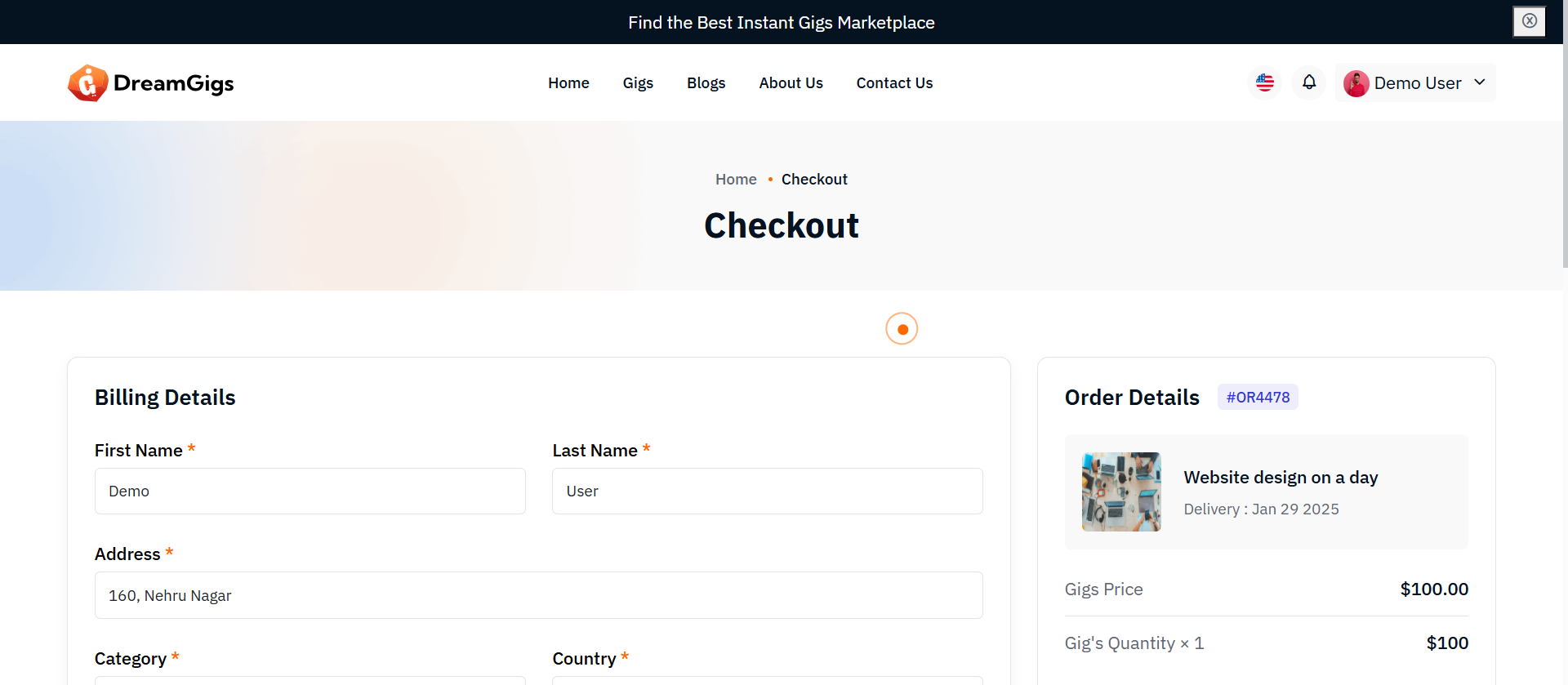
Purpose
The User Checkout page is the final step in the booking process, where buyers review the details of their order, add billing information, and select a payment method to complete the transaction. This page ensures a smooth and secure experience, offering multiple payment options for buyer convenience.
Features
1. Order Summary: Displays all order details, including the selected gig, extras, fast-track options, and the final total. 2. Billing Information: Collects the buyer’s billing details (name, address, etc.) for invoicing. Payment Methods: 1. PayPal: Direct integration for easy and secure payments. 2. Stripe: A popular choice for credit/debit card payments. 3. Wallet: A platform-specific wallet balance for quick checkout (if supported). Order Confirmation: Upon successful payment, the order is finalized, and the user is shown a confirmation page with order details.
Summary
The User Checkout page ensures that the buyer: 1. Sees a clear and concise order summary. 2. Can securely enter their billing information. 3. Chooses from multiple payment options (PayPal, Stripe, Wallet). 4. Receives instant feedback on the success or failure of their payment. This process should be as smooth and secure as possible, prioritizing user experience and minimizing friction at the final step of the purchase process.
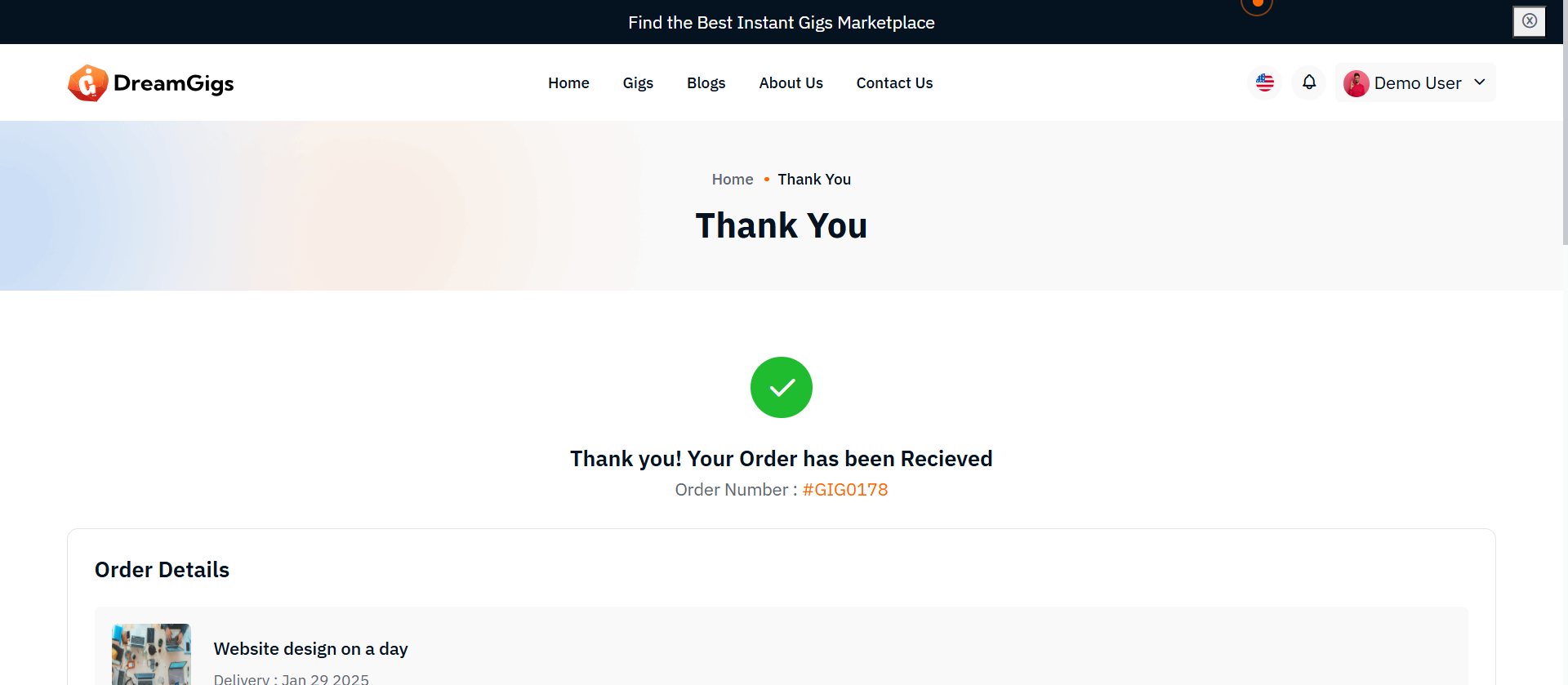
Purpose
The Payment Success Page confirms that the payment has been successfully processed and the order is complete. It provides a summary of the purchase, including payment details, billing information, and the order summary. This page is crucial for building trust with the user by providing clear, transparent details about the transaction.
Features
1. Payment Success Confirmation: Display a "Thank You" message and confirmation of successful payment. 2. Order Details: Provide a breakdown of the order, including items purchased, total price, and any extra services selected. 3. Billing Information: Display the buyer’s billing address and payment method used. 4. Order ID: A unique identifier for the order. 5. Next Steps: Provide users with information on the next steps (e.g., "Your order is being processed" or "You will receive an email with your order details"). 6. Downloadable Receipt: Option to download or view the receipt for the transaction.
Summary
The Payment Success Page is the final step in the transaction process. It confirms the successful payment, provides a clear order summary, and gives the buyer all necessary details about the order (items, billing info, next steps). This page serves to reassure the buyer that the transaction was successful and give them all the information they need for their records.
Please note that our respond can take up to 2 business days.
- Availability to answer questions, Answering technical questions about item’s features, Assistance with reported bugs and issues, Help with included 3rd party assets.
- Any customization request will be ignored.
- Please make sure to read more about the support policy.
If this documentation does not address your questions, please feel free to contact us via email at Item Support Page
We are in the GMT+5:30 time zone and typically respond to inquiries on weekdays within 12-24 hours. Please note that in rare cases, the response time may extend to 48 hours, especially during holiday seasons.
We strive to offer top-notch support, but it's only available to verified buyers and for template-related issues such as bugs and errors. Custom changes and third-party module setups are not covered.
Don’t forget to Rate DreamGigs!
DreamGigs is developed by Dreams Technologies and is available under both Envato Extended & Regular License options.
Regular License
Usage by either yourself or a single client is permitted for a single end product, provided that end users are not subject to any charges.
Extended License
For use by you or one client in a single end product for which end users may be charged.
What are the main differences between the Regular License and the Extended License?
If you operate as a freelancer or agency, you have the option to acquire the Extended License, which permits you to utilize the item across multiple projects on behalf of your clients.
Do you need a customized application for your business?
If you need a customized application for your business depends on your specific requirements and goals, Please contact us.
Customization can be the key to success, ensuring your project perfectly aligns with your unique goals and requirements.
Don't Miss Out on the Benefits of Customization!
Unlock the potential of your project. It's time to ensure that your project isn't just another cookie-cutter solution but a truly unique and effective one.
Discover how customization can make a difference in your project's success. Let's create a solution that's as unique as your vision!
- We'll tailor the application to meet your specific needs and preferences.
- We will upload your website to the server and ensure it is live.

Thank You
Thank you once again for downloading DreamGigs.
We hope you're enjoying your experience, and we kindly request that you take a
moment to share your valuable review and rating with us.